
- SAP Community
- Products and Technology
- Technology
- Technology Blogs by SAP
- SAP Fiori for Android 7.1 and iOS 10.0 – Introduci...
Technology Blogs by SAP
Learn how to extend and personalize SAP applications. Follow the SAP technology blog for insights into SAP BTP, ABAP, SAP Analytics Cloud, SAP HANA, and more.
Turn on suggestions
Auto-suggest helps you quickly narrow down your search results by suggesting possible matches as you type.
Showing results for
 EmilVoutta
Advisor
Options
- Subscribe to RSS Feed
- Mark as New
- Mark as Read
- Bookmark
- Subscribe
- Printer Friendly Page
- Report Inappropriate Content
12-20-2023
11:41 PM
We are always working on improving our mobile design system and mobile technology offerings to give you everything you need for designing mobile business applications. We have not only made updates to our existing UI components based on the valuable feedback from app teams, but we have also introduced new ones to enhance the possibilities for creating a truly enjoyable user experience. One of the major accomplishments in this release was the introduction of a new card system for SAP Fiori on Android and iOS. This card system offers improved customization and flexibility, as well as adaptable sizing options to fit various screen sizes and layouts.
The new card system for native applications revolutionizes the way cards are used, providing a convenient way to display content from different sources. It consists of a toolkit of nested components that allow you to create a variety of cards that meet SAP product requirements. Whether you need list items, KPIs, or a data table, each card’s flexible header, body, and footer seamlessly transform a single container into various card types.
Take a look at our updated Design Guidelines to find out more about the features and flexibility of our new Mobile Card System:
SAP Fiori for Android Card Guidelines | SAP Fiori for iOS Card Guidelines
Let's take a look at some of the release highlights of SAP Fiori for Android 7.1:
Design tokens are our new cross-platform solution to managing color across iOS and Android. Design tokens are stored pieces of UI information such as color, spacing, sizing, and typography that collectively make up our design system’s visual identity. Additionally, design tokens help to maintain visual consistency, scale design decisions, and are simple to maintain and update.
See Design Tokens to find out more.
The calendar view provides a visual overview of a week, a month, or multiple months. It can filter and display different types of content, such as events, agendas, or schedules, based on the time dimension.
For more information, check out the Calendar article in the SAP Fiori for Android Design Guidelines.
Illustrated messages communicate empty, error, and success states through a combination of solution-oriented messages, engaging illustrations, and a conversational tone. They are flexible and adaptive. Use an illustrated message when you want to improve the user experience for one or more message states in your application.
See Illustrated Message for more details.
The new status info label component displays short bits of information complementary to the object, either in a horizontal row or a vertical stack. It is a flexible combination of an icon and a text label.
Refer to Status Info Label for more details.
The new step progress indicator component is a progress indicator for tracking and displaying a user’s state in a user flow. It allows the user to navigate to another step in both the horizontal view and the vertical “All Steps” view. It also supports dynamic steps such as sub-steps or indeterminate steps.
Find out more about this new component in the Step Progress Indicator guideline article.
Tags are new components that are used to display quick and useful category labels to users. They are nested, non-actionable components in cards, object headers, and object cells.
See Tags to learn more about this component.
The rating control can be used in various contexts to provide insight regarding the opinions and preferences of an object. Currently, the rating control is display-only.
Check out the Rating Control article to learn more about this new component.
Next, let's take a look at some of the release highlights of SAP Fiori for iOS 10.0:
Design tokens are our new cross-platform solution to managing color across iOS and Android. Design tokens are stored pieces of UI information such as color, spacing, sizing, and typography that collectively make up our design system’s visual identity. Additionally, design tokens help to maintain visual consistency, scale design decisions, and are simple to maintain and update.
See Design Tokens to find out more.
The filter feedback bar is a horizontal bar that appears above a list of content. The Filter buttons now come with more style variations and a modal sheet in case more complex filters are applied using the filter feedback bar.
Refer to Filter Feedback Bar for more details.
The illustrated message is a new type of feedback component that helps to inform users about various system states and suggests actions they can take to resolve an issue.
Check out the Illustrated Message guideline article.
Inline validation provides static information to a user or provides temporary feedback in response to a user’s input and is commonly used with form cell in forms.
Inline success messages and warning messages are now available in addition to error messages. Hint text is also enhanced for multiline messages.
See Inline Validation to learn more about this pattern.
The new key value table view cell component is an uneditable read-only table view cell that fits inside the table view container. It may also contain actionable text in certain use cases.
For more information, check out the Key Value Table View Cell article in the SAP Fiori for iOS guidelines.
Skeleton loading is a new progress indicator that is used when a screen or part of a screen is loading. It is best used when the structure and layout of a container are known, such as a page or card, and the system requires time to fetch and display the actual data.
See Skeleton Loading for more information.
A detailed documentation on component anatomy, behavior, and interactions allows you to use components that match your use case. Crosslinks to Google’s Material Design Guidelines for Android and Apple’s Human Interface Guidelines for iOS, as well as links to development documentation, help you navigate to these resources. Additionally, you can find a feedback function on each guideline article that allows you to provide feedback.
SAP Fiori for Android Design Guidelines | SAP Fiori for iOS Design Guidelines
With the updated SAP Fiori for Android and iOS Figma UI design kits, it’s now easier than ever to use the latest components and patterns in your mobile design. By using the design kits, you can quickly create a consistent user experience that enables app implementations at scale.
SAP Fiori for Android 7.0 UI Design Kits | SAP Fiori for iOS 9.2 UI Design Kits
The SAP Fiori Mentor app is an interactive playground that allows you to explore the flexibility of mobile components and patterns available through the SAP BTP SDKs for Android and iOS. By adjusting component settings within the app, the behavior, interaction, and features of components can be previewed live. If you’re a developer, you can export code samples with predefined settings into your preferred development tool. If you’re a designer, you can easily understand the scope of functionality for a specific component and specify your designs with applicable parameters, and hand over the respective code snippets to your development partners. To provide some tangible examples of the actual UI component usage in apps, the best practices section provides a selection of app design examples. By highlighting specific areas, each app design indicates which UI components are used, so you can deep dive into their additional features.
Apple App Store | Google Play Store
The SAP BTP SDK for iOS and SAP BTP SDK for Android include the SAP Fiori framework that contains user interface components. These frameworks are standalone and do not have a dependency on other parts of the SDK. These libraries make it easier to create applications that conform to the SAP Fiori design language. On iOS, the SAP BTP SDK offers “SAP Fiori framework“ and the “Fiori” controls extend Apple’s UIKit/SwiftUI. These controls can be used programmatically or through storyboard files. On Android, the SAP BTP SDK UI components are contained in the “Fiori” library and extend Material Design controls.
SAP BTP SDK for iOS | SAP BTP SDK for Android
Experience matters. Follow our journey as we transform the way we build products for enterprise on www.sap.com/design.
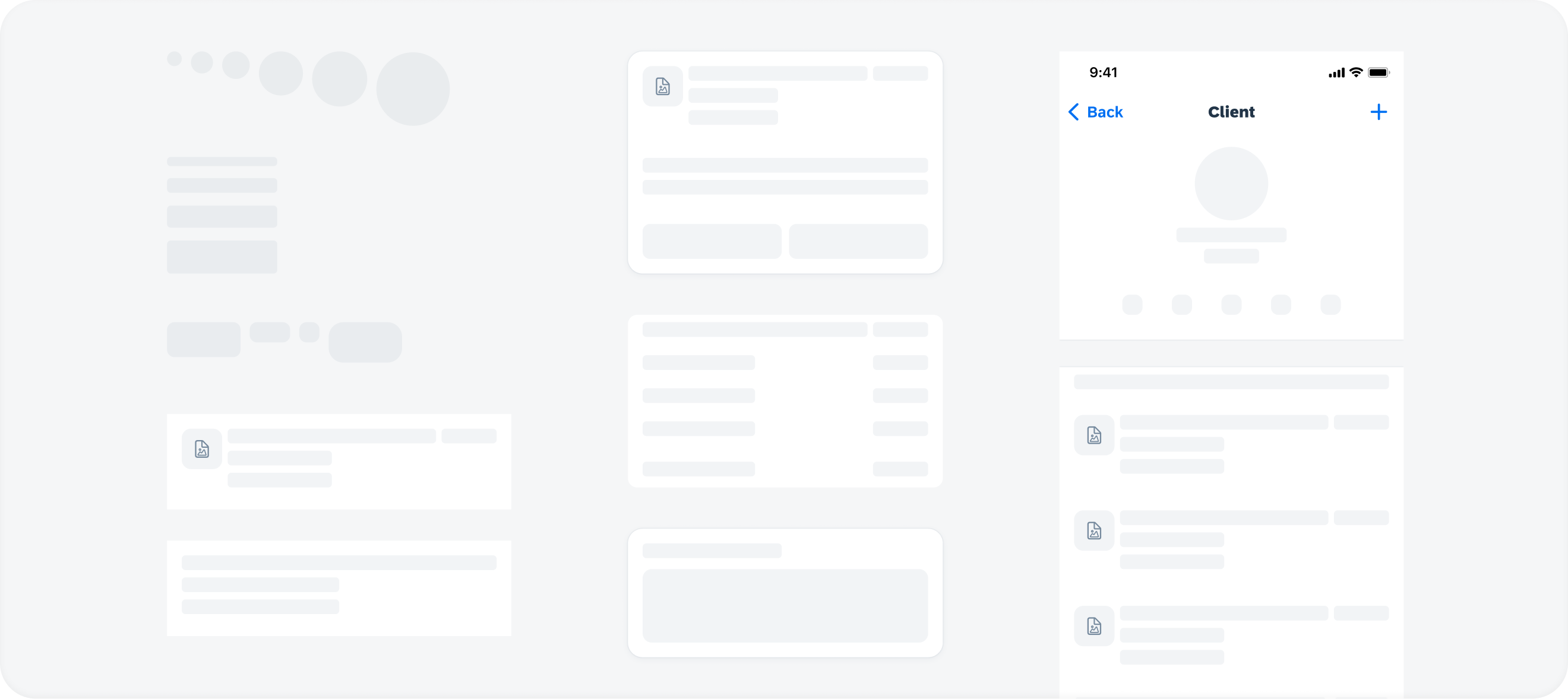
Mobile Card System
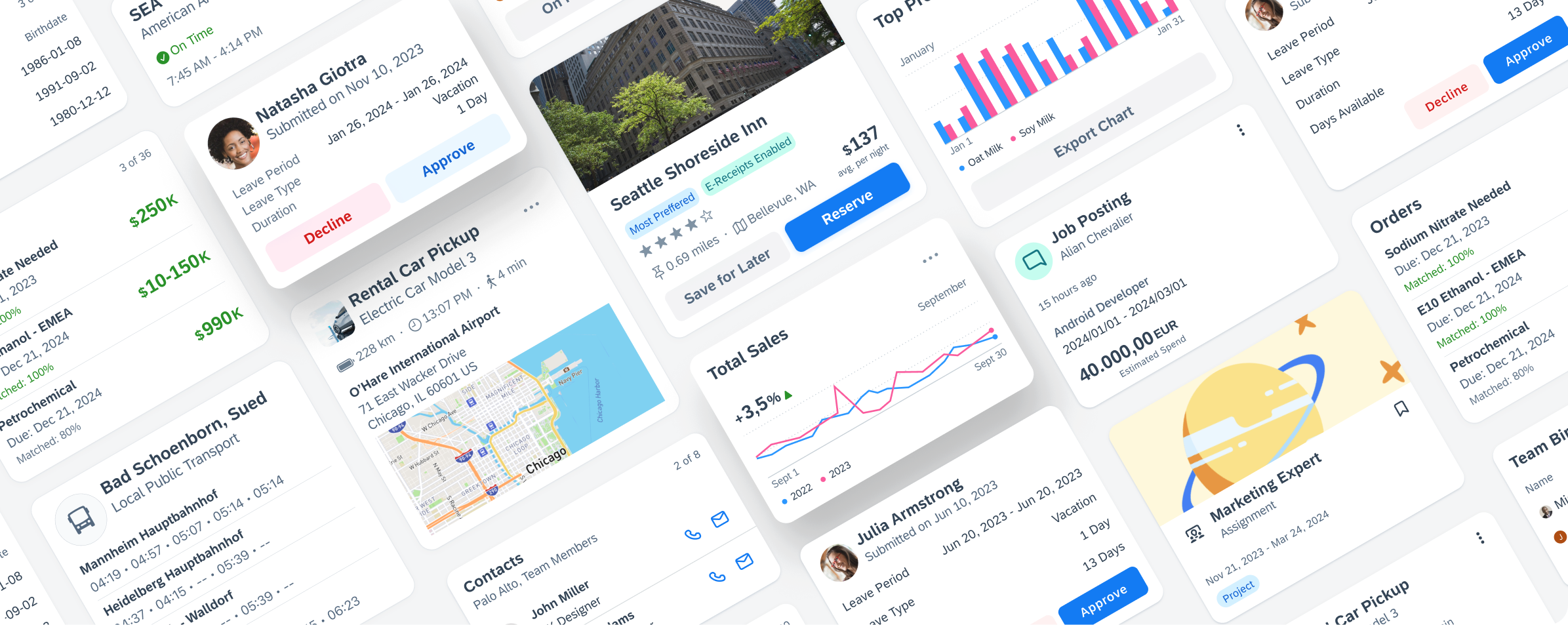
Mobile Card System for SAP Fiori for Android and iOS
The new card system for native applications revolutionizes the way cards are used, providing a convenient way to display content from different sources. It consists of a toolkit of nested components that allow you to create a variety of cards that meet SAP product requirements. Whether you need list items, KPIs, or a data table, each card’s flexible header, body, and footer seamlessly transform a single container into various card types.

Variety of cards, based on one card container
Take a look at our updated Design Guidelines to find out more about the features and flexibility of our new Mobile Card System:
SAP Fiori for Android Card Guidelines | SAP Fiori for iOS Card Guidelines
New in SAP Fiori for Android 7.1
Let's take a look at some of the release highlights of SAP Fiori for Android 7.1:
Design Tokens
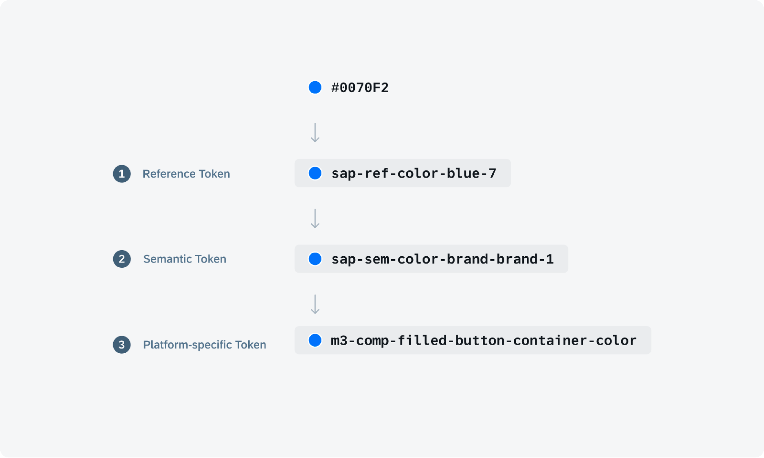
Design Token Hierarchy
Design tokens are our new cross-platform solution to managing color across iOS and Android. Design tokens are stored pieces of UI information such as color, spacing, sizing, and typography that collectively make up our design system’s visual identity. Additionally, design tokens help to maintain visual consistency, scale design decisions, and are simple to maintain and update.
See Design Tokens to find out more.
Calendar

Calendar view on mobile
The calendar view provides a visual overview of a week, a month, or multiple months. It can filter and display different types of content, such as events, agendas, or schedules, based on the time dimension.
For more information, check out the Calendar article in the SAP Fiori for Android Design Guidelines.
Illustrated Message

Empty state example on mobile
Illustrated messages communicate empty, error, and success states through a combination of solution-oriented messages, engaging illustrations, and a conversational tone. They are flexible and adaptive. Use an illustrated message when you want to improve the user experience for one or more message states in your application.
See Illustrated Message for more details.
Status Info Label

Status info label example
The new status info label component displays short bits of information complementary to the object, either in a horizontal row or a vertical stack. It is a flexible combination of an icon and a text label.
Refer to Status Info Label for more details.
Step Progress Indicator

Step progress indicator in horizontal view
The new step progress indicator component is a progress indicator for tracking and displaying a user’s state in a user flow. It allows the user to navigate to another step in both the horizontal view and the vertical “All Steps” view. It also supports dynamic steps such as sub-steps or indeterminate steps.
Find out more about this new component in the Step Progress Indicator guideline article.
Tags

Sample tags in a card
Tags are new components that are used to display quick and useful category labels to users. They are nested, non-actionable components in cards, object headers, and object cells.
See Tags to learn more about this component.
Rating Control

Rating controls in a list
The rating control can be used in various contexts to provide insight regarding the opinions and preferences of an object. Currently, the rating control is display-only.
Check out the Rating Control article to learn more about this new component.
New in SAP Fiori for iOS 10.0
Next, let's take a look at some of the release highlights of SAP Fiori for iOS 10.0:
Design Tokens
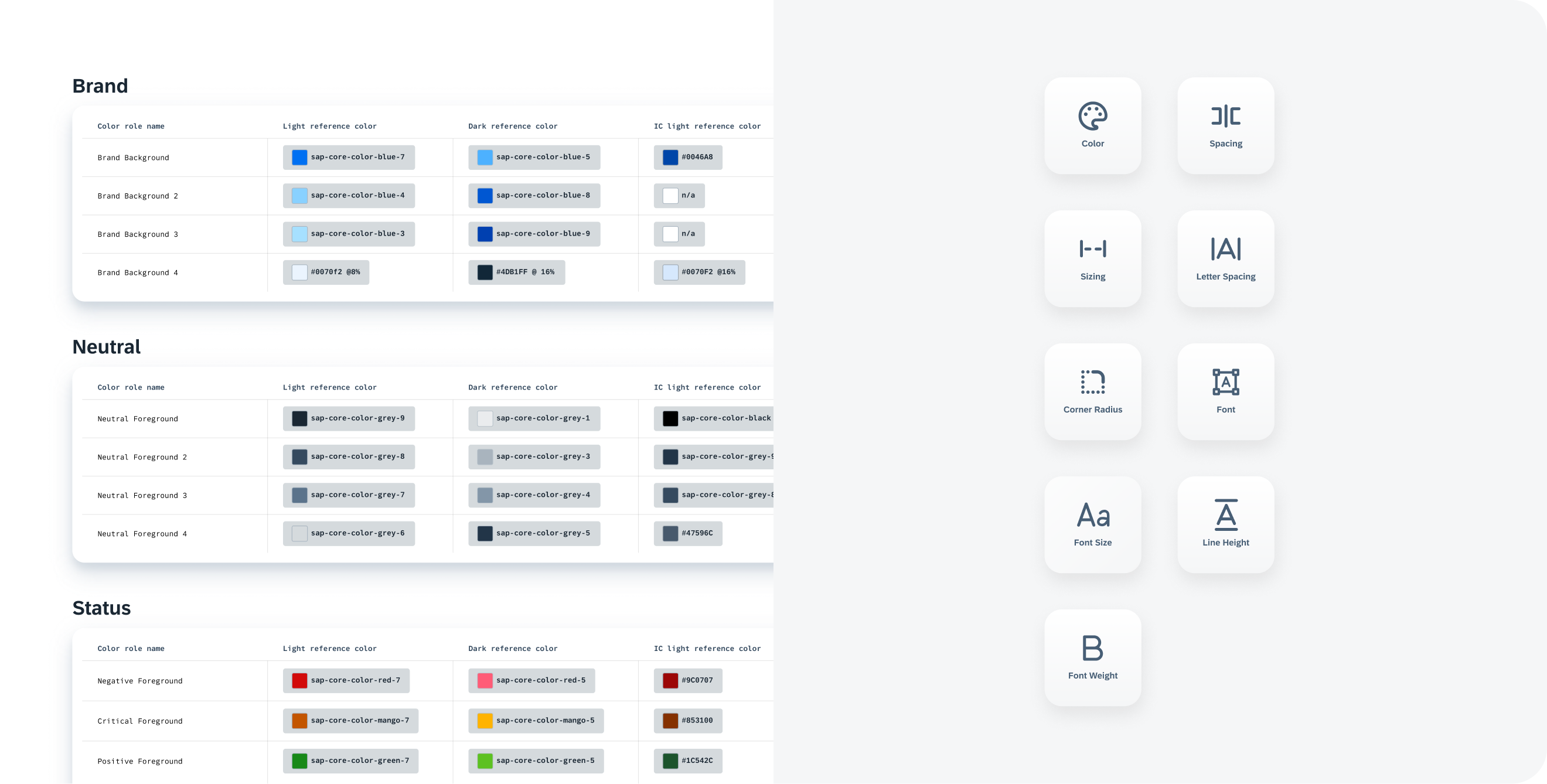
Token groups (left) with Token types (right)
Design tokens are our new cross-platform solution to managing color across iOS and Android. Design tokens are stored pieces of UI information such as color, spacing, sizing, and typography that collectively make up our design system’s visual identity. Additionally, design tokens help to maintain visual consistency, scale design decisions, and are simple to maintain and update.
See Design Tokens to find out more.
Filter Feedback Bar
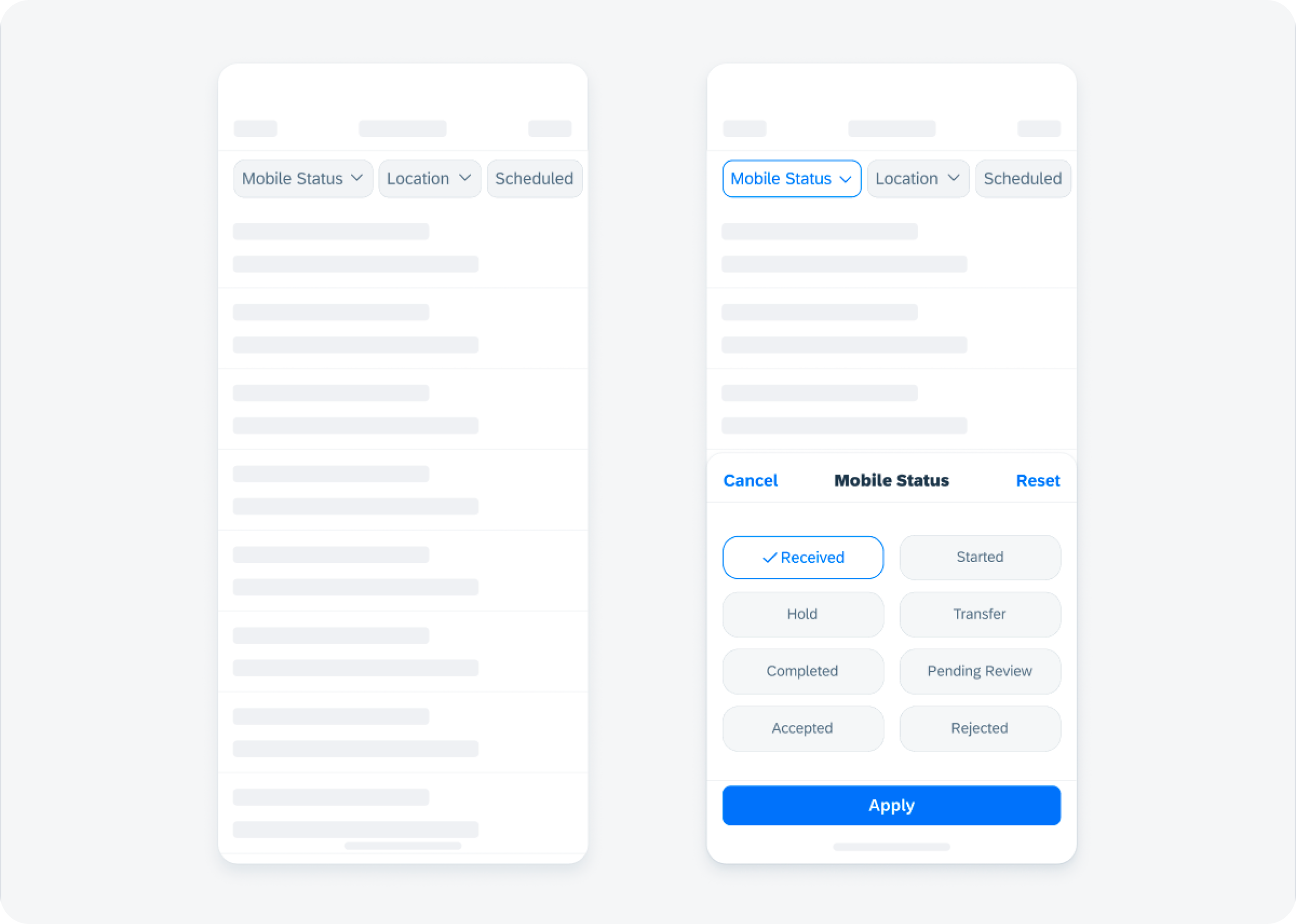
Filter feedback bar example
The filter feedback bar is a horizontal bar that appears above a list of content. The Filter buttons now come with more style variations and a modal sheet in case more complex filters are applied using the filter feedback bar.
Refer to Filter Feedback Bar for more details.
Illustrated Message

Illustrated message on compact (left) and regular (right)
The illustrated message is a new type of feedback component that helps to inform users about various system states and suggests actions they can take to resolve an issue.
Check out the Illustrated Message guideline article.
Inline Validation

Example of multiline hint text (left) and success and warning messages (right)
Inline validation provides static information to a user or provides temporary feedback in response to a user’s input and is commonly used with form cell in forms.
Inline success messages and warning messages are now available in addition to error messages. Hint text is also enhanced for multiline messages.
See Inline Validation to learn more about this pattern.
Key Value Table View Cell

Key value table view cell examples
The new key value table view cell component is an uneditable read-only table view cell that fits inside the table view container. It may also contain actionable text in certain use cases.
For more information, check out the Key Value Table View Cell article in the SAP Fiori for iOS guidelines.
Skeleton Loading
Skeleton loading examples
Skeleton loading is a new progress indicator that is used when a screen or part of a screen is loading. It is best used when the structure and layout of a container are known, such as a page or card, and the system requires time to fetch and display the actual data.
See Skeleton Loading for more information.
Resources
Mobile Design Guidelines

SAP Fiori Mobile Design Guidelines for Android and iOS
A detailed documentation on component anatomy, behavior, and interactions allows you to use components that match your use case. Crosslinks to Google’s Material Design Guidelines for Android and Apple’s Human Interface Guidelines for iOS, as well as links to development documentation, help you navigate to these resources. Additionally, you can find a feedback function on each guideline article that allows you to provide feedback.
SAP Fiori for Android Design Guidelines | SAP Fiori for iOS Design Guidelines
Figma UI Design Kits

Figma UI Design Kit
With the updated SAP Fiori for Android and iOS Figma UI design kits, it’s now easier than ever to use the latest components and patterns in your mobile design. By using the design kits, you can quickly create a consistent user experience that enables app implementations at scale.
SAP Fiori for Android 7.0 UI Design Kits | SAP Fiori for iOS 9.2 UI Design Kits
SAP Fiori Mentor App
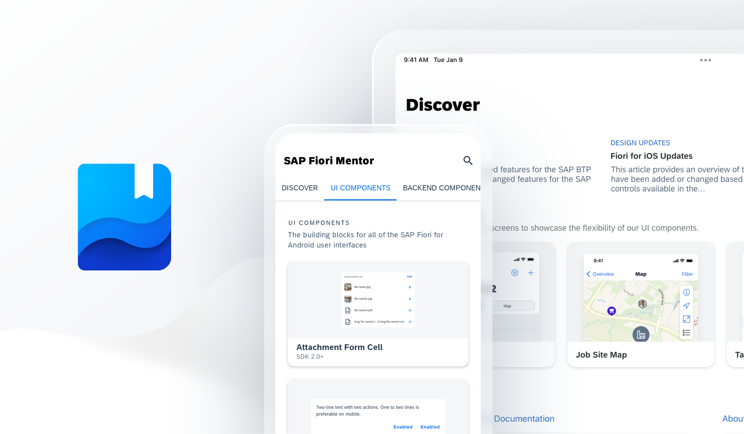
SAP Fiori Mentor App for Android and iOS
The SAP Fiori Mentor app is an interactive playground that allows you to explore the flexibility of mobile components and patterns available through the SAP BTP SDKs for Android and iOS. By adjusting component settings within the app, the behavior, interaction, and features of components can be previewed live. If you’re a developer, you can export code samples with predefined settings into your preferred development tool. If you’re a designer, you can easily understand the scope of functionality for a specific component and specify your designs with applicable parameters, and hand over the respective code snippets to your development partners. To provide some tangible examples of the actual UI component usage in apps, the best practices section provides a selection of app design examples. By highlighting specific areas, each app design indicates which UI components are used, so you can deep dive into their additional features.
Apple App Store | Google Play Store
Software Development Kits

SAP BTP SDKs for Android and iOS
The SAP BTP SDK for iOS and SAP BTP SDK for Android include the SAP Fiori framework that contains user interface components. These frameworks are standalone and do not have a dependency on other parts of the SDK. These libraries make it easier to create applications that conform to the SAP Fiori design language. On iOS, the SAP BTP SDK offers “SAP Fiori framework“ and the “Fiori” controls extend Apple’s UIKit/SwiftUI. These controls can be used programmatically or through storyboard files. On Android, the SAP BTP SDK UI components are contained in the “Fiori” library and extend Material Design controls.
SAP BTP SDK for iOS | SAP BTP SDK for Android
Experience matters. Follow our journey as we transform the way we build products for enterprise on www.sap.com/design.
- SAP Managed Tags:
- SAP Fiori,
- SAP BTP SDK for Android,
- SAP BTP SDK for iOS,
- SAP Mobile Platform SDK,
- Mobile,
- User Experience
Labels:
You must be a registered user to add a comment. If you've already registered, sign in. Otherwise, register and sign in.
Labels in this area
-
ABAP CDS Views - CDC (Change Data Capture)
2 -
AI
1 -
Analyze Workload Data
1 -
BTP
1 -
Business and IT Integration
2 -
Business application stu
1 -
Business Technology Platform
1 -
Business Trends
1,658 -
Business Trends
93 -
CAP
1 -
cf
1 -
Cloud Foundry
1 -
Confluent
1 -
Customer COE Basics and Fundamentals
1 -
Customer COE Latest and Greatest
3 -
Customer Data Browser app
1 -
Data Analysis Tool
1 -
data migration
1 -
data transfer
1 -
Datasphere
2 -
Event Information
1,400 -
Event Information
67 -
Expert
1 -
Expert Insights
177 -
Expert Insights
301 -
General
1 -
Google cloud
1 -
Google Next'24
1 -
GraphQL
1 -
Kafka
1 -
Life at SAP
780 -
Life at SAP
13 -
Migrate your Data App
1 -
MTA
1 -
Network Performance Analysis
1 -
NodeJS
1 -
PDF
1 -
POC
1 -
Product Updates
4,577 -
Product Updates
346 -
Replication Flow
1 -
REST API
1 -
RisewithSAP
1 -
SAP BTP
1 -
SAP BTP Cloud Foundry
1 -
SAP Cloud ALM
1 -
SAP Cloud Application Programming Model
1 -
SAP Datasphere
2 -
SAP S4HANA Cloud
1 -
SAP S4HANA Migration Cockpit
1 -
Technology Updates
6,873 -
Technology Updates
429 -
Workload Fluctuations
1
Related Content
- Consuming SAP with SAP Build Apps - Mobile Apps for iOS and Android in Technology Blogs by SAP
- Recap - SAP ALM at SAP Insider Las Vegas 2024 in Technology Blogs by SAP
- Gamifying SAP C4C with BTP, the Flutter or Build Apps way. in Technology Blogs by SAP
- Linear programming in ABAP. Simplex method. Find optimised BOM in Technology Blogs by Members
- Digital Twins of an Organization: why worth it and why now in Technology Blogs by SAP
Top kudoed authors
| User | Count |
|---|---|
| 34 | |
| 17 | |
| 15 | |
| 14 | |
| 11 | |
| 9 | |
| 8 | |
| 8 | |
| 8 | |
| 7 |