
- SAP Community
- Products and Technology
- Technology
- Technology Blogs by SAP
- Welcome to the dark side of Analytics - Enabling D...
Technology Blogs by SAP
Learn how to extend and personalize SAP applications. Follow the SAP technology blog for insights into SAP BTP, ABAP, SAP Analytics Cloud, SAP HANA, and more.
Turn on suggestions
Auto-suggest helps you quickly narrow down your search results by suggesting possible matches as you type.
Showing results for
Employee
Options
- Subscribe to RSS Feed
- Mark as New
- Mark as Read
- Bookmark
- Subscribe
- Printer Friendly Page
- Report Inappropriate Content
02-04-2021
2:16 PM
First, I’d like to thank my mentor and supervisor sarah.detzler and florian.decker for their help and advice.
At the coffee corner on a Monday morning, 8:30 am. “Oh man, 2020 has been such a great year! Can’t wait for what 2021 has to offer”. In disbelief you stare at the enthusiastic face of your colleague, your body shaking, either caused by your colleague's words or from coffee withdrawal. You stay expressionless as you try to sip on your coffee, without making it too obvious, that you’d rather be somewhere else right now. No eye contact, otherwise, he might lure me into a small talk, you think to yourself. “Yeah uh… I can’t even imagine…” you mutter under your breath, as you turn your back on your co-worker, trying to casually, yet swiftly, walk away from that guy. No sane person would be able to utter such words. Little did you know that this allegedly weird colleague is a massive SAP Analytics Cloud fan and is talking about all the new features and enhancements that came to Analytics Cloud in 2020! Indeed, weird colleague, 2020 wasn’t so bad after all!
One of the latest features coming to SAP Analytics Cloud - Analytics Designer was the ability to define multiple Cascading Style Sheets (CSS) either per widget or as a global default.
Now, some of you guys might think “That’s nice and all, I guess…But why would I need that?”. Well, let me introduce you to Brian. Brian is a Sales Analyst, who has to work with dashboards fairly regularly. Naturally, Brian really likes dashboards, since they make his life easier. They’re also nice to look at. Sometimes, during long working hours, Brian likes to take a look at some of his dashboards. His office is dimly lit, almost dark. He opens up a dashboard, which in normal daylight looks perfectly fine. In the dark though, it casts its white background into the abyss that is Brian’s office, like a flashlight shining straight into his face. As if the protagonist of the latest toothpaste commercial is smiling directly at him, blending him with his/her Hollywood smile. Brian’s eyes hurt. Also, he’s thinking to himself, that his last dentist appointment has been a while.
How nice would it be, to switch between a lighter theme and a dark theme on a whim?!
Well, I’ve got good and bad news for you Brian: The bad news: You probably should make an appointment with your dentist, dental care is no joke.
The good news is: SAP Analytics Cloud – Analytics Designer can help save your eyes!
It is also important to note, that this is just one example on how to leverage this feature. Another way of looking at this, would be to further enhance the accessibility of SAP Analytics Cloud, like changing the colors to a more colorblind friendly theme. Additionally, it can help with screen fatigue. A darker screen is usually preferred by some, as it is easier on the eyes (don’t quote me on that though, I’m not a doctor and this is not a medical advice).
In this blog post I will quickly show you, how to implement a switch to your application to easily switch from your light theme, to a darker theme, using the switch widget.
Generally, you can change a whole lot of your widget’s appearance using CSS, although not everything is supported yet. However, rest assured, that this feature is continuously expanding its functionality.
Looking back at the topic of this blog post, the end product should act like this:
First, you’ll need a SAP Analytics Cloud Analytical Application, which is indicated by these two little puzzle pieces. Preferably, you could just look at the type description on the right-hand side. Looking for puzzle pieces is more fun though.
Your application might look something like this:
First, I will have to break some bad news though: I won’t cover how to build an Analytics Designer application in this tutorial, we will build on an existing application. If you’re not familiar with the Analytics Designer and analytical applications, first off: What have you been doing this whole time?
No worries though, I got you covered! You can watch this video to get started. Preferably, you could also read my previous blog post, where I explain the first steps of creating an application within SAP Analytics Cloud. Shameless plug, I know.
Now that we’ve covered the ground rules, let’s edit our dashboard! One way to go to the editor mode, is to hover at the top of the screen with your mouse until this small banner appears. Click on the pencil icon and it will jump right to the editing mode! They are a ton of ways to go to the edit mode. Like the famous saying goes “All roads lead to Editing Mode” or something along those lines. This is just one of them, if you start with an already running application.
Quick recap on how the SAP Analytics Cloud – Analytics Designer IDE (Integrated Development Environment. Could be useful for your next crossword puzzle) is structured. On the left-hand side, is the layout overview, where you’ll find all the widgets, that are on your canvas (basically your dashboard) and some scripting stuff, which we won’t really focus on this time. At the top, you’ll find a banner, where you find some helpful tools to design your dashboard, like adding new widget to your canvas.
The most frequent widgets, like a chart or table, are separated from the other widgets. To get to our desired widgets, we’ll have to click on the “+”- sign. Now, all available widgets should appear. First, we’d like a simple text widget. The sole purpose of the text is to indicate our users, that there is a switch, which triggers an event when clicked on.
Select the text widget and change the displayed text to something meaningful…like “your life”… or just “Dark Mode”, whatever floats your boat. For the sake of this tutorial, we’re keeping “Dark Mode”.
Next up, we’ll add the switch widget. The switch (not to be confused with the Nintendo Switch™) will be our hidden champion of this tutorial. Again, we’ll have to click on the “+”-symbol but this time, we’ll have to go to “More Widgets” and then select the switch widget. I guess, the switch is not frequently used. Let’s show some love, so the switch feels like it belongs!
We can go ahead and rename our switch to something more fitting. Like “Light_Switch”.
Place the widget somewhere near our text:
You with your eagle eyes probably already noticed, that the default state of the widget is “On”. However, that’s not how we’d want it. When we start the application, we’d want the state of the switch to be “Off” and activate it, when we please. In order to change the default state of our switch, we take a look at the “Builder” tab, which we can access through the “Designer” button:
In there, we’ll find the option “State”, which by default is set on “On”. Go ahead and change it to “Off”:
If we check our canvas, we can see, that the switch is now “Off”.
Alright, I can already hear you shouting at your screen “Hold up a minute! I was promised to learn how to leverage the new CSS feature!”. Hold your horses, people. First, let us save our progress.
Okay, let’s put you guys out of your misery and check out how to apply CSS to your application.
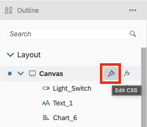
If you hover over the “Canvas” section on the left-hand layout panel, you’ll see a brush icon appear. This is where you can declare all the CSS classes.
Now let us put on our best Bob Ross wig and paint some happy little trees on our canvas! (Not really trees, but you catch my drift).
After clicking on the brush symbol, we’re greeted with this:
At first glance, this layout might look a bit off to you but upon further investigation, this is actually quite helpful. At the top, you’ll see a dropdown menu. With this dropdown, you can select every widget, you want to change the appearance with, and it will show you all predefined class names available for this widget. Basically, a cheat sheet. And everybody loves cheat sheets, am I right?
Now, let us take a tiny look into the future and see what our endgame with the actual scripting will be:
As you can see, the Analytics Designer API (Application Programming Interface, another word for your crosswords puzzle) provides us with the function “setCssClass()”. We feed this function with the class name; we will define inside our CSS script.
Seeing the final scripting should help with getting the point across and makes it easier to understand the following part.
Now, let us get back to the CSS script. First, we want to get a blackish background. As you might have already seen (or rather not seen), there is no “canvas” object inside the dropdown menu for our available objects. I guess our little journey finds an early ending, right? Wrong! There is a general way to apply some CSS scripting. However, let’s first take a look on how we’ll approach the scripting.
First, we define the class name, which we will eventually feed to our setCssClass() function. It is done using following syntax: “.ClassName” (you can name it how you want) followed with those little squiggly brackets. Inside those squiggly brackets (a more professional name would probably be curly brackets, but where’s the fun in that) we define the properties, we want to change.
The end product will look something like this:
You can choose the color coding the way you want. Now, we can go over all the widget types on our canvas (like charts, tables and so on) and define their new look. In order to do so, I’ll use the provided cheat sheet. Select the widget you want to change the appearance of (e.g., chart) and look through the available methods. The method’s name implies what property of the widget it will change. For example, I chose “.sap-custom-chart-title”, which will change the appearance of the chart title. Fortunately, the cheat sheet also provides us with a description.
This is how it should like now:
Now you can go through all methods and see, what you’d like to change. Here are the one, I used for my application:
Obviously, just the CSS script is no use to us, is it? We want to see our changes in action! Let’s shift our focus back to our switch widget. In the next step, we will apply the needed script to our switch. Head back to the Layout overview, hover over the switch widget and click on the appearing “fx” symbol.
The concept of a light switch (or a light bulb) dates all the way back to the 19th century, a truly revolutionary invention that changed many lives and would guarantee you a spot in the history books. Nowadays, implementing something like this, won’t get you anything. Maybe a shoulder pet and an uplifting “Good job!” but that doesn’t put food on the table now, does it? That won’t stop us though, maybe it will change at least on person’s life!
So, the basic concept is, if the switch is turned on, do something, if it’s off, don’t do something.
The following script is the basic structure of our light switch.
If the switch is turned on, we will apply the CSS classes we previously defined. However, we don’t have to define a CSS class for every single widget. Some widgets come with a pre-defined function, called “.setStyle()”, where we can directly change the styling of the widget. The syntax is the same as with the CSS classes, meaning we define the properties inside the squiggly brackets.
To check, whether an application provides the needed API, one can always check the API Reference provided by SAP Help page.
The coding of our light switch should look something like this:
Basically, if the switch is activated, we apply all our changes, and revert them, when the switch is deactivated.
We apply our CSS class to every widget. Of course, there probably is a way to code this more efficiently, but for the sake of this short tutorial, this gets the point across.
Finally, we can run our application and taste the fruits of our hard work! If you turn on the switch, you should be greeted with this:
Thank you for bearing with me and reading this tutorial, I hope you enjoyed it and that it provided you with some inspiration to try out the CSS feature by yourself. Adding to this, maybe it also gives you some ideas to further enhance your applications with some niche widgets, like the switch, to make your application that more interactive.
For a general information about CSS in SAP Analytics Cloud, you guys can check out this Blog Post by Aleksey Salinin.
If you want to find out more about SAP Analytics Cloud - Analytics Designer you can get a great overview on the SAP Hana Journey website, or you could join the Analytics Designer Community, where you can find useful resources, tutorials and other awesome blog posts.
At the coffee corner on a Monday morning, 8:30 am. “Oh man, 2020 has been such a great year! Can’t wait for what 2021 has to offer”. In disbelief you stare at the enthusiastic face of your colleague, your body shaking, either caused by your colleague's words or from coffee withdrawal. You stay expressionless as you try to sip on your coffee, without making it too obvious, that you’d rather be somewhere else right now. No eye contact, otherwise, he might lure me into a small talk, you think to yourself. “Yeah uh… I can’t even imagine…” you mutter under your breath, as you turn your back on your co-worker, trying to casually, yet swiftly, walk away from that guy. No sane person would be able to utter such words. Little did you know that this allegedly weird colleague is a massive SAP Analytics Cloud fan and is talking about all the new features and enhancements that came to Analytics Cloud in 2020! Indeed, weird colleague, 2020 wasn’t so bad after all!
One of the latest features coming to SAP Analytics Cloud - Analytics Designer was the ability to define multiple Cascading Style Sheets (CSS) either per widget or as a global default.
Now, some of you guys might think “That’s nice and all, I guess…But why would I need that?”. Well, let me introduce you to Brian. Brian is a Sales Analyst, who has to work with dashboards fairly regularly. Naturally, Brian really likes dashboards, since they make his life easier. They’re also nice to look at. Sometimes, during long working hours, Brian likes to take a look at some of his dashboards. His office is dimly lit, almost dark. He opens up a dashboard, which in normal daylight looks perfectly fine. In the dark though, it casts its white background into the abyss that is Brian’s office, like a flashlight shining straight into his face. As if the protagonist of the latest toothpaste commercial is smiling directly at him, blending him with his/her Hollywood smile. Brian’s eyes hurt. Also, he’s thinking to himself, that his last dentist appointment has been a while.
How nice would it be, to switch between a lighter theme and a dark theme on a whim?!
Well, I’ve got good and bad news for you Brian: The bad news: You probably should make an appointment with your dentist, dental care is no joke.
The good news is: SAP Analytics Cloud – Analytics Designer can help save your eyes!
It is also important to note, that this is just one example on how to leverage this feature. Another way of looking at this, would be to further enhance the accessibility of SAP Analytics Cloud, like changing the colors to a more colorblind friendly theme. Additionally, it can help with screen fatigue. A darker screen is usually preferred by some, as it is easier on the eyes (don’t quote me on that though, I’m not a doctor and this is not a medical advice).
In this blog post I will quickly show you, how to implement a switch to your application to easily switch from your light theme, to a darker theme, using the switch widget.
Generally, you can change a whole lot of your widget’s appearance using CSS, although not everything is supported yet. However, rest assured, that this feature is continuously expanding its functionality.
Looking back at the topic of this blog post, the end product should act like this:
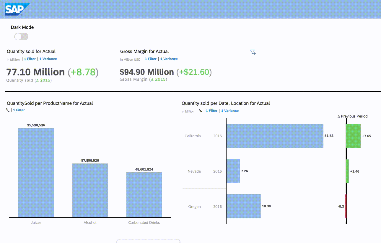
First, you’ll need a SAP Analytics Cloud Analytical Application, which is indicated by these two little puzzle pieces. Preferably, you could just look at the type description on the right-hand side. Looking for puzzle pieces is more fun though.

Your application might look something like this:

First, I will have to break some bad news though: I won’t cover how to build an Analytics Designer application in this tutorial, we will build on an existing application. If you’re not familiar with the Analytics Designer and analytical applications, first off: What have you been doing this whole time?
No worries though, I got you covered! You can watch this video to get started. Preferably, you could also read my previous blog post, where I explain the first steps of creating an application within SAP Analytics Cloud. Shameless plug, I know.
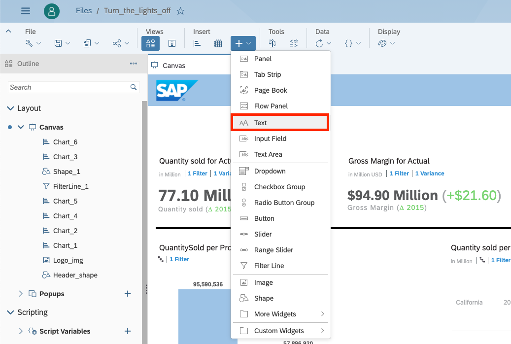
Now that we’ve covered the ground rules, let’s edit our dashboard! One way to go to the editor mode, is to hover at the top of the screen with your mouse until this small banner appears. Click on the pencil icon and it will jump right to the editing mode! They are a ton of ways to go to the edit mode. Like the famous saying goes “All roads lead to Editing Mode” or something along those lines. This is just one of them, if you start with an already running application.

Quick recap on how the SAP Analytics Cloud – Analytics Designer IDE (Integrated Development Environment. Could be useful for your next crossword puzzle) is structured. On the left-hand side, is the layout overview, where you’ll find all the widgets, that are on your canvas (basically your dashboard) and some scripting stuff, which we won’t really focus on this time. At the top, you’ll find a banner, where you find some helpful tools to design your dashboard, like adding new widget to your canvas.
The most frequent widgets, like a chart or table, are separated from the other widgets. To get to our desired widgets, we’ll have to click on the “+”- sign. Now, all available widgets should appear. First, we’d like a simple text widget. The sole purpose of the text is to indicate our users, that there is a switch, which triggers an event when clicked on.
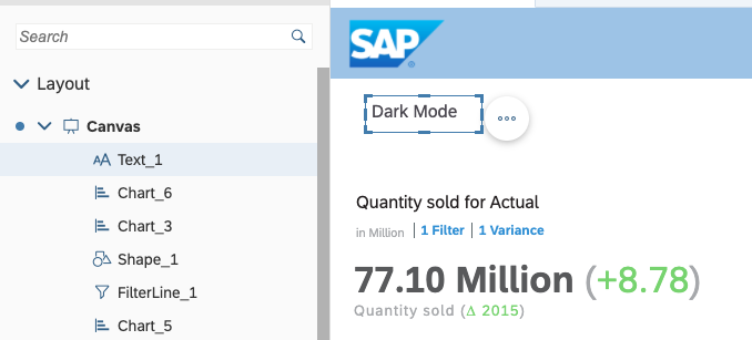
Select the text widget and change the displayed text to something meaningful…like “your life”… or just “Dark Mode”, whatever floats your boat. For the sake of this tutorial, we’re keeping “Dark Mode”.
Next up, we’ll add the switch widget. The switch (not to be confused with the Nintendo Switch™) will be our hidden champion of this tutorial. Again, we’ll have to click on the “+”-symbol but this time, we’ll have to go to “More Widgets” and then select the switch widget. I guess, the switch is not frequently used. Let’s show some love, so the switch feels like it belongs!

We can go ahead and rename our switch to something more fitting. Like “Light_Switch”.

Place the widget somewhere near our text:

You with your eagle eyes probably already noticed, that the default state of the widget is “On”. However, that’s not how we’d want it. When we start the application, we’d want the state of the switch to be “Off” and activate it, when we please. In order to change the default state of our switch, we take a look at the “Builder” tab, which we can access through the “Designer” button:

In there, we’ll find the option “State”, which by default is set on “On”. Go ahead and change it to “Off”:

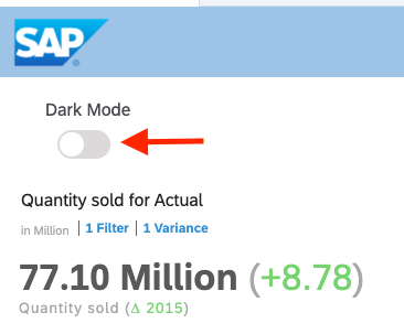
If we check our canvas, we can see, that the switch is now “Off”.
Alright, I can already hear you shouting at your screen “Hold up a minute! I was promised to learn how to leverage the new CSS feature!”. Hold your horses, people. First, let us save our progress.
Okay, let’s put you guys out of your misery and check out how to apply CSS to your application.
If you hover over the “Canvas” section on the left-hand layout panel, you’ll see a brush icon appear. This is where you can declare all the CSS classes.
Now let us put on our best Bob Ross wig and paint some happy little trees on our canvas! (Not really trees, but you catch my drift).
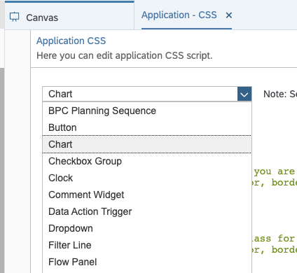
After clicking on the brush symbol, we’re greeted with this:

At first glance, this layout might look a bit off to you but upon further investigation, this is actually quite helpful. At the top, you’ll see a dropdown menu. With this dropdown, you can select every widget, you want to change the appearance with, and it will show you all predefined class names available for this widget. Basically, a cheat sheet. And everybody loves cheat sheets, am I right?
Now, let us take a tiny look into the future and see what our endgame with the actual scripting will be:
Chart_1.setCssClass("chart");As you can see, the Analytics Designer API (Application Programming Interface, another word for your crosswords puzzle) provides us with the function “setCssClass()”. We feed this function with the class name; we will define inside our CSS script.
Seeing the final scripting should help with getting the point across and makes it easier to understand the following part.
Now, let us get back to the CSS script. First, we want to get a blackish background. As you might have already seen (or rather not seen), there is no “canvas” object inside the dropdown menu for our available objects. I guess our little journey finds an early ending, right? Wrong! There is a general way to apply some CSS scripting. However, let’s first take a look on how we’ll approach the scripting.
First, we define the class name, which we will eventually feed to our setCssClass() function. It is done using following syntax: “.ClassName” (you can name it how you want) followed with those little squiggly brackets. Inside those squiggly brackets (a more professional name would probably be curly brackets, but where’s the fun in that) we define the properties, we want to change.

The end product will look something like this:
.canvas {


    background-color: #4d4d4f;


}
You can choose the color coding the way you want. Now, we can go over all the widget types on our canvas (like charts, tables and so on) and define their new look. In order to do so, I’ll use the provided cheat sheet. Select the widget you want to change the appearance of (e.g., chart) and look through the available methods. The method’s name implies what property of the widget it will change. For example, I chose “.sap-custom-chart-title”, which will change the appearance of the chart title. Fortunately, the cheat sheet also provides us with a description.
This is how it should like now:

Now you can go through all methods and see, what you’d like to change. Here are the one, I used for my application:
.chart .sap-custom-chart-title {


	color:white;

}


.chart .sap-custom-chart-legend{


	fill: white;

}


.chart .sap-custom-chart-data-labels{


	fill: white;

}


.chart .sap-custom-chart-color-axis-label{


	fill: white;

}


.chart .sap-custom-number-chart-primary-values{


	color: white;

}


.chart .sap-custom-chart-value-axis-label{


	fill:white;

}


.chart .sap-custom-chart-category-axis-sublabel{


	fill:white;

}


.chart .sap-custom-chart-value-axis-label-2{


	fill:white;

}


.chart .sap-custom-number-chart-primary-labels{


	color:white

}


.chart .sap-custom-number-chart-secondary-labels{


	color:white

}


.chart .sap-custom-number-chart-secondary-values{


	color:white

}


.chart .sap-custom-chart-category-axis-title{


	fill:white;

}


.chart .sap-custom-chart-value-axis-title{


	fill:white;

}
Obviously, just the CSS script is no use to us, is it? We want to see our changes in action! Let’s shift our focus back to our switch widget. In the next step, we will apply the needed script to our switch. Head back to the Layout overview, hover over the switch widget and click on the appearing “fx” symbol.

The concept of a light switch (or a light bulb) dates all the way back to the 19th century, a truly revolutionary invention that changed many lives and would guarantee you a spot in the history books. Nowadays, implementing something like this, won’t get you anything. Maybe a shoulder pet and an uplifting “Good job!” but that doesn’t put food on the table now, does it? That won’t stop us though, maybe it will change at least on person’s life!
So, the basic concept is, if the switch is turned on, do something, if it’s off, don’t do something.
The following script is the basic structure of our light switch.
if(Light_Switch.isOn() === true) {


} else {


}
If the switch is turned on, we will apply the CSS classes we previously defined. However, we don’t have to define a CSS class for every single widget. Some widgets come with a pre-defined function, called “.setStyle()”, where we can directly change the styling of the widget. The syntax is the same as with the CSS classes, meaning we define the properties inside the squiggly brackets.
To check, whether an application provides the needed API, one can always check the API Reference provided by SAP Help page.
The coding of our light switch should look something like this:
if(Light_Switch.isOn() === true) {


	//set header color to black


	Header_shape.setStyle({


		fillColor:"#23242A"


	});


	//set "Dark Mode" text to white

	Text_1.setStyle({


		color:"white"


	});


	//set separation line to white

	Separation_line.setStyle({


		lineColor:"white"


	});


	//use our defined CSS Classes


	//set the application background to black

	Application.setCssClass("canvas");


	//apply css class to our desired charts

	Chart_1.setCssClass("chart");

	Chart_2.setCssClass("chart");

	Chart_3.setCssClass("chart");

	Chart_4.setCssClass("chart");

	Chart_5.setCssClass("chart");

	Chart_6.setCssClass("chart");


} else {


	//set the color back

	Header_shape.setStyle({


		fillColor: "#9dc3e6"

	});


	Text_1.setStyle({


		color:"black"

	});


	Separation_line.setStyle({


		lineColor:"black"

	});


	//Reset all styling

	Application.setCssClass("");

	Chart_1.setCssClass("");

	Chart_2.setCssClass("");

	Chart_3.setCssClass("");

	Chart_4.setCssClass("");

	Chart_5.setCssClass("");

	Chart_6.setCssClass("");


}
Basically, if the switch is activated, we apply all our changes, and revert them, when the switch is deactivated.
We apply our CSS class to every widget. Of course, there probably is a way to code this more efficiently, but for the sake of this short tutorial, this gets the point across.
Finally, we can run our application and taste the fruits of our hard work! If you turn on the switch, you should be greeted with this:

Thank you for bearing with me and reading this tutorial, I hope you enjoyed it and that it provided you with some inspiration to try out the CSS feature by yourself. Adding to this, maybe it also gives you some ideas to further enhance your applications with some niche widgets, like the switch, to make your application that more interactive.
For a general information about CSS in SAP Analytics Cloud, you guys can check out this Blog Post by Aleksey Salinin.
If you want to find out more about SAP Analytics Cloud - Analytics Designer you can get a great overview on the SAP Hana Journey website, or you could join the Analytics Designer Community, where you can find useful resources, tutorials and other awesome blog posts.
- SAP Managed Tags:
- Data and Analytics,
- SAP Analytics Cloud, analytics designer
Labels:
6 Comments
You must be a registered user to add a comment. If you've already registered, sign in. Otherwise, register and sign in.
Labels in this area
-
ABAP CDS Views - CDC (Change Data Capture)
2 -
AI
1 -
Analyze Workload Data
1 -
BTP
1 -
Business and IT Integration
2 -
Business application stu
1 -
Business Technology Platform
1 -
Business Trends
1,658 -
Business Trends
111 -
CAP
1 -
cf
1 -
Cloud Foundry
1 -
Confluent
1 -
Customer COE Basics and Fundamentals
1 -
Customer COE Latest and Greatest
3 -
Customer Data Browser app
1 -
Data Analysis Tool
1 -
data migration
1 -
data transfer
1 -
Datasphere
2 -
Event Information
1,400 -
Event Information
74 -
Expert
1 -
Expert Insights
177 -
Expert Insights
348 -
General
1 -
Google cloud
1 -
Google Next'24
1 -
GraphQL
1 -
Kafka
1 -
Life at SAP
780 -
Life at SAP
14 -
Migrate your Data App
1 -
MTA
1 -
Network Performance Analysis
1 -
NodeJS
1 -
PDF
1 -
POC
1 -
Product Updates
4,575 -
Product Updates
392 -
Replication Flow
1 -
REST API
1 -
RisewithSAP
1 -
SAP BTP
1 -
SAP BTP Cloud Foundry
1 -
SAP Cloud ALM
1 -
SAP Cloud Application Programming Model
1 -
SAP Datasphere
2 -
SAP S4HANA Cloud
1 -
SAP S4HANA Migration Cockpit
1 -
Technology Updates
6,871 -
Technology Updates
483 -
Workload Fluctuations
1
Related Content
- Embracing Sustainability using the SAP Enterprise Architecture Framework in Technology Blogs by Members
- Unleashing the Power of Custom Widgets in SAP Analytics Cloud in Technology Blogs by Members
- SAP Analytics Cloud Private Options - Memory impact on Performance in Technology Q&A
- SAP Analytics Cloud - Planning using Validation Models in Technology Blogs by SAP
- Watch the SAP BW Modernization Webinar Series in Technology Blogs by SAP
Top kudoed authors
| User | Count |
|---|---|
| 15 | |
| 11 | |
| 10 | |
| 9 | |
| 8 | |
| 8 | |
| 7 | |
| 7 | |
| 7 | |
| 7 |