
- SAP Community
- Products and Technology
- Technology
- Technology Blogs by SAP
- Hands-On Tutorial Enhancing your run-of-the-mill b...
Technology Blogs by SAP
Learn how to extend and personalize SAP applications. Follow the SAP technology blog for insights into SAP BTP, ABAP, SAP Analytics Cloud, SAP HANA, and more.
Turn on suggestions
Auto-suggest helps you quickly narrow down your search results by suggesting possible matches as you type.
Showing results for
Employee
Options
- Subscribe to RSS Feed
- Mark as New
- Mark as Read
- Bookmark
- Subscribe
- Printer Friendly Page
- Report Inappropriate Content
03-21-2020
1:10 AM
First, I want to thank my mentor and supervisor sarah.detzler for her help and advise!
As we all know, SAP Analytics Cloud is the strategic analytics tool for all SAP Business Applications. We won’t focus on SAP Analytics Cloud (SAC) per se but rather on a fairly new key component of SAC: SAC Analytics Design.
The SAC is built on 4 Pillars:
We will lay our eyes on the fourth pillar, Analytics Design (formerly known as Application Design). What’s Analytics Design you ask? Well, it’s easy! With Analytics Designer, you can create analytical applications for data analysis to meet sophisticated business requirements. With added scripting capabilities, a world of added flexibility is revealed to the Application Designer, providing, next to the Stories, a new layer for creating outstanding applications to wow your audience with.
Now you might ask “But I’m already using Stories, what benefits does Analytics Design offer over my comfortable Stories?” Well, let me paint you a picture:
With SAP Analytical Cloud Stories, it is a little like a guided tour, through a beautiful scenery. You will have fun, see a lot of nice things around you, but ultimately you are safe. Nothing can happen, the road is laid out in front of you, you just have to use it.
However, Analytics Design is different. This is like an arctic expedition. You have your tools on you, but you have to find the way for yourself. There is no right or wrong, the possibilities are endless. It is more dangerous but at the same time more rewarding, when you achieve your goals.
This is the feeling, that SAC Analytics Design conveys: Hard work, but the results speak for themselves.
In this blog post, I will show you how to design a bar chart. “A simple bar chart?” you might be asking yourself. Well, since most SAC users start out with a bar chart anyways, why shouldn’t we as well? Before you stop reading and contemplate about your poor life choices, leading you to read this post:
Since we are using SAC Analytics Designer, we won’t stop at a simple bar chart. With a little bit of scripting, our bar chart will be able to calculate and display the differences of measures between each bar and will eventually look something like this:

To remain in the established allegory of an arctic expedition: Every expedition starts at base camp, so naturally we will start out with a simple bar chart and make our way gradually from there.
The data, which I used for this post can be downloaded here.
Let’s get started. First, you need to log into your SAP Analytics Cloud tenant. Instead of a story, we will create an Analytical Application. To do so, you’ll have to click on the burger menu symbol on the left-hand side, then click on “Create” and afterwards on “Analytical Application”.

In the next step, you will be greeted with an empty canvas, just like this one:

Here, you’ll notice the first difference, between an analytical application and a story. On the left-hand side, you have different options, like “Canvas” and a bunch of scripting functionalities, such as “Script Variables”.
Let’s clear up some lingo, which you’ll be reading throughout this blog post. First, the canvas. The canvas is…well, your canvas. Just like painting a picture, you’ll need a canvas to draw on. The same is happening here, you drag and drop your widgets to your liking on this empty canvas. Wait, what are widgets? Widgets are your charts, tables and so on. Place them wherever you like on your canvas. As I’m sure one person once said “A blank canvas has unlimited possibilities”.
Do you guys also feel a little anxious? Like something is missing? That’s right, we forgot to safe our progress. Let’s go ahead and do that. In a similar fashion as in stories, you safe your application by clicking on the floppy disc (for the younger readers, a floppy disc is a storage medium from ancient times), which is located beneath the “File” – tab strip, as shown on the picture below:

Right after, you’ll promptly be asked, to name your application (for finding purposes) and you can add a little description too, if you feel like it.

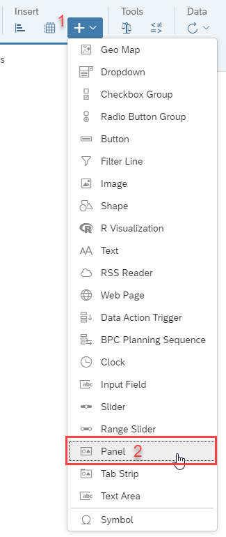
Alright, it’s time to get our hands dirty. The basic functionality of Analytics Design is, that you can add widgets like Charts and Tables, which we already know from stories, but additionally you have the option to add new widgets, like dropdowns and radio buttons. We start with the “Panel”-widget.
At first glance, the panel is inconspicuous but there’s more than meets the eye! The panel is very useful, when you want to bundle up a couple of widgets and treat them as one big content area, allowing you to move widgets that belong together, altogether! The panel widget is the base of all the other widgets, which we want to place on our canvas. In order to fit anything inside our panel, we’ll have to resize it. To do so, move your mouse to the lower right corner of the panel until the mouse cursor changes to a double-sided arrow, indicating that you hit the right spot for resizing the panel. Here’s an image of how it should look like:

Just adjust the size to your liking. No worries, you can change the size of the panel at any given time.
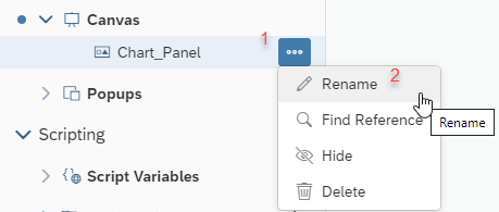
Alright, so far so good, now let’s move on. I have one question for you guys. What’s one of the most important keys of coding or even working in a professional environment in general? That’s right! Structure! In order to achieve that with our application, we are going to rename our variables to something more descriptive, so we can distinguish them more easily. You can rename them the way that is best for you, as long as it’s clear for you. I chose to name mine “Chart_Panel”. On the left-hand side, you’ll find all your added widgets in a sub-category of “Canvas”. Find your newly added panel, which should be named “panel_1” upon creation. Hover over the term and promptly after, on the right-hand side, three dots should appear. Click on the three dots and a context menu shows up. Click on “Rename” in order to rename the widget.
Another option to rename the widgets is to do a double-click on the widget name and change it directly:

Now let’s get to the charts and I’m not talking about music. We’re talking about some nice bar charts. Under the “Insert” category you’ll find the button for the bar charts. Right next to the bar chart is the button for tables. Click on the bar chart button.

The SAP Analytics Cloud Story veterans might feel some sort of relief now. Up until this point, their only thought might have been something like “Wait. What about my models? My data? “. Worry not, my friends. The step, that starts of the Stories process, is only coming to action when inserting a chart or table. You’ll be asked to choose your data source for your charts and tables. A pop up appears, where you can select your model. If you don’t have your data source handy, you can also search for it, provided you know the name of your model. The pop-up looks like this:

Select your model and confirm your selection.
Now we will decide, which measures and dimensions we will be displaying on our chart. The Analytics Cloud experts will feel familiar with the following windows and steps. After you have selected the model, you’ll be greeted with the “Builder”-Panel.
With the Builder Panel you can change the data source of the chart/table, select which type of chart structure you want (i.e. Bar chart, pie charts etc.), the chart orientation and what your measures and dimensions are, which you want to display and so on. In this hands-on we will choose the “units sold” measure. Under the title “Measures” you’ll find a dropdown with all your available measures. If you fancy the search functionality, you can also look for your preferred measure yourself.

After we selected the “units sold” measure, we’ll choose our dimensions. What’s life without any dimensions anyway, am I right?
Same procedure as with the measures, we’ll select the “Date” dimension.

Then, we will filter the date. First, click on the filter symbol (which looks like a funnel). Immediately, a context menu pops up. You have to filter options: “Filter by Member” and “Filter by Range”. We want to filter by member.

After clicking on “Filter by Member”, a new pop up appears. You are greeted with a mostly white window, with a ticked tick box, labeled “(all)”. So far so good, but in this case, we don’t want a ticked “all” tick box. Next to the tick box, on the left-hand side, you’ll see a fine, little arrow, facing the right direction. Click on that, and more tick boxes should appear. Namely the years 2017 to 2019. Now you’ll have to tick the years one by one. The result should look like this:

Instead of a ticked box in “(all)”, the box is marked with a square. Now you might be asking yourself: “Why this odyssey. Am I stuck in a Stanley Kubrick movie? “(A 2001 Space Odyssey joke, a bad one at that too). First off, any affiliation with the work of Stanley Kubrick is purely coincidental.Second, if we would have left the ticked “(all)” box, how many bars would our chart have? Yes, you guessed right: One. The units sold, cumulated over all years. We want each year separately though.
Alright, after you clicked on “ok”, the chart should look something like this:

If you want to rename the chart, you can do so, just like we did with the panel. I’ll name mine “chart”. Creative, I know.

Let’s tidy the chart up a little bit. We want the user to know, what measure they are looking at. Hover over the chart. On the top right corner, a circle with 3 dots inside should appear. Click on it and a context menu reveals itself. We want the selection “Show/Hide”. Hover over that option and a second menu shows up. There you click on the “Legend” option. With the newer releases, a right click should also work to reveal the context menu.

After clicking, a picture of you appears. Just kidding, unfortunately it’s not as exciting. The selected measure, appears in text form at the top of the chart. Personally, I’m not a fan of having the legend on top of the chart. I’d rather have it at the bottom. In order to change that, click on the designer tab on the top right corner. The Builder panel shows up. We want the Style Panel though. If you look closely, you’ll see a small brush on the top right corner of the Builder Panel. That little brush indicates the Style Panel. Brush over the brush.
The overall color of the panel changes to orange, which indicates that you’re in the styling mode. Now channel your inner Karl Lagerfeld and style that bar chart. Scroll all the way down, until you see the “Legend” title. A small dropdown menu is placed there, which shows, where the legend is placed. Click on the drop-down menu, select the “Below Chart” placement. The legend of the chart should now be at the bottom of the chart.
So far so good! Now, we want those little circles, where our differences will be located in. For that, move your cursor towards the tab strip at the top. Right next to the bar and table icons, you’ll find a small “+”. Behind that innocent “+” button, are the rest of the Analytics Designer widgets. Click on that and a whole armada of widgets will appear. In that list, you’ll find a “shape” widget:

After clicking on “Shape”, a pop up will appear:

Under the “All” tap, you’ll find all the shapes, Analytics Cloud has to offer, ranging from smartphone shapes to….circles. Yes. We will need the circle shape. Select the circle and click on “insert”.
Afterwards, a black circle will appear on your canvas. Ok, now resize the circle to your liking and place it between two bars. Preferably in the middle, that way it looks a bit tidier.
I know, black is in fashion but not on our little creation here. We will go ahead and change the color of the circle, so we can easily see the future figures, which will be displayed inside the circle.
In order to do so, we will visit our old friend “Styling Panel”. Make sure you selected your circle (indicated with the blue frame, surrounding the circle and click on “Designer” on the top right corner. If you’re not already in Styling Mode (orange sidebar), click on the little brush icon. Scroll down, until you see a subitem called “Pictogram Properties”. The you’ll find the “Fill Color” property of the circle. Click on the little dropdown and select a fair color. I’ll choose a fair gray, almost white color, so you can still see the circle but any text inside the circle will still be clear.

Once you chose your circle color to your liking, go ahead and copy the circle (ctrl + c) and paste (ctrl + v) it on your canvas. In this blog post, I have the bars, so I’ll need 2 circles. If you have more bars, I will provide you with a bulletproof mathematical formula, so that you can calculate on your own, how many circles you need:
Let B be the number of your bars in your bar chart. Let C be the number of your needed circles.
Formula:
This blog post has everything, even high complex mathematical formulas. Ok, now we got that out of our way, your bar chart should look something like this:

The last little detail that we need, are the lines connecting the circles and bars and little text boxes. The lines are also a shape type. Go ahead and click on the “+” sign at the top, select “shape” insert the line shape:

A small line should appear on your canvas. We want three vertical lines and three horizontal lines. Vertical lines to “connect” the bars with the circle and horizontal to connect the two circles. After inserting the line shape, the line should be horizontal by default. Copy that line and leave where you can find it for later. To make the line face vertically, we will need the styling panel again. Click on “Designer” and switch to Styling Mode (if not already in Style Mode). Scroll down a bit until you find a subitem called “Actions”. Under this subitem, you’ll find the sub-category “Rotate”. Click on the first button. That button indicates a switch to vertical orientation.

Your line should now be vertical. Copy and paste that line two times, making it three. Now arrange your lines on the bar chart, until they look like this:

Note: Those two horizontal lines left and right of the circles are small horizontal lines.
Ok, almost done with the designing part of this blog post! What’s left are two text boxes, that we will place inside the circles, which will ultimately display the differences between each chart. Text boxes are also a widget, so click on the “+” sign, and select “Text”.

A text box should appear on your canvas. Copy and paste that text box, making them two. Place those boxes inside the circle, like this:

Those little inconspicuous text boxes will be very important for us, because they will be displaying the difference between each chart. In order to remember that, we will name them accordingly. On the left hand side, you’ll find all your widgets, that are on your canvas. There should be two widgets called “text_1” and “text_2”. Go ahead and rename them (double click) to “Diff_Text_1” and “Diff_Text_2”.

In this blog post, we will trigger the calculation by pressing a button. As you might have guessed, a button is also a widget. Insert it on your canvas:

To let the button sound telling of it’s function, we will rename the text, that is displayed on the button. To do so, click on that button until the little circle with 3 dots appears. Click on that circle, and afterwards click on Edit Styling. Now you might think “Wait, I could have done that, by going into the styling panel!” You are right! I just wanted to show you a different way of going there.

Anyhow, at the very top of the Styling Panel of the button, you’ll find the subitem “Analytics Designer Properties”. Change the name (the name of the widget, not the text on the button) to “But_Calc” and the text to “Calculate”.

Finally! We are done with the designing part!
Before we start writing to some code, we will create some script variables. Script variables are variables, which we can use globally in our application. We will create two: One for our calculation and one to store those values in, which will be an array.
On the left side, underneath the “Canvas” widgets, you’ll see the term “Script Variables”. Click on the plus sign, right next to it:

First, we will create our “result” Variable like this:

Afterwards, create the “Results” Array:

Don’t forget to toggle the “Set As Array” toggle to “YES”.
Let’s get to the scripting!
Now you should be familiar with the left panel, which displays every widget on your canvas. If you hover over the widgets, you’ll notice that a faint “fx” symbol appears. That little fx indicates, if there is some script written behind the widget. If it’s visible without hovering over the widget and in blue, then there is a script hooked on that widget.
In Analytics Designer, certain events are your hook. Now you might be asking yourself “Wait, what exactly are events?” Ask no more! I’ll tell you. Events are your application starting, the data changing, the user clicking on a widget etc. The Designer is using those events to react to certain interactions. If you click on the fx symbol next to a widget, certain methods will be displayed, which you can choose between. Depending on the widget it will be “onClick”, “onResultsChanged”, “onInizialisation” etc.
In this case the button only has the “onClick” method. When there’s only one method to chose from, SAC won’t even give you a list of possible methods and immediately open up a new tab with the scripting environment for that widget.

So every time you’ll want to script on widgets, a new tab shows up, like this:

In there you can write your JavaScript Code. Analytics Designer uses a subset of JavaScript, with auto-completion and syntax check. What you CAN’T do, is to use external libraries. There is a workaround on that (hint: Custom Widgets), but later more on that. We will go through each code segment step by step:
In this section, we will get the selected dimensions and selected measures. In our case, that’s the date dimension, with the years 2017 to 2018 and the measure “Units Sold”. The method “getDataSource()” gives access to the used model for that particular chart.
“console.log()” is for debugging purposes, in which we will display our selectionArray in the console (which you can access by pressing the F12 Key, while running the application). Debugging won’t be our focus here, though.
Next up, are two arrays. One for the calculated values, and one for the string version of these values, which we will be displaying inside the text fields inside our bubbles.
This is a rather big step. We’re iterating through our “selectionsArray” and pick the “Units Sold” value for each bar. This is mainly made, with the “getData()” method. After that, we will push those values inside our unitsArray. One problem is, that the Data-Method gives as the values as strings, but since we want to calculate the differences between each value, we’ll have to convert from string to number!
Now, we’re pushing our Text widgets inside our “TxtArray”, so that we can use a For-Loop in the next step.
In this loop, we are iterating through our stored values inside the unitsArray. You’ll notice the “results” variable, which we created beforehand to store the results for each iteration. Afterwards we will push each result inside the “Results” array. In the end, we will apply the text for the bubbles. Notice that we declared a number format, which is pre-set in SAC.
This is it, that’s all we need to display the differences between each bar in a bar chart.
But all that glitters is not gold, unfortunately. We can do this calculation only once, meaning if you change your dates (like only 2018 and 2019), you’ll have to change the amount of bubble charts and lines, meaning that it is not really a dynamic solution. You’d also have to tweak your code a little bit at the “TxtArray” part, since you’ll have a different number of Textboxes, which you’ll push into your array.
So, to avoid misconception with the amount of “calculations” you can do during run time, we’ll disable the calculation button after we click on it, with this line of code.
Now, let’s see the fruit of our hard work! On the top right corner, you’ll see “Run Analytical Application”.

Click on that, in order to run your Application. Afterwards, you should be greeted by this:

Now if you click on the “Calculate” Button, the differences should be displayed inside the bubbles like this:

Additionally, the “Calculate” Button should disappear.
Since Q4 2019 there is a new feature available in SAC Analytics Designer: Custom Widgets. With Custom Widgets you are able to create your own widget, which you can use just like regular widgets in your application. Since Analytics Designer is a bit limited with certain things like using HTML or CSS in your application, custom widgets won’t have those limitations. You can develop them in your IDE of choice, use your favorite JavaScript libraries and deploy them in your application.
With that possibility, we could make the current solution way more dynamic. But this will be shown in a different blog post, so stay tuned.
Thank you again for reading this blog post all the way through! Like my old computer science professor once said, “you won’t learn anything, as long as you don’t get your hands dirty”. Try it out yourself, experiment and learn.
Here are some links, which helped me a lot, to get started with the Analytics Designer:
Analytics Designer Developer Handbook
API Reference Documentation
Product Tutorials
Blog Post about Custom Widgets
As we all know, SAP Analytics Cloud is the strategic analytics tool for all SAP Business Applications. We won’t focus on SAP Analytics Cloud (SAC) per se but rather on a fairly new key component of SAC: SAC Analytics Design.
The SAC is built on 4 Pillars:
- Business Intelligence
- Planning
- Predictive
- Analytics Design
We will lay our eyes on the fourth pillar, Analytics Design (formerly known as Application Design). What’s Analytics Design you ask? Well, it’s easy! With Analytics Designer, you can create analytical applications for data analysis to meet sophisticated business requirements. With added scripting capabilities, a world of added flexibility is revealed to the Application Designer, providing, next to the Stories, a new layer for creating outstanding applications to wow your audience with.
Now you might ask “But I’m already using Stories, what benefits does Analytics Design offer over my comfortable Stories?” Well, let me paint you a picture:
With SAP Analytical Cloud Stories, it is a little like a guided tour, through a beautiful scenery. You will have fun, see a lot of nice things around you, but ultimately you are safe. Nothing can happen, the road is laid out in front of you, you just have to use it.
However, Analytics Design is different. This is like an arctic expedition. You have your tools on you, but you have to find the way for yourself. There is no right or wrong, the possibilities are endless. It is more dangerous but at the same time more rewarding, when you achieve your goals.
This is the feeling, that SAC Analytics Design conveys: Hard work, but the results speak for themselves.
In this blog post, I will show you how to design a bar chart. “A simple bar chart?” you might be asking yourself. Well, since most SAC users start out with a bar chart anyways, why shouldn’t we as well? Before you stop reading and contemplate about your poor life choices, leading you to read this post:
Since we are using SAC Analytics Designer, we won’t stop at a simple bar chart. With a little bit of scripting, our bar chart will be able to calculate and display the differences of measures between each bar and will eventually look something like this:
To remain in the established allegory of an arctic expedition: Every expedition starts at base camp, so naturally we will start out with a simple bar chart and make our way gradually from there.
The data, which I used for this post can be downloaded here.
Let’s get started. First, you need to log into your SAP Analytics Cloud tenant. Instead of a story, we will create an Analytical Application. To do so, you’ll have to click on the burger menu symbol on the left-hand side, then click on “Create” and afterwards on “Analytical Application”.
In the next step, you will be greeted with an empty canvas, just like this one:
Here, you’ll notice the first difference, between an analytical application and a story. On the left-hand side, you have different options, like “Canvas” and a bunch of scripting functionalities, such as “Script Variables”.
Let’s clear up some lingo, which you’ll be reading throughout this blog post. First, the canvas. The canvas is…well, your canvas. Just like painting a picture, you’ll need a canvas to draw on. The same is happening here, you drag and drop your widgets to your liking on this empty canvas. Wait, what are widgets? Widgets are your charts, tables and so on. Place them wherever you like on your canvas. As I’m sure one person once said “A blank canvas has unlimited possibilities”.
Do you guys also feel a little anxious? Like something is missing? That’s right, we forgot to safe our progress. Let’s go ahead and do that. In a similar fashion as in stories, you safe your application by clicking on the floppy disc (for the younger readers, a floppy disc is a storage medium from ancient times), which is located beneath the “File” – tab strip, as shown on the picture below:
Right after, you’ll promptly be asked, to name your application (for finding purposes) and you can add a little description too, if you feel like it.
Alright, it’s time to get our hands dirty. The basic functionality of Analytics Design is, that you can add widgets like Charts and Tables, which we already know from stories, but additionally you have the option to add new widgets, like dropdowns and radio buttons. We start with the “Panel”-widget.
At first glance, the panel is inconspicuous but there’s more than meets the eye! The panel is very useful, when you want to bundle up a couple of widgets and treat them as one big content area, allowing you to move widgets that belong together, altogether! The panel widget is the base of all the other widgets, which we want to place on our canvas. In order to fit anything inside our panel, we’ll have to resize it. To do so, move your mouse to the lower right corner of the panel until the mouse cursor changes to a double-sided arrow, indicating that you hit the right spot for resizing the panel. Here’s an image of how it should look like:
Just adjust the size to your liking. No worries, you can change the size of the panel at any given time.
Alright, so far so good, now let’s move on. I have one question for you guys. What’s one of the most important keys of coding or even working in a professional environment in general? That’s right! Structure! In order to achieve that with our application, we are going to rename our variables to something more descriptive, so we can distinguish them more easily. You can rename them the way that is best for you, as long as it’s clear for you. I chose to name mine “Chart_Panel”. On the left-hand side, you’ll find all your added widgets in a sub-category of “Canvas”. Find your newly added panel, which should be named “panel_1” upon creation. Hover over the term and promptly after, on the right-hand side, three dots should appear. Click on the three dots and a context menu shows up. Click on “Rename” in order to rename the widget.
Another option to rename the widgets is to do a double-click on the widget name and change it directly:
Now let’s get to the charts and I’m not talking about music. We’re talking about some nice bar charts. Under the “Insert” category you’ll find the button for the bar charts. Right next to the bar chart is the button for tables. Click on the bar chart button.
The SAP Analytics Cloud Story veterans might feel some sort of relief now. Up until this point, their only thought might have been something like “Wait. What about my models? My data? “. Worry not, my friends. The step, that starts of the Stories process, is only coming to action when inserting a chart or table. You’ll be asked to choose your data source for your charts and tables. A pop up appears, where you can select your model. If you don’t have your data source handy, you can also search for it, provided you know the name of your model. The pop-up looks like this:
Select your model and confirm your selection.
Now we will decide, which measures and dimensions we will be displaying on our chart. The Analytics Cloud experts will feel familiar with the following windows and steps. After you have selected the model, you’ll be greeted with the “Builder”-Panel.
With the Builder Panel you can change the data source of the chart/table, select which type of chart structure you want (i.e. Bar chart, pie charts etc.), the chart orientation and what your measures and dimensions are, which you want to display and so on. In this hands-on we will choose the “units sold” measure. Under the title “Measures” you’ll find a dropdown with all your available measures. If you fancy the search functionality, you can also look for your preferred measure yourself.
After we selected the “units sold” measure, we’ll choose our dimensions. What’s life without any dimensions anyway, am I right?
Same procedure as with the measures, we’ll select the “Date” dimension.
Then, we will filter the date. First, click on the filter symbol (which looks like a funnel). Immediately, a context menu pops up. You have to filter options: “Filter by Member” and “Filter by Range”. We want to filter by member.
After clicking on “Filter by Member”, a new pop up appears. You are greeted with a mostly white window, with a ticked tick box, labeled “(all)”. So far so good, but in this case, we don’t want a ticked “all” tick box. Next to the tick box, on the left-hand side, you’ll see a fine, little arrow, facing the right direction. Click on that, and more tick boxes should appear. Namely the years 2017 to 2019. Now you’ll have to tick the years one by one. The result should look like this:
Instead of a ticked box in “(all)”, the box is marked with a square. Now you might be asking yourself: “Why this odyssey. Am I stuck in a Stanley Kubrick movie? “(A 2001 Space Odyssey joke, a bad one at that too). First off, any affiliation with the work of Stanley Kubrick is purely coincidental.Second, if we would have left the ticked “(all)” box, how many bars would our chart have? Yes, you guessed right: One. The units sold, cumulated over all years. We want each year separately though.
Alright, after you clicked on “ok”, the chart should look something like this:
If you want to rename the chart, you can do so, just like we did with the panel. I’ll name mine “chart”. Creative, I know.
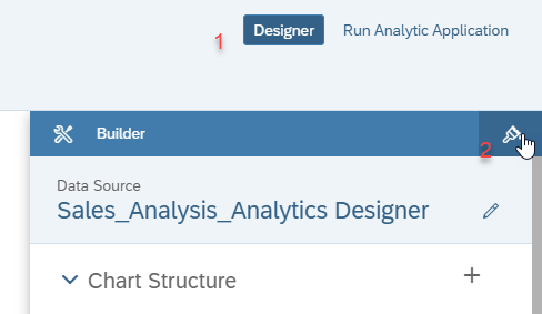
Let’s tidy the chart up a little bit. We want the user to know, what measure they are looking at. Hover over the chart. On the top right corner, a circle with 3 dots inside should appear. Click on it and a context menu reveals itself. We want the selection “Show/Hide”. Hover over that option and a second menu shows up. There you click on the “Legend” option. With the newer releases, a right click should also work to reveal the context menu.
After clicking, a picture of you appears. Just kidding, unfortunately it’s not as exciting. The selected measure, appears in text form at the top of the chart. Personally, I’m not a fan of having the legend on top of the chart. I’d rather have it at the bottom. In order to change that, click on the designer tab on the top right corner. The Builder panel shows up. We want the Style Panel though. If you look closely, you’ll see a small brush on the top right corner of the Builder Panel. That little brush indicates the Style Panel. Brush over the brush.
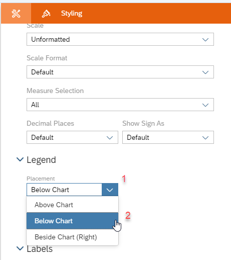
The overall color of the panel changes to orange, which indicates that you’re in the styling mode. Now channel your inner Karl Lagerfeld and style that bar chart. Scroll all the way down, until you see the “Legend” title. A small dropdown menu is placed there, which shows, where the legend is placed. Click on the drop-down menu, select the “Below Chart” placement. The legend of the chart should now be at the bottom of the chart.
So far so good! Now, we want those little circles, where our differences will be located in. For that, move your cursor towards the tab strip at the top. Right next to the bar and table icons, you’ll find a small “+”. Behind that innocent “+” button, are the rest of the Analytics Designer widgets. Click on that and a whole armada of widgets will appear. In that list, you’ll find a “shape” widget:
After clicking on “Shape”, a pop up will appear:
Under the “All” tap, you’ll find all the shapes, Analytics Cloud has to offer, ranging from smartphone shapes to….circles. Yes. We will need the circle shape. Select the circle and click on “insert”.
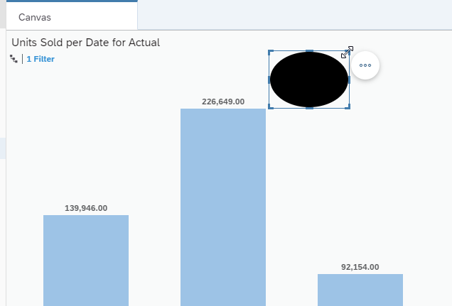
Afterwards, a black circle will appear on your canvas. Ok, now resize the circle to your liking and place it between two bars. Preferably in the middle, that way it looks a bit tidier.
I know, black is in fashion but not on our little creation here. We will go ahead and change the color of the circle, so we can easily see the future figures, which will be displayed inside the circle.
In order to do so, we will visit our old friend “Styling Panel”. Make sure you selected your circle (indicated with the blue frame, surrounding the circle and click on “Designer” on the top right corner. If you’re not already in Styling Mode (orange sidebar), click on the little brush icon. Scroll down, until you see a subitem called “Pictogram Properties”. The you’ll find the “Fill Color” property of the circle. Click on the little dropdown and select a fair color. I’ll choose a fair gray, almost white color, so you can still see the circle but any text inside the circle will still be clear.
Once you chose your circle color to your liking, go ahead and copy the circle (ctrl + c) and paste (ctrl + v) it on your canvas. In this blog post, I have the bars, so I’ll need 2 circles. If you have more bars, I will provide you with a bulletproof mathematical formula, so that you can calculate on your own, how many circles you need:
Let B be the number of your bars in your bar chart. Let C be the number of your needed circles.
Formula:
C := (B - 1)
This blog post has everything, even high complex mathematical formulas. Ok, now we got that out of our way, your bar chart should look something like this:
The last little detail that we need, are the lines connecting the circles and bars and little text boxes. The lines are also a shape type. Go ahead and click on the “+” sign at the top, select “shape” insert the line shape:
A small line should appear on your canvas. We want three vertical lines and three horizontal lines. Vertical lines to “connect” the bars with the circle and horizontal to connect the two circles. After inserting the line shape, the line should be horizontal by default. Copy that line and leave where you can find it for later. To make the line face vertically, we will need the styling panel again. Click on “Designer” and switch to Styling Mode (if not already in Style Mode). Scroll down a bit until you find a subitem called “Actions”. Under this subitem, you’ll find the sub-category “Rotate”. Click on the first button. That button indicates a switch to vertical orientation.
Your line should now be vertical. Copy and paste that line two times, making it three. Now arrange your lines on the bar chart, until they look like this:
Note: Those two horizontal lines left and right of the circles are small horizontal lines.
Ok, almost done with the designing part of this blog post! What’s left are two text boxes, that we will place inside the circles, which will ultimately display the differences between each chart. Text boxes are also a widget, so click on the “+” sign, and select “Text”.
A text box should appear on your canvas. Copy and paste that text box, making them two. Place those boxes inside the circle, like this:
Those little inconspicuous text boxes will be very important for us, because they will be displaying the difference between each chart. In order to remember that, we will name them accordingly. On the left hand side, you’ll find all your widgets, that are on your canvas. There should be two widgets called “text_1” and “text_2”. Go ahead and rename them (double click) to “Diff_Text_1” and “Diff_Text_2”.
In this blog post, we will trigger the calculation by pressing a button. As you might have guessed, a button is also a widget. Insert it on your canvas:
To let the button sound telling of it’s function, we will rename the text, that is displayed on the button. To do so, click on that button until the little circle with 3 dots appears. Click on that circle, and afterwards click on Edit Styling. Now you might think “Wait, I could have done that, by going into the styling panel!” You are right! I just wanted to show you a different way of going there.
Anyhow, at the very top of the Styling Panel of the button, you’ll find the subitem “Analytics Designer Properties”. Change the name (the name of the widget, not the text on the button) to “But_Calc” and the text to “Calculate”.
Finally! We are done with the designing part!
Before we start writing to some code, we will create some script variables. Script variables are variables, which we can use globally in our application. We will create two: One for our calculation and one to store those values in, which will be an array.
On the left side, underneath the “Canvas” widgets, you’ll see the term “Script Variables”. Click on the plus sign, right next to it:
First, we will create our “result” Variable like this:
Afterwards, create the “Results” Array:
Don’t forget to toggle the “Set As Array” toggle to “YES”.
Let’s get to the scripting!
Now you should be familiar with the left panel, which displays every widget on your canvas. If you hover over the widgets, you’ll notice that a faint “fx” symbol appears. That little fx indicates, if there is some script written behind the widget. If it’s visible without hovering over the widget and in blue, then there is a script hooked on that widget.
In Analytics Designer, certain events are your hook. Now you might be asking yourself “Wait, what exactly are events?” Ask no more! I’ll tell you. Events are your application starting, the data changing, the user clicking on a widget etc. The Designer is using those events to react to certain interactions. If you click on the fx symbol next to a widget, certain methods will be displayed, which you can choose between. Depending on the widget it will be “onClick”, “onResultsChanged”, “onInizialisation” etc.
In this case the button only has the “onClick” method. When there’s only one method to chose from, SAC won’t even give you a list of possible methods and immediately open up a new tab with the scripting environment for that widget.
So every time you’ll want to script on widgets, a new tab shows up, like this:
In there you can write your JavaScript Code. Analytics Designer uses a subset of JavaScript, with auto-completion and syntax check. What you CAN’T do, is to use external libraries. There is a workaround on that (hint: Custom Widgets), but later more on that. We will go through each code segment step by step:
//get the selected objects in the chart

//selectionsArray is an array filled with the objects of the chart

var selectionsArray = Chart.getDataSource().getDataSelections();

console.log(selectionsArray);
In this section, we will get the selected dimensions and selected measures. In our case, that’s the date dimension, with the years 2017 to 2018 and the measure “Units Sold”. The method “getDataSource()” gives access to the used model for that particular chart.
“console.log()” is for debugging purposes, in which we will display our selectionArray in the console (which you can access by pressing the F12 Key, while running the application). Debugging won’t be our focus here, though.
//create array to store the values in

var unitsArray = ArrayUtils.create(Type.number);

var TxtArray = ArrayUtils.create(Type.Text);
Next up, are two arrays. One for the calculated values, and one for the string version of these values, which we will be displaying inside the text fields inside our bubbles.
//iterate through selectionsArray, pick the needed numbers and push them into unitsArray

for (var key = 0; key < selectionsArray.length; key++){


	var obj = selectionsArray[key];


	console.log(obj["@MeasureDimension"]);

	console.log(obj["Date"]);

	unitsArray.push(ConvertUtils.stringToNumber(Chart.getDataSource().getData({[Alias.MeasureDimension]: obj["@MeasureDimension"], "Date": obj["Date"]}).rawValue));

}
This is a rather big step. We’re iterating through our “selectionsArray” and pick the “Units Sold” value for each bar. This is mainly made, with the “getData()” method. After that, we will push those values inside our unitsArray. One problem is, that the Data-Method gives as the values as strings, but since we want to calculate the differences between each value, we’ll have to convert from string to number!
//Push Textfield to an array, so we can use them in our loop

TxtArray.push(Diff_Text_1);

TxtArray.push(Diff_Text_2);
Now, we’re pushing our Text widgets inside our “TxtArray”, so that we can use a For-Loop in the next step.
//Calculate the differences and display them inside the textfield

for (var i = 0; i < unitsArray.length -1 ; ++i) {


		result= unitsArray[i+1] - unitsArray[i];

		Results.push(result);


		TxtArray[i].applyText(NumberFormat.format(Results[i]));

}
In this loop, we are iterating through our stored values inside the unitsArray. You’ll notice the “results” variable, which we created beforehand to store the results for each iteration. Afterwards we will push each result inside the “Results” array. In the end, we will apply the text for the bubbles. Notice that we declared a number format, which is pre-set in SAC.
This is it, that’s all we need to display the differences between each bar in a bar chart.
But all that glitters is not gold, unfortunately. We can do this calculation only once, meaning if you change your dates (like only 2018 and 2019), you’ll have to change the amount of bubble charts and lines, meaning that it is not really a dynamic solution. You’d also have to tweak your code a little bit at the “TxtArray” part, since you’ll have a different number of Textboxes, which you’ll push into your array.
So, to avoid misconception with the amount of “calculations” you can do during run time, we’ll disable the calculation button after we click on it, with this line of code.
//Turn button invisible, so we don't click on it more than once

But_Calc.setVisible(false);
Now, let’s see the fruit of our hard work! On the top right corner, you’ll see “Run Analytical Application”.
Click on that, in order to run your Application. Afterwards, you should be greeted by this:
Now if you click on the “Calculate” Button, the differences should be displayed inside the bubbles like this:
Additionally, the “Calculate” Button should disappear.
Since Q4 2019 there is a new feature available in SAC Analytics Designer: Custom Widgets. With Custom Widgets you are able to create your own widget, which you can use just like regular widgets in your application. Since Analytics Designer is a bit limited with certain things like using HTML or CSS in your application, custom widgets won’t have those limitations. You can develop them in your IDE of choice, use your favorite JavaScript libraries and deploy them in your application.
With that possibility, we could make the current solution way more dynamic. But this will be shown in a different blog post, so stay tuned.
Thank you again for reading this blog post all the way through! Like my old computer science professor once said, “you won’t learn anything, as long as you don’t get your hands dirty”. Try it out yourself, experiment and learn.
Here are some links, which helped me a lot, to get started with the Analytics Designer:
Analytics Designer Developer Handbook
API Reference Documentation
Product Tutorials
Blog Post about Custom Widgets
- SAP Managed Tags:
- SAP Analytics Cloud,
- SAP Analytics Cloud, analytics designer
Labels:
3 Comments
You must be a registered user to add a comment. If you've already registered, sign in. Otherwise, register and sign in.
Labels in this area
-
ABAP CDS Views - CDC (Change Data Capture)
2 -
AI
1 -
Analyze Workload Data
1 -
BTP
1 -
Business and IT Integration
2 -
Business application stu
1 -
Business Technology Platform
1 -
Business Trends
1,658 -
Business Trends
95 -
CAP
1 -
cf
1 -
Cloud Foundry
1 -
Confluent
1 -
Customer COE Basics and Fundamentals
1 -
Customer COE Latest and Greatest
3 -
Customer Data Browser app
1 -
Data Analysis Tool
1 -
data migration
1 -
data transfer
1 -
Datasphere
2 -
Event Information
1,400 -
Event Information
67 -
Expert
1 -
Expert Insights
177 -
Expert Insights
310 -
General
1 -
Google cloud
1 -
Google Next'24
1 -
GraphQL
1 -
Kafka
1 -
Life at SAP
780 -
Life at SAP
13 -
Migrate your Data App
1 -
MTA
1 -
Network Performance Analysis
1 -
NodeJS
1 -
PDF
1 -
POC
1 -
Product Updates
4,576 -
Product Updates
353 -
Replication Flow
1 -
REST API
1 -
RisewithSAP
1 -
SAP BTP
1 -
SAP BTP Cloud Foundry
1 -
SAP Cloud ALM
1 -
SAP Cloud Application Programming Model
1 -
SAP Datasphere
2 -
SAP S4HANA Cloud
1 -
SAP S4HANA Migration Cockpit
1 -
Technology Updates
6,873 -
Technology Updates
441 -
Workload Fluctuations
1
Related Content
- SAP BTP Innobytes – April 2024 in Technology Blogs by SAP
- SAP Analytics Cloud - Flatten hierarchy into columns in Technology Q&A
- What’s New in SAP Datasphere Version 2024.9 — Apr 23, 2024 in Technology Blogs by Members
- SAP Analytics Cloud - Custom Widget Testing in Technology Q&A
- Hybrid Architectures: A Modern Approach for SAP Data Integration in Technology Blogs by SAP
Top kudoed authors
| User | Count |
|---|---|
| 19 | |
| 14 | |
| 12 | |
| 11 | |
| 10 | |
| 9 | |
| 8 | |
| 8 | |
| 8 | |
| 7 |