- SAP Community
- Products and Technology
- Technology
- Technology Blogs by SAP
- Display data details in card view (Object Cards)
- Subscribe to RSS Feed
- Mark as New
- Mark as Read
- Bookmark
- Subscribe
- Printer Friendly Page
- Report Inappropriate Content
Background
Many times, while presenting Stories, I need to see the details for a specific record in my data. A possible solution is to use Explorer views and Data Analyzers, but I find sometimes users don't need all the model dimensions and measures, don't need to build their own view, nor have the skills to do so. A partial solution to this challenge is to create a widget that looks like, what is sometimes referred to as in other applications, an Object Card. Object, being a single datapoint. Card, being the format in which the details are visualized. I find this view shows data details in a quick, concise manner than can be controlled with filters/hyperlinks.
Most Stories in SAC provide summaries from lots of data. So, I find the natural way a user needs to navigate to a view like Object Card is by wanting to 'dig into the details' of a specific data point they see in a typical Story widget. While it is technically possible to add the details of your data to a Story widget directly, it can be difficult to consume and isn't always a best practice. To present the details of a data point and the individual dimension members for it, I am writing this blog to share how I achieved this. I have not found many community posts about visualizing data this way, so I wanted to share in the event someone else was looking to create a similar view. In this example, I have created an Object Card for individual Purchase Orders (POs) in one of my stories.
1. Create table and add desired data.
- Start on a blank page by creating a table. Set this page as Hidden.
- Add all the dimensions and measures to this table that you'd like to show in the Object Card. I brought in 20 dimensions and 2 measures.
- Use the Swap Axis button in the Builder pane to switch the measure to the rows and dimensions to the columns.
| Note: You don't have to filter the data yet. We need to load multiple records so that we can adjust the drill limitation. |
Your dimensions headers should now be stacked on the left side of your table. Your measures should be below the dimension headers at the bottom of the table.
2. Edit Drill Limitation
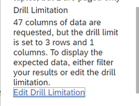
Next, we will limit the number of cells that load into the table so we only see one member for each dimension. The Edit Drill Limitation hazard sign only appears in the Table Details if your table loads more than 500 rows and/or more than 60 columns. You should quickly hit the 60 column limit after swapping the axis.
- Under Table Details, click on the Hazard Sign and scroll to Drill Limitation.
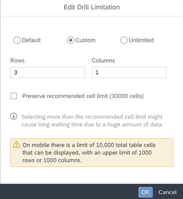
- Click the Edit Drill Limitation link
- Change the Drill Limitation to Custom
- Uncheck "Preserve recommended cell limit (30000 cells)"
- Set the Columns Limit to 1
- Set the Rows Limit to the number of measures you have in the table. I loaded 2 measures, so I set the Rows Limit to 2.
- Click OK. You should see the Dimension Headers, and one column of data. You will always see only one column of data, even if your filters return multiple records.
| Tip: Use Sort Options on the first dimension to influence the data that first loads by default. I set the same sort as the source table or chart that leads you to this this page. You can also Add Customer Order... and drag the member what you want to first load to the top. |
3. Format table to look more like a card
I find the below Styling makes this card view easy to interpret:
- Set the Table Title to a larger font and bold
- Bold the dimension headers text
- Align dimension headers text to the right
- In the Widget section of the Styling Panel: Set a lighter Background Color, set All Borders in Borders, round edges with Corner Radius.
- In the Lines section of the Styling Panel: Add a Simple Line to seperate the Measures from the Dimensions towards the bottom.
- Select the table click More Actions, Show/Hide: uncheck Table Details and Subtitle.
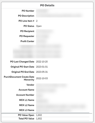
Your table could look something like this:
4. Create a filtering point for the Object Card
Since this view only works well by showing one dimension member at a time, we want to control how and when a user sees this Object Card. We can have the user filter on a data point in many ways, there are two ways that I found work well with this Object Card:
Option 1: Use Hyperlinks and Applying Selected Dimensions as a Filter, from a table or chart with similar dimensions. I find this first option to be the most useful and intuitive when consuming a Story with lots of data.
Option 2: Add a Single Selection Input Control that allow users to toggle through the data points they want to see in the Object Card: to make sure we limit the filtering options to only load one record at a time in the Object Card. This Input Control may get overwhelming with lots of data.
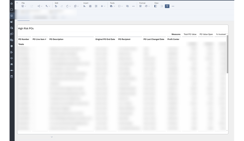
To setup the first option, start with a widget in a separate page that shows a summary data where the user can hyperlink to the Card Object details. This Hyperlink will take them to the page with the Card Object and apply a Story filter on the selected data point. The data point the user clicks on must at a unique identifying level of detail, so that we force only one member to load in the Object Card. In my example, the PO Number + PO Line Number are the unique identifiers of my data records. There is only one possible member for all dimensions when filtering on a single PO Number + PO Line Number.
- Create a table with my basic dimensions (Unique Identifiers PO Number + PO Line Number included) and measures. I suggest only the most important data points for an user to see when loading my story. Like mentioned before, we can technically add all 20 columns to this table and load all records at once, but this can be hard to fit all on the screen and difficult to consume as an user.
| Note: A Horizontal Bar Chart could also work with the same data if you don't want to use a table. |
- Create table as mentioned above
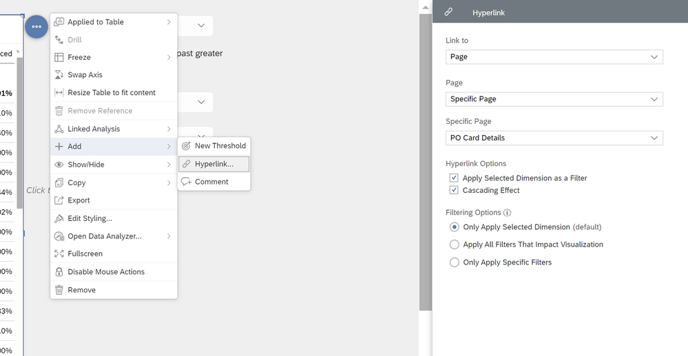
- Click on the table, go to More Options
- Click "+ Add" then Hyperlink
- In the Hyperlink Panel: Link to Page, Specific Page, then choose the page with the Object Card. (Mine is called PO Card Details)
- Click Done
To use this hyperlink in either a table or chart:
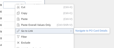
Table, right click in the measure cell of the data point you want to see the details, Click Go to Link, click Navigate to <your page name>.
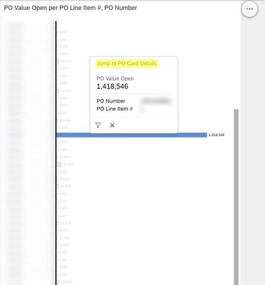
Bar Charts, Click on a data bar, then Jump to <your page name> at the top of the tool tip. Or right click, Go to Link, click Navigate to <your page name>.
When users navigate to the page with the Object Card, a Story filter will be applied. To go back, the users will need to navigate back to the initial page, then clear the Story filter. I have not found a shortcut to do this without scripting, other than adding a button (or a Shape that looks like a button) and hyperlinking back to your initial page. Users will still need to know to clear the Story filter.
You have now completed all steps to setup an Object Card view and enabled the first option of filtering data in the card. You may now train users to right click on the data point they want to see in the Object Card in the hidden page.
Summary
Give this a few tests to make sure the Object Card is behaving as you expect. You can test by leaving on Table Details and check to see if the table tries to load more than the limited number of Rows or Columns. If it does, then you need add more filtering dimensions in the hyperlink to get only one record to load in the Object Card.
You can take this much further with Analytical Scripting but I wanted to focus this blog on using standard functionality to keep it easy to understand and quick to setup.
I am happy to update this blog if the community is able to come up with any improvements or suggestions as to following functionality without using scripting:
- Auto remove story filters from hyperlinks when going back to initial page.
- Remove cached data from table while loading new filter set. When a user hyperlinks once, then clears filter and goes back, then hyperlinks another data point, the previous data point will display in the Object Card while the new one loads.
- Setup same view and format using other functionalities.
- SAP Managed Tags:
- SAP Analytics Cloud
You must be a registered user to add a comment. If you've already registered, sign in. Otherwise, register and sign in.
-
ABAP CDS Views - CDC (Change Data Capture)
2 -
AI
1 -
Analyze Workload Data
1 -
BTP
1 -
Business and IT Integration
2 -
Business application stu
1 -
Business Technology Platform
1 -
Business Trends
1,658 -
Business Trends
93 -
CAP
1 -
cf
1 -
Cloud Foundry
1 -
Confluent
1 -
Customer COE Basics and Fundamentals
1 -
Customer COE Latest and Greatest
3 -
Customer Data Browser app
1 -
Data Analysis Tool
1 -
data migration
1 -
data transfer
1 -
Datasphere
2 -
Event Information
1,400 -
Event Information
67 -
Expert
1 -
Expert Insights
177 -
Expert Insights
301 -
General
1 -
Google cloud
1 -
Google Next'24
1 -
GraphQL
1 -
Kafka
1 -
Life at SAP
780 -
Life at SAP
13 -
Migrate your Data App
1 -
MTA
1 -
Network Performance Analysis
1 -
NodeJS
1 -
PDF
1 -
POC
1 -
Product Updates
4,577 -
Product Updates
346 -
Replication Flow
1 -
REST API
1 -
RisewithSAP
1 -
SAP BTP
1 -
SAP BTP Cloud Foundry
1 -
SAP Cloud ALM
1 -
SAP Cloud Application Programming Model
1 -
SAP Datasphere
2 -
SAP S4HANA Cloud
1 -
SAP S4HANA Migration Cockpit
1 -
Technology Updates
6,873 -
Technology Updates
429 -
Workload Fluctuations
1
- Using Integration Suite API's with Basic Auth in Technology Q&A
- Creating a Custom Navigation Side Panel in SAP Analytics Cloud (Optimized Story Experience) in Technology Blogs by SAP
- Integrating Smart contracts with SAPUI5 in Technology Blogs by Members
- Extract blob data (PDF) from CAPM using python library of Document information extraction service. in Technology Blogs by Members
- Govern SAP APIs living in various API Management gateways in a single place with Azure API Center in Technology Blogs by Members
| User | Count |
|---|---|
| 34 | |
| 17 | |
| 15 | |
| 14 | |
| 11 | |
| 9 | |
| 8 | |
| 8 | |
| 8 | |
| 7 |


