- SAP Community
- Products and Technology
- Technology
- Technology Blogs by SAP
- Development Experience Sharing for SAC Widget Add-...
- Subscribe to RSS Feed
- Mark as New
- Mark as Read
- Bookmark
- Subscribe
- Printer Friendly Page
- Report Inappropriate Content
Preface
In order to meet the diversified needs of customers for SAP Analytics Cloud chart styles, I have studied the Widget Add-On in Story and developed a version of sample package with richer features based on a version of the initial sample in the code repository. In the process of learning and developing, I mainly referred to the official documentation of the developer guide for Widget Add-On. In the following, I will combine the documentation and the specific code of the sample package to systematically introduce Widget Add-On and share my experience and insights.
Introduction
SAP Analytics Cloud provides two features, Custom Widget and Widget Add-On, to enrich the style of the native charts provided by the system in Story. Custom Widget offers great freedom, allowing users to present data using charts from other external libraries. For those who only need to change part of the style based on the native charts and maximize the use of data binding and other features of the native charts, Widget Add-On is the best choice. Currently, the following 3 add-on types and corresponding chart types are supported:
- Tooltip: Supported chart types exclude numeric point.
- Plot area (general): Supported chart types are bar/column, stacked bar/column, stacked area and line.
- Plot area (numeric point): Supported chart type is numeric point.
The tooltip type of add-on specializes in modifying the style of the tooltip on the chart, and the plot area type of add-in specializes in modifying the style of the plot area portion of the chart.
The source file of Widget Add-On consists of a JSON file that declares the meta information of the add-on, and JavaScript files that use web component syntax to implement the functionality of the add-on. Each JSON file can declare up to one of each of the three types of widget add-ons, so that they have the same name but different types. Each type of widget add-on must have a main JavaScript file that implements the functionality, and optionally a settings panel JavaScript file which can modify the add-on's behavior within the story.
Take the index.json file in the sample package as an example: "extensionPoint" is "sap.addOn.viz.plotarea.general" which means that the widget add-on is of the plotarea (general) type, and then there are two items in the "webcomponents" section, "kind" is "main" means that the JavaScript file is the main source file to realize the function, "kind " is "builder" means that the JavaScript file is the source file of the settings panel. Let’s take a quick look at other important properties: "id" needs to be unique; "name" is the widget add-on’s name in the system.
Principle
Let’s talk about the principle of Widget Add-on in this section. The JSON file’s settings will hide part of the original chart. The JavaScript file get the information of the original chart through the setExtensionData function and then render a new chart based on the information and overwrite it to the original chart. Take the index.json file in the sample package as an example: in the "properties" section of each widget add-on, there are some pre-defined properties starting with "sapHide". Setting the "default" property to true will hide the corresponding part of the original chart, while setting it to false will keep the corresponding part of the original chart. In the sample package, the native X-axis labels are retained for the plot area (general) type of add-on, and the rest is re-rendered, so "sapHideOriginalXAxisLabels" is false and the rest is true.
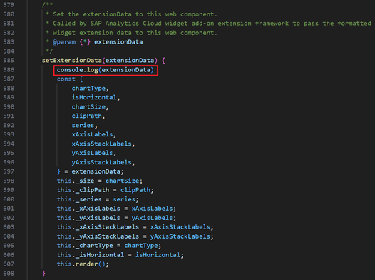
Next, let's focus on what information the setExtensionData function can get about the original chart. This function is at line 585 in the viz-plotarea.js file, and thanks to the addition of line 586, we can view the information we get about the original chart in the browser.
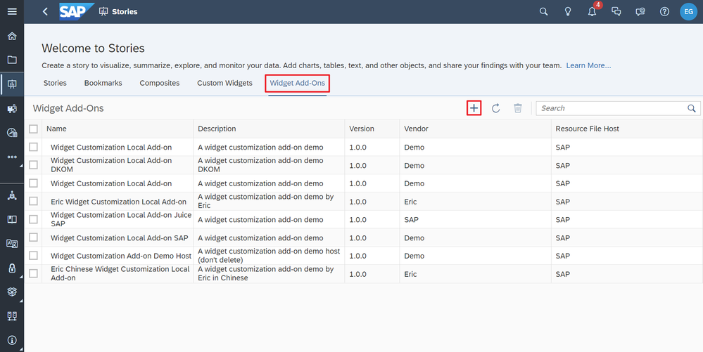
Let's start by uploading the sample package to SAP Analytics Cloud. Open the Story panel, select Widget Add-ons and click the Add button.
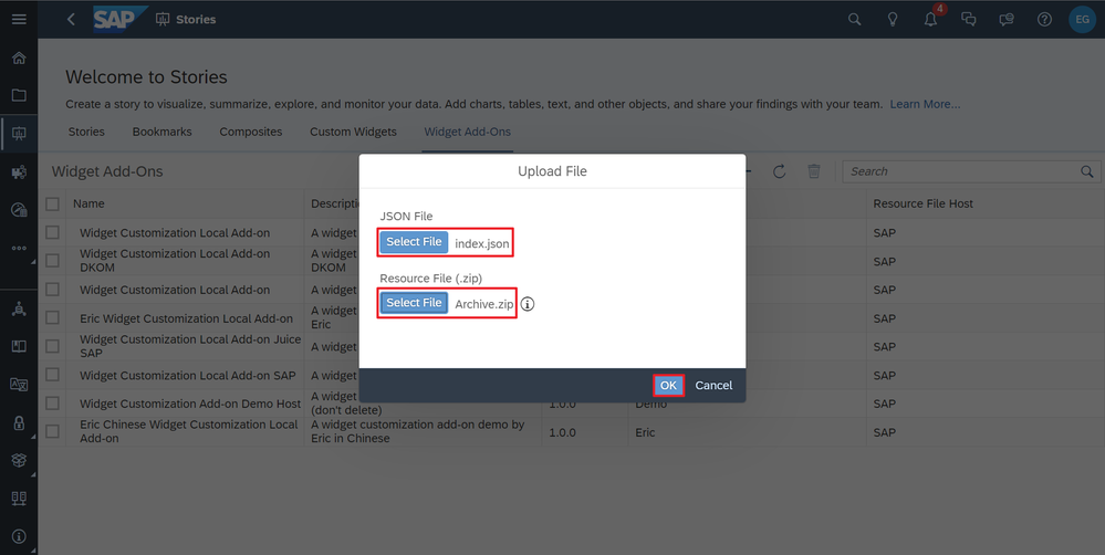
In the Upload File panel, select the index.json file in the sample package as the JSON file and the Archive.zip file in the sample package as the resource file. This zip file is actually packaged from the four JavaScript files in the sample package. Click OK so that the widget add-on is uploaded.
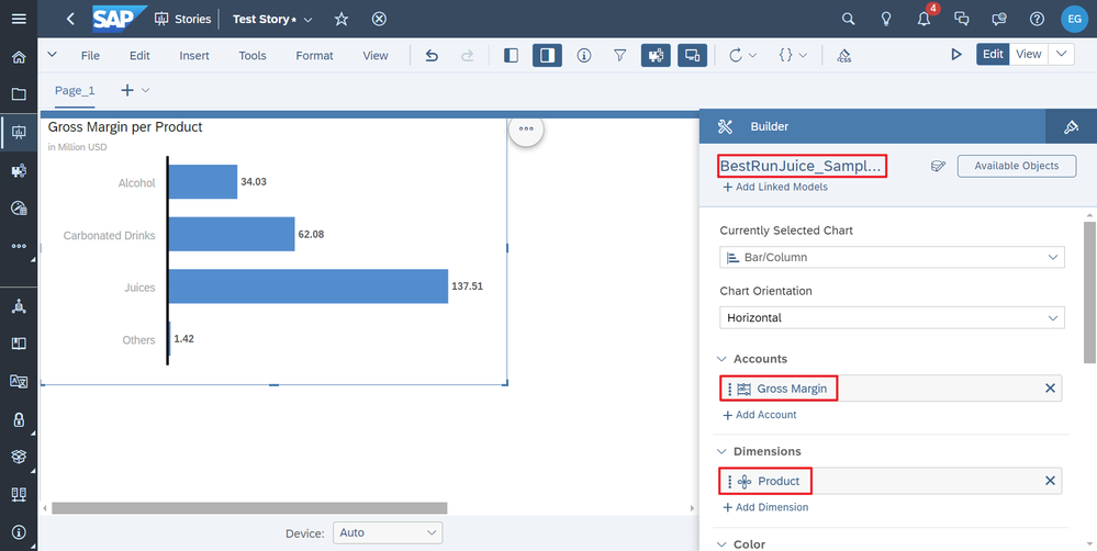
Next, we create a new Optimized Experience Story. Insert a bar chart, select a sample model, and set up the accounts and dimensions.
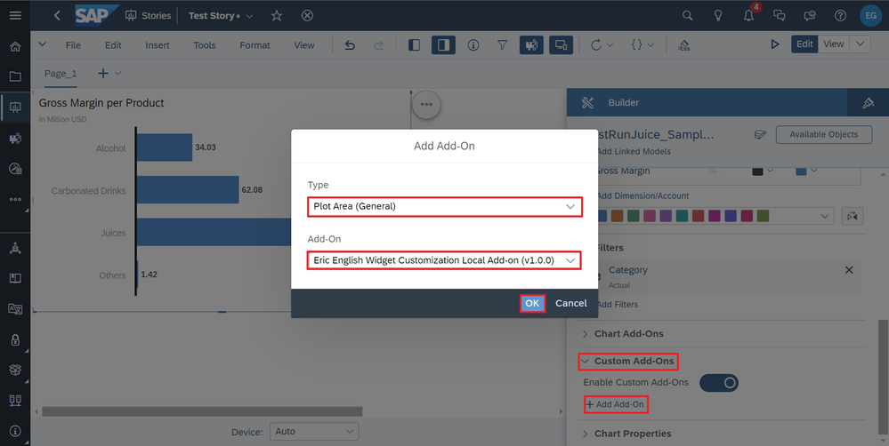
In the Custom Add-ons section click the Add Add-on button, select Type as Plot Area (General) and select the add-on we just uploaded.
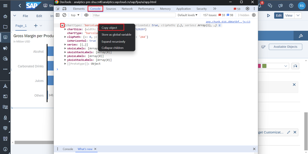
Finally, open the browser's developer tools. In the Console panel, we can see an Object printed out, right-click to copy it and paste it in the code editor. Through these steps we can get the information of the original chart.
We can get the type and size of the original chart, the axis’s position and length, and the position, length, width, color, and content of each data point, data label, and axis label of each series on the chart, these are all the information we can get about the original chart, and the widget add-on is re-rendering the chart on the basis of these information.
Code
In this section, I will combine the sample package and specific code to introduce how each function of the plot area (general) type of add-on is implemented. The plot area (numeric point) type of add-on has fewer and simpler functions, so I won't go into details.
Rounded Data Marker
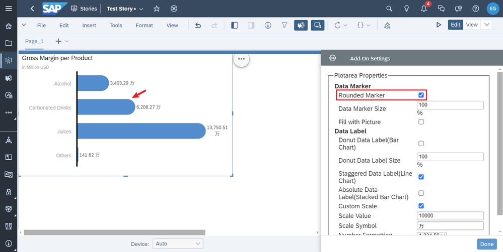
The first is "Rounded Data Marker", which can be turned on or off in the Settings panel. When it is turned on, it will make the rectangular section of the original bar chart become rounded.
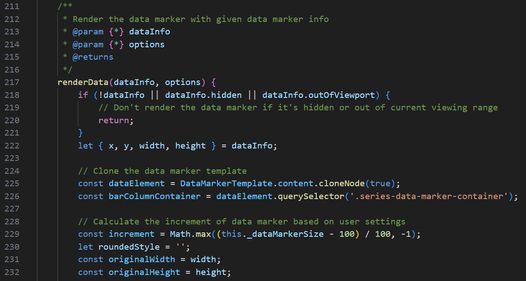
This part is implemented in the renderData function in viz-plotarea.js, the main source file of the plot area (general) type of add-on. It is responsible for the rendering of the data marker.
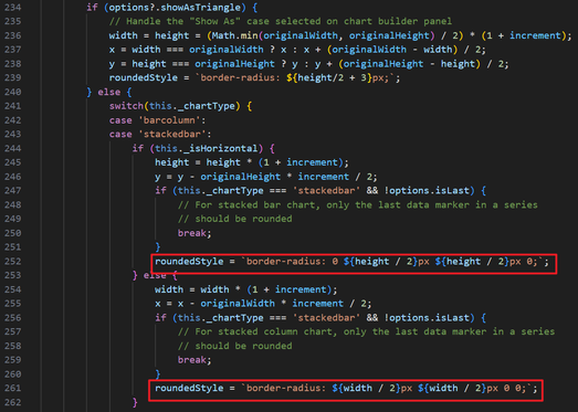
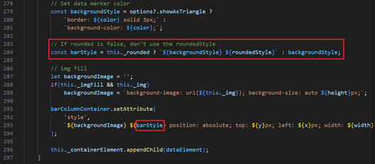
The main steps are calculating the number of degrees of rounded corners based on the original chart type and column width, saving it as a css string, deciding whether to use this css string or not based on the value of the set option "this._rounded" (boolean), and then adding it to the element's attributes using the setAttribute function.
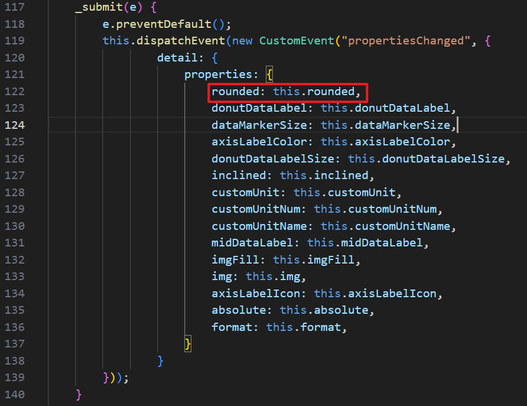
The value of "this._rounded" is controlled by the settings panel. To inplement it, we need to add the relevant code in three files. First is the settings panel source file viz-plotarea-builder-panel.js, in which the html code for the option checkbox is written.
Add a listener for it to trigger an event when the state of the checkbox changes, passing the updated value to the system.
Also add set and get functions to get and modify the state of the item in the settings panel.
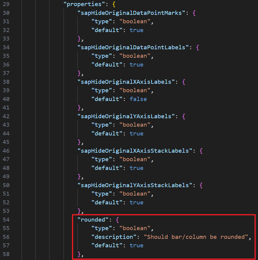
Then there is the file index.json, in which you need to declare this item in the "properties" property so that the system can recognize it, and you can set a default value in the "default" property.
Finally, the main source file viz-plotarea.js, you need to add the set function, the set function will use the value passed by the system to modify the "this._rounded" within this file, and then call the render function to render the entire chart, so as to implement the add-on’s functionality.
This set of logic for controlling the switching of some of the add-on's functions through the settings panel is similar for each of the add-on's functions and will not be repeated afterwards.
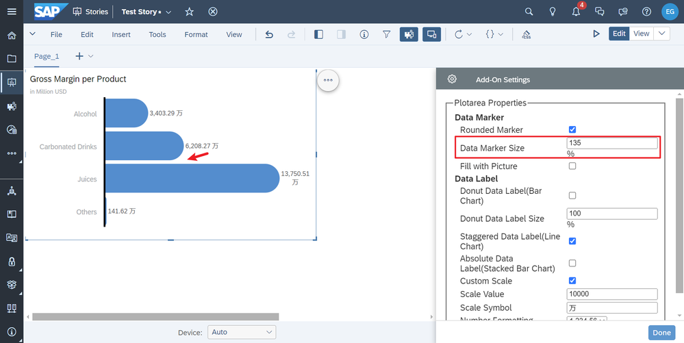
Data Marker Size
Next, let's take a look at " Data Marker Size". This item modifies the width of the bars on the chart, which also affects the spacing between the bars.
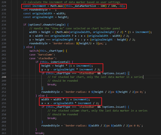
This part is also implemented in the renderData function in the main source file viz-plotarea.js. The increment is calculated from the "_dataMarkerSize" passed by the settings panel, and then the width and x or y coordinates of the column are modified according to the direction of the column and the increment.
Finally set it to the style attribute of the element.
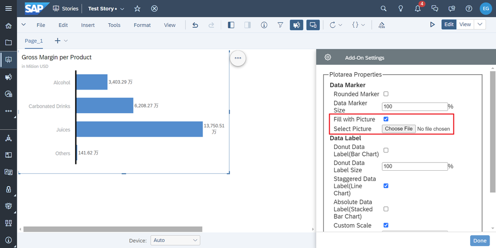
Fill with Picture
Next we will look at "Picture Fill". This item allows you to select a picture in the settings panel and fill the column with a stack of pictures. Steps are as follows: After checking Picture Fill, the file selector will appear, click to select a picture.
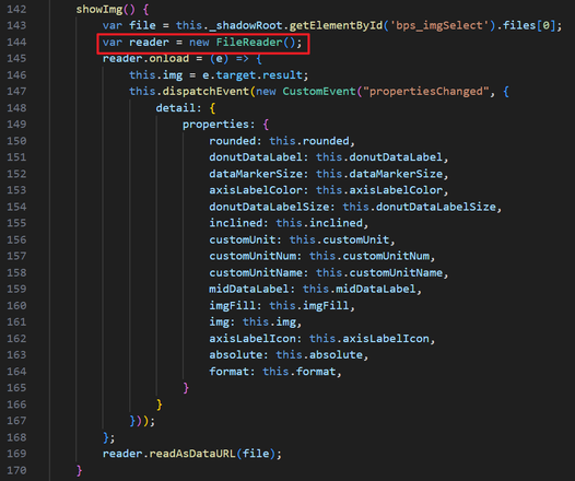
In this part, I save the image file in index.json by converting it to a base64 encoded string. The conversion process is implemented in the settings panel source file viz-plotarea-builder-panel.js, utilizing the FileReader class provided by the browser.
Also note that when declared in index.json, the type needs to be set to "String" accordingly.
Finally, in the main source file viz-plotarea.js, in the renderData function, use the css syntax to set the base64 encoding of the image to the "background-image" attribute of the element style. Note that, here by modifying the syntax of css, you can also modify the direction of the image stacking, or to achieve the picture of the stretched fill, this article will not be elaborated in detail.
Donut Data Label
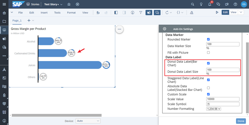
Next, let's take a look at the "Donut Data Label", which is currently only available for bar charts. When you turn it on in the Settings panel, the data label on the chart will become a donut showing its percentage of the total, and you can also resize it in the Settings panel.
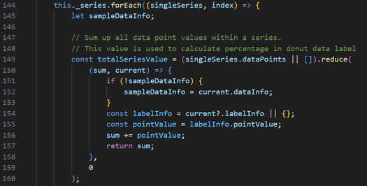
This part is implemented in the renderLabel function in the main source file viz-plotarea.js. Before that, the total value of each series needs to be calculated using the reduce function.
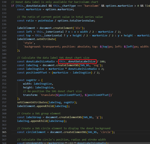
Next, draw a svg donut. The process is more complicated and it is in viz-plotarea.js lines 330 to 438, which will not be explained in detail. In the process of it, by using "this._donutDataLabelSize", you can implement the svg’s size settings.
Custom Scale
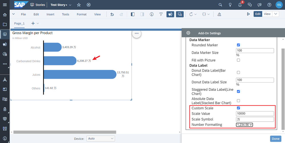
Next, let's take a look at "Custom Scale". This item can be configured in the settings panel so that the data labels on the chart are displayed in the configured scale.
This part is also implemented in the renderLabel function in the main source file viz-plotarea.js. The implementation method is relatively simple. The original value of the label is divided by the "Scale Value". Add the "Scale Symbol". Using toLocaleString function to change its formatting at last.
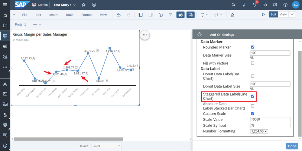
Staggered Data Label
Finally, let's take a look at " Staggered Data Label". This item is only available for line charts, so you need to change the chart type, and change the dimensions of one member for a better presentation. When this item is turned on, the data labels’ location of the line chart will alternate from one to the other, to prevent overlapping labels.
This part is also implemented in the renderLabel function in the main source file viz-plotarea.js. The implementation method is also very simple. Add some of the vertical position of the data labels at intervals, so that the original default data labels which are above the data point can now move to be below the data point at intervals.
Thoughts Sharing
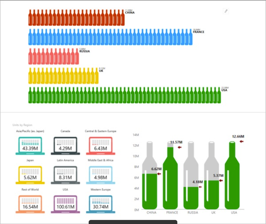
After studying the official documentation and actually developing add-ons, I believe that Widget Add-on is powerful due to the ability to overwrite the original chart and re-render it. This provides full freedom as it is possible to add as much content as you want as long as the content is supported by the browser, such as the image fills and svg graphics mentioned above. But there is also a major limitation to the functionality of Widget Add-on. The information that can be obtained about the original chart is very limited. The effects that developers want to achieve are ultimately dependent on the original information, which means that some additional complex logic may need to be added in order to achieve the effect. I think the simplest application of the add-on would be to change some font style colors of the original chart or add some custom icons to the labels. These features are not officially available as part of the sample package, but are reflected in the code of the source files. According to the survey, users have more needs for data labels, readers can consider how to use Widget Add-on to better solve the problem of anti-obscuring labels for line charts or bar charts and the problem of customizing styles for labels. You can also try to develop add-ons that make the style of charts cooler, refer to the following figure.
Conclusion
Thank you for reading this. If there are mistakes above, please bear with me. Feel free to leave comments to exchange insights. The functionality of this sample package is still very imperfect. We share it and aims to provide a way of thinking for all developers. I sincerely hope that all developers can learn from this article and develop powerful widget add-ons which meet various needs.
This sample package is for learning and communication only, not for production use. It is critical that you check and thoroughly read the licenses of any third-party libraries that may be used in it before using it. By using the examples in this repository, you confirm that you understand and agree to abide by all the terms and conditions set forth in those licenses. Please use this resource pack responsibly and any use of this resource pack will be at your own risk.
- SAP Managed Tags:
- SAP Analytics Cloud,
- SAP Analytics Cloud, analytics designer
You must be a registered user to add a comment. If you've already registered, sign in. Otherwise, register and sign in.
-
ABAP CDS Views - CDC (Change Data Capture)
2 -
AI
1 -
Analyze Workload Data
1 -
BTP
1 -
Business and IT Integration
2 -
Business application stu
1 -
Business Technology Platform
1 -
Business Trends
1,658 -
Business Trends
93 -
CAP
1 -
cf
1 -
Cloud Foundry
1 -
Confluent
1 -
Customer COE Basics and Fundamentals
1 -
Customer COE Latest and Greatest
3 -
Customer Data Browser app
1 -
Data Analysis Tool
1 -
data migration
1 -
data transfer
1 -
Datasphere
2 -
Event Information
1,400 -
Event Information
67 -
Expert
1 -
Expert Insights
177 -
Expert Insights
301 -
General
1 -
Google cloud
1 -
Google Next'24
1 -
GraphQL
1 -
Kafka
1 -
Life at SAP
780 -
Life at SAP
13 -
Migrate your Data App
1 -
MTA
1 -
Network Performance Analysis
1 -
NodeJS
1 -
PDF
1 -
POC
1 -
Product Updates
4,577 -
Product Updates
346 -
Replication Flow
1 -
REST API
1 -
RisewithSAP
1 -
SAP BTP
1 -
SAP BTP Cloud Foundry
1 -
SAP Cloud ALM
1 -
SAP Cloud Application Programming Model
1 -
SAP Datasphere
2 -
SAP S4HANA Cloud
1 -
SAP S4HANA Migration Cockpit
1 -
Technology Updates
6,873 -
Technology Updates
429 -
Workload Fluctuations
1
- Sapphire 2024 user experience and application development sessions in Technology Blogs by SAP
- Quick & Easy Datasphere - When to use Data Flow, Transformation Flow, SQL View? in Technology Blogs by Members
- Govern SAP APIs living in various API Management gateways in a single place with Azure API Center in Technology Blogs by Members
- 5 Easy apps that can be created right away using Joule AI Assistant in Technology Blogs by SAP
- Supporting Multiple API Gateways with SAP API Management – using Azure API Management as example in Technology Blogs by SAP
| User | Count |
|---|---|
| 33 | |
| 17 | |
| 15 | |
| 13 | |
| 11 | |
| 9 | |
| 8 | |
| 8 | |
| 8 | |
| 7 |


