
- SAP Community
- Products and Technology
- Technology
- Technology Blogs by Members
- SAP Fiori Overview Page - Beginner Guide
Technology Blogs by Members
Explore a vibrant mix of technical expertise, industry insights, and tech buzz in member blogs covering SAP products, technology, and events. Get in the mix!
Turn on suggestions
Auto-suggest helps you quickly narrow down your search results by suggesting possible matches as you type.
Showing results for
former_member68
Explorer
Options
- Subscribe to RSS Feed
- Mark as New
- Mark as Read
- Bookmark
- Subscribe
- Printer Friendly Page
- Report Inappropriate Content
07-31-2020
10:36 AM
Background
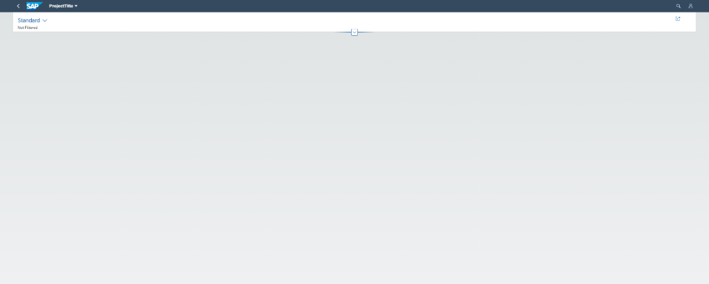
In this post, we will discuss some useful information we learned while making an Overview Page Application and provide beginner level instructions on how to start an SAP Fiori Overview Page project like the one pictured below. We will discuss common problems faced during the process, and the solutions which may be otherwise difficult to discover. I worked on this project with my colleague Jarrod Lane
(In the proceeding examples, live ID numbers have been censored for privacy)
1. Creating a New Project
Once you are logged into the SAP WebIDE, you can create a new project from a project template, start with a sample application, or import an existing project from git or your local file system. The sample application has a pre-built overview page you can use to gain insights into how the cards work, annotation structure requirements and so on. We began our first Overview Page development using the sample application and trying to add the cards we wanted to it, for practise.
Note: The WebIDE has inbuilt git functionality, but we have found it to be finicky at best, and we recommend avoiding it whenever possible, instead we used a git-bash command line on our local computers.

For now, we will open a new project from a project template, however when making your Overview Page, it helps to have a Sample Application project in your project workspace as well as your actual project.
You will need to select the Overview Page template, which can be found under the Category “SAP Fiori Elements”.

The namespace you select will later dictate the prefix of your data entities as they appear to the WebIDE, so we will call our namespace NameSpace, so you can see how it affects the metadata.xml file later.

To set up the project’s OData connection, you will need your account authorised to access your backend data service gateway (assuming you already have a backend data source).

Select your system from the Service Catalogue and then scroll down the list of options to find the service which contains your data that will be displayed on the Overview Page.

At this point you will be asked to select an annotation file for your project. If you do not have one already, you can create one later, as shown in section 3: Annotations.
Then, under Template Customisation, you will need to decide an alias for your data source. This alias will be used as a name for your database when you reference Entities and EntitySets.

The line reading “EntityType for Filter” defines a global filter for your Overview Page. This is a filter bar at the top of the application that filters the data that goes to every card on the page. If only one of your Entity types needs filter capability, then you can select that Entity. If multiple Entity types need to be filtered, then you may want to have a dedicated Entity type whose fields describe which Entity properties can be filtered, as pictured below.

If you do not yet have an Entity type for filters, then you can leave the EntityType for Filter blank, and after the Entity type for filter has been created, add a reference to it in you manifest.json file, next to “globalFilterEntityType”.

Some extra work will need to be done on the backend before the filter works, detailed in section 4: Global Filtering.
2. Creating a Card
SAP Overview pages display information in the form of SAP Cards. These take various forms, such as tables, graphs, lists, and contact cards. Adding a card can be done by writing code into the manifest.json file itself, or by using the WebIDE’s Add Card wizard. For the purposes of this blog, cards will be added using the wizard, and the resulting manifest.json file changes will be explained.
Note: Analytical Cards cannot be created using the wizard however, and the method for creating them will be included in the appendix.
Either right click your desired project, or with the same project selected open the File menu, then navigate to the New option and select Card.
From here, the card creation wizard will open and the first option you will have to decide upon is what type of card to select. In this example, a simple Table card will be created.

Next, a data source must be selected. Generally, the default option is likely to be the one you want, as it will be the data source set up with the project.

The next tab is where most of the important details of the card are filled out. Here you decide which data the card is going to be working with from your dataset, as well as setting its title, subtitle and so on. Most of the options in this tab are discussed in the annotations section below and can be added manually without the wizard, so it’s fine to leave them blank for now.

Next you have the option to set a default size for your card, this is mostly for aesthetics and can be edited later regardless. If you select Disable Resizing, then users will not be able to alter the size of the card when running the application.

After this, the final tab simply asks you to select Finish and assuming the previous steps have been done correctly your card will be created. This can be checked in the manifest.json, and assuming this is your first card, it will look as follows:
"sap.ovp": {

    "globalFilterModel": "Alias",

    "globalFilterEntityType": "OVPFilter",

    "containerLayout": "resizable",

    "enableLiveFilter": false,

    "considerAnalyticalParameters": false,

    "cards": {

        "card00": {

            "model": "Alias",

            "template": "sap.ovp.cards.table",

            "settings": {

                "title": "{{card00_title}}",

                "subTitle": "{{card00_subTitle}}",

                "entitySet": "OrdersStats",

                "sortBy": "EquipmentNumber",

                "sortOrder" "ascending",

                "addODataSelect": false

            }

        }

    }

}
If this is not your first card, then it will appear at the bottom of the list of cards. Cards can be added by typing directly into manifest.json in this same fashion.
So, when the project is run now, we see the following:
The card currently doesn’t display in the application, and the reason is simply that SAP doesn’t know what data from your data entity you want it to display. If you click around on the page, you’ll likely highlight the outline of the card, revealing that it is there but currently invisible. In order to make the card truly work, the annotations for the card must be correctly created/modified.
3. Annotations
Annotations functionally tell your application what data to display in your cards. Annotations are in xml form in the application but can be edited using a simpler editor that SAP provides. If you didn’t already have an annotations file for your project, simply right click on your webapp folder in your project and under New select Annotation File. Here you can select a name for the file, and the appropriate data source, which should default to the one you want.

For this example, the annotation file has simply been named annotation.xml. Upon opening your new annotation file, you should see something like this:
<edmx:Edmx xmlns:edmx="http://docs.oasis-open.org/odata/ns/edmx" Version="4.0">

	<edmx:Reference Uri="/sap/opu/odata/sap/ZREPAIR_PROCESSING_SRV/$metadata"/>

	<edmx:DataServices>

		<Schema xmlns="http://docs.oasis-open.org/odata/ns/edm"/>

	</edmx:DataServices>

</edmx:Edmx>
Here you can type directly into the file to create annotations, using examples found on SAP blogs and other sources, or you can select the Annotation Modeller option in the bottom left corner of the editor.
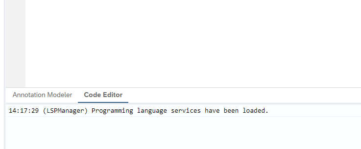
The screen should change to look similar to the image below:

So, from here annotations can be added much more simply than writing them yourself. Clicking Select Targets will open a menu of all your data source’s data entity types. In this example, since the card created in section 2 was targeting Order Stats, that is going to be selected.

And so now the table on the annotation modeller page should look something like this:

From here, selecting the + on the right side of the screen allows you to add annotations for a data entity type. There are many options for annotations, each one has a purpose for certain types of cards. Important types of annotations for the available cards will be discussed further below.
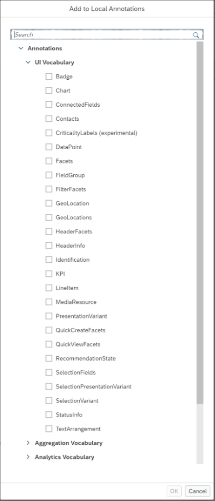
For the purpose of our simple Table card, we only need to select LineItem hit OK. Next, click the + on the row where your new LineItem has been added, and a new list of annotation options will appear. Again, each of these serves its own purpose, but in this case all we need to add is a basic DataField.

Your DataField annotation should appear like this:
Clicking the dropdown on Property opens a list of the data types within the selected entity (OrderStats in this example). Select whichever one you want to be displayed in your Table card created in part 2. From here you can add multiple DataField entries in the same way the first was added, resulting in something like this:

Make sure to save your changes and now when you run your project, your first card should appear with data being displayed.

From this point on in this section, details about specific annotation types will be explained.
Some of the annotations you need can be written using information easily found on the SAP blog forums, but some information of specific annotations is not easily found. These difficult annotations are explained here.
Selection Variant
The selection variant pre-filters the data that goes to a particular card, overriding the global filter. For example, when first making a stack card showing information on our Order class, we found that our database had too many Orders recorded and if we try to read all of them, then the OverView Page times out and crashes, so the data must be filtered before the card is displayed.
<Annotations Target="Metadata.Order">

    <Annotation Term="UI.SelectionVariant" Qualifier="Filter2">

        <Record Type="UI.SelectionVariantType">

            <PropertyValue Property="SelectOptions">

                <Collection>

                    <Record Type="UI.SelectOptionType">

                        <PropertyValue Property="PropertyName" PropertyPath="SystemStatus"/>

                        <PropertyValue Property="Ranges">

                            <Collection>

                                <Record Type="UI.SelectionRangeType">

                                    <PropertyValue Property="Sign" EnumMember="UI.SelectionRangeSignType/I"/>

                                    <PropertyValue Property="Option" EnumMember="UI.SelectionRangeOptionType/EQ"/>

                                    <PropertyValue Property="Low" String="REL"/>

                                </Record>

                            </Collection>

                        </PropertyValue>

                    </Record>

                    <Record Type="UI.SelectOptionType">

                        <PropertyValue Property="PropertyName" PropertyPath="Plant"/>

                        <PropertyValue Property="Ranges">

                            <Collection>

                                <Record Type="UI.SelectionRangeType">

                                    <PropertyValue Property="Sign" EnumMember="UI.SelectionRangeSignType/I"/>

                                    <PropertyValue Property="Option" EnumMember="UI.SelectionRangeOptionType/EQ"/>

                                    <PropertyValue Property="Low" String="8500"/>

                                </Record>

                            </Collection>

                        </PropertyValue>

                    </Record>

                </Collection>

            </PropertyValue>

        </Record>

    </Annotation>

</Annotations>
Here, we have 2 SelectOptionTypes. The first refers to our Order PropertyPath=”SystemStatus” which describes whether the Order is complete or not. The Property=”Low” describes the value that the data can take. In our database, the string REL is given to orders that have been released, but not completed, so if we want our stack card to show only those orders which are not yet completed, we give the String=”REL”.
The second select option refers to the Plant property of an Order. Here we want to display only the Orders that come from Plant 8500, so we dictate that each Order displayed must have the Plant property equal 8500.
Our selection variant is described for cards that are based on the EntityType ‘Order’. The Qualifer=”Filter2” identifies this selection variant, so when we want a card to be restricted by this filter, we need to give the card a reference to this filter in the card settings, found in the manifest.json.
"card01": {

    "model": "Alias",

    "template": "sap.ovp.cards.stack",

    "settings": {

        "title": "{{Open Work Orders, Plant 8500}}",

        "entitySet": "Orders",

        "addODataSelect": false,

        "selectionAnnotationPath": "com.sap.vocabularies.UI.v1.SelectionVariant#Filter2",

        "annotationPath": "com.sap.vocabularies.UI.v1.FieldGroup#Note/Data"

    }

},
After applying this Selection Variant to a Stack Card for Orders, we see that there are 3 open work orders from Plant 8500.
Stack Cards
Stack cards show detail information on up to 20 entries from a given entity set.


Firstly, the annotation for HeaderInfo, applies to all cards with a header, so this will also apply to the stack card. This defines the information that appears in the title of each Work Order card and the description, which appears directly underneath the header.
Below, we see the PropertyValue “TypeName” assigned the string “Work Order”. Then, the PropertyValue “Title” is assigned a DataField whose Value is given as “OrderNumber”. This causes the Header of each card to display Work Order: <Order Number>, and also causes the Order Number to appear as a title at the top of each card’s body.
<Annotation Term="UI.HeaderInfo">

    <Record Type="UI.HeaderInfoType" Qualifier="OpenWorkOrders">

        <PropertyValue Property="TypeName" String="Work Order"/>

        <PropertyValue Property="TypeNamePlural" String="Work Orders"/>

        <PropertyValue Property="Title">

            <Record Type="UI.DataField">

                <PropertyValue Property="Label" String="Order Number"/>

                <PropertyValue Property="Value" Path="OrderNumber"/>

            </Record>

        </PropertyValue>

        <PropertyValue Property="Description">

            <Record Type="UI.DataField">

                <PropertyValue Property="Label" String="Description"/>

                <PropertyValue Property="Value" Path="Description"/>

            </Record>

        </PropertyValue>

    </Record>

</Annotation>
The Header Description Property defined here causes the description of each order to appear directly below the title. This is what generates the lines “service 1”, “WARRANTY SERVICE SCHEDULE”, and “Test for Work+” in each respective card.
The rest of the information is a little trickier to display and requires a few extra steps. First, the data is described in a FieldGroup annotation. The annotation must be given a Qualifier for later, here we have given it the Qualifer “Note”.
<Annotation Term="com.sap.vocabularies.UI.v1.FieldGroup" Qualifier="Note">

    <Record Type="UI.FieldGroupType">

        <PropertyValue Property="Data">

            <Collection>

                <Record Type="UI.DataField">

                    <PropertyValue Property="Label" String="Order Type"/>

                    <PropertyValue Property="Value" Path="OrderType"/>

                </Record>

                <Record Type="UI.DataField">

                    <PropertyValue Property="Label" String="ActTypeDescription"/>

                    <PropertyValue Property="Value" Path="ActTypeDesc"/>

                </Record>

                <Record Type="UI.DataField">

                    <PropertyValue Property="Label" String="Work Centre"/>

                    <PropertyValue Property="Value" Path="WorkCentreId"/>

                </Record>

                <Record Type="UI.DataField">

                    <PropertyValue Property="Label" String="Equipment Number"/>

                    <PropertyValue Property="Value" Path="EquipmentNumber"/>

                </Record>

                <Record Type="UI.DataField">

                    <PropertyValue Property="Label" String="Vehicle Type"/>

                    <PropertyValue Property="Value" Path="VehicleType"/>

                </Record>

                <Record Type="UI.DataField">

                    <PropertyValue Property="Label" String="Manufacturer"/>

                    <PropertyValue Property="Value" Path="Manufacturer"/>

                </Record>

            </Collection>

        </PropertyValue>

    </Record>

</Annotation>
If you try to display the stack card with only these annotations, you will find that the body of the card is empty. Unfortunately, the FieldGroup annotation is not enough to display the body of the card. You need a Facet annotation which tells the Stack card to actually use the FieldGroup annotation.
<Annotation Term="UI.Facets">

    <Collection>

        <Record Type="UI.ReferenceFacet">

            <Annotation Term="UI.IsSummary"/>

            <PropertyValue Property="Label" String="Note"/>

            <PropertyValue Property="Target" AnnotationPath="@com.sap.vocabularies.UI.v1.FieldGroup#Note"/>

        </Record>

    </Collection>

</Annotation>
The PropertyValue “Label” is given the String “Note”, which is the same as the Qualifier we defined earlier, and the PropertyValue “Target” is given the AnnotationPath of the FieldGroup which describes our Stack card.
Finally, we return to this line of the card definition in manifest.json
"annotationPath": "com.sap.vocabularies.UI.v1.FieldGroup#Note/Data"
The Qualifier #Note points to our FieldGroup annotation, and specifically /Data is required to point to the section of the annotation which describes the body of the card, and is written under PropertyValue Property=”Data”.
List Card
The List Card is similar to the Table Card, but is slightly more complicated. It uses Line Items as well as a DataPoint in the annotations file to display data.

The first thing required is a DataPoint, which looks like the following:
<Annotations Target="Metadata.AssetStat">

    <Annotation Term="UI.DataPoint" Qualifier="CostAnno">

        <Record Type="UI.DataPointType">

            <PropertyValue Property="Value" Path="Cost"/>

            <PropertyValue Property="Criticality" EnumMember="UI.CriticalityType/Negative"/>

        </Record>

    </Annotation>

</Annotations>
Note, for this example the AssetStat data source has been used. It is also worth noting that the DataPoint has a qualifier of “CostAnno”. A qualifier is required for making a List Card, as will be explained below. Furthermore, the DataPointType element containing the Criticality property determines the colour of the List Card. In this case Negative was chosen, which is why the card elements are red. So the next required element is a LineItem.
<Annotation Term="UI.LineItem" Qualifier="Cost">
<Collection>
<Record Type="UI.DataField">
<PropertyValue Property="Value" Path="Assetclass"/>
<PropertyValue Property="Label" String="{@i18n>ASSET_CLASS}"/>
</Record>
<Record Type="UI.DataField">
<PropertyValue Property="Value" Path="Plant"/>
<PropertyValue Property="Label" String="{@i18n>STAT_NUM}"/>
</Record>
<Record Type="UI.DataFieldForAnnotation">
<PropertyValue Property="Target" AnnotationPath="@UI.DataPoint#CostAnno"/>
</Record>
<Record Type="UI.DataField">
<PropertyValue Property="Value" Path="StatMonth"/>
</Record>
<Record Type="UI.DataField">
<PropertyValue Property="Value" Path="OrderType"/>
</Record>
</Collection>
</Annotation>Similar to the Table Card, the Line Item is filled with DataFields. As you can see when comparing this to the completed card, the first two DataFields are the heading and description of each list element. The difference is the DataFieldForAnnotation record in this Line Item. Here, the annotation path must reference the DataPoint created above, this is what lets the List Card know which element is to fill the bar section for each list element.
Again, this annotation has a qualifier, this is only required if you plan on making multiple List Cards. In this case, all that is required is to add the annotationPath variable to the card definition in manifest.json as follows:
"card03": {

    "model": "Alias",

    "template": "sap.ovp.cards.list",

    "settings": {

        "title": "{{Worst Performing Assets by Cost}}",

        "entitySet": "AssetStats",

        "listType": "extended",

        "annotationPath": "com.sap.vocabularies.UI.v1.LineItem#Cost",

        "listFlavor": "bar",

        "sortBy": "Cost",

        "sortOrder": "descending",

        "addODataSelect": false,

        "defaultSpan": {

            "rows": 6,

            "cols": 2

        }

    }

},
At this point, the List Card is complete. As a side note, List Cards without the bar can be made, and as such the DataPoint and DataFieldForAnnotation would not be required. Furthermore, the List Card in this example is what is referred to as an Extended List Card, the other option is a Condensed List Card. The primary difference is that an Extended List Card can display more information in each list element, which has been shown in this example.
4. Global Filtering
Filtering in SAP Overview Page applications can be handled by a filter bar at the top of your application page. This filter bar can contain multiple fields and filters all applicable cards, ignoring those that the filter does not apply to. This section details how a filter bar can be applied, including any back end and annotation settings to be applied.
Setting up the Global Filter during the creation of the project is enough to have the filter bar appear at the top of your app. It does not, however, filter anything until a filter method is defined in your backend getEntitySet method. Below is a method we used to filter OrderStats by plant. This method is written in the getEntitySet method of our OrderStats class, and so it only filters cards that draw from the OrderStats class. Any other class that has a reference to ‘Plant’ will not be filtered until another filter method is written in their respective getEntitySet methods.
*Filter


    if it_filter_select_options is not initial.

      data lr_pl type range of werks_d.


      read table it_filter_select_options with key property = 'Plant'

       assigning field-symbol(<lsline>).

      if <lsline> is assigned.

        read table <lsline>-select_options index 1 assigning field-symbol(<lsop>).

        if <lsop> is assigned.

          append initial line to lr_pl assigning field-symbol(<lslr>).

          <lslr>-sign = <lsop>-sign.

          <lslr>-option = <lsop>-option.

          <lslr>-low = <lsop>-low.

        endif.

      endif.


      delete et_entityset where plant not in lr_pl.
What this is doing is – if filter select option have not been initialised, then create a set of data (called lr_pr, this is just a variable name), whose type is ‘werks_d’. werks_d is the ABAP data type of our Plant property. The data type for your property can found by opening the data model of your backend data source, and viewing the properties of your entity type you wish to be filtered.
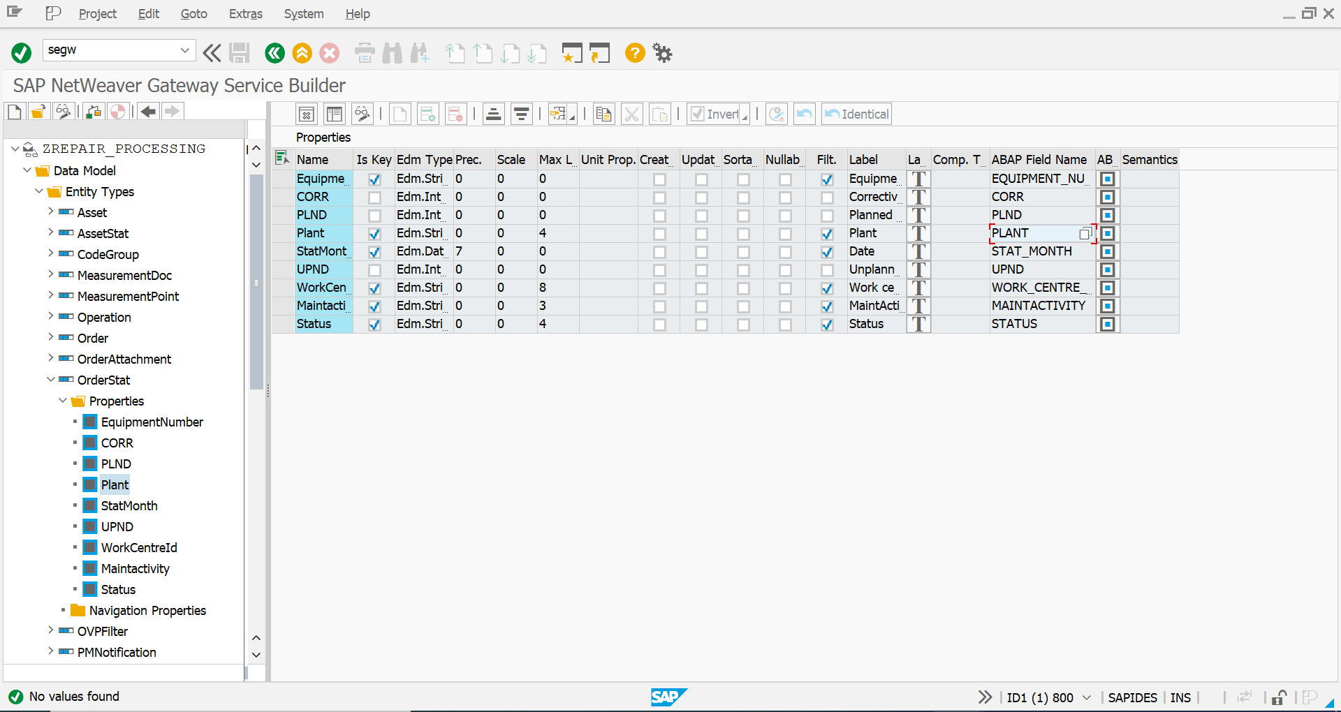
Click on the white square that appears next to the ABAP Field Name entry, and you will see this table, which describes your data fields. Here we see that the Plant property is of the type ‘werks_d’, so that is the type our filtered data set must take.

After creating the new data set named lr_pr, the function reads the filter select options for the key word ‘Plant’. If a filter option for Plant has been entered, then append the matching data to the data set lr_pr.
Finally, delete everything in et_entityset that doesn’t match the filtered data. This ensures that only data entries that fit the given criteria are sent to the cards.
Note: our getEntitySet method begins with this line
field-symbols: <ls_es> like line of et_entityset. Also note that whenever we filtered data, our app only showed the first data entry that matched the criteria and ignored every other tuple, forcing us to arrange our backend data source in such a way that all the information we needed to display could be found in one tuple. This filter method is a bit of a hack and may be the cause of this bug, so keep that in mind if you encounter the same problem.
Appendix
Creating an Analytical Card
Analytical Cards cannot be created using the Card Wizard and must instead be typed out manually in the manifest.json file. If you try to use the card wizard, you will find that you must select a KPI annotation path, but you will have no options from which to select.

You must have this code in your manifest.json, in the section that describes your cards:
"card03": {

    "model": "Alias",

    "template": "sap.ovp.cards.charts.analytical",

    "settings": {

        "itemText": "{{card00_itemText}}",

        "title": "{{Corrective Work Orders}}",

        "subTitle": "{{Corrective Work Orders}}",

        "category": "{{card00_category}}",

        "entitySet": "OrderStats",

        "chartAnnotationPath": "com.sap.vocabularies.UI.v1.Chart#CorrectiveWorkOrders",

        "selectionAnnotationPath": "com.sap.vocabularies.UI.v1.SelectionVariant#Filter",

        "dataPointAnnotationPath": "com.sap.vocabularies.UI.v1.DataPoint#CorrectiveWorkOrders"

    }

},
You may find that the variable text for the card title
“title”: “{{card00_title}}”,
Does not produce an actual title on your card, as you define it in the annotation file. If this is the case, you must hard-code the title as seen here in the manifest.json.
The annotation paths defined at the end point to the annotations you must write in your annotation file, with the identifier after the # matching the annotation qualifier.
The dataPointAnnotation is optional, if you need to display fields with special formatting, described here: https://help.sap.com/viewer/468a97775123488ab3345a0c48cadd8f/7.52.5/en-US/65731e6b823240398e33133908...
The selectionAnnotationPath is optional, if you need the card to be pre-filtered, overriding the global filter. The annotation for Selection Variants is discussed at the end of Section 3: Annotations.
The important line here is chartAnnotationPath, which must be included for the card to work. This points to the annotation for your Analytical Card. Here we have an annotation for a stacked column chart, which displays the number of Corrective Work Orders (CORR) raised by each Plant (Plant), in each month (StatMonth).
Note: The EntitySet from which this example chart is produced sends through a table, where each tuple represents a month and a plant – these are the keys of the table – and the CORR column contains a count of all the corrective work orders that have been raised by that plant in that month. During our project, when trying to make a card show specific data from that table using filters, we found that the OverView Page only displayed the first tuple in the table that met the criteria and ignored every other tuple that met the criteria. To get around this, we had to organise the backend data source in such a way that all the data we need can be displayed in a single tuple.
<Annotation Term="UI.Chart" Qualifier="CorrectiveWorkOrders">

    <Record Type="UI.ChartDefinitionType">

        <PropertyValue Property="ChartType" EnumMember="UI.ChartType/ColumnStacked"/>

        <PropertyValue Property="Title" String="Corrective Work Orders Raised / Month"/>

        <PropertyValue Property="MeasureAttributes">

            <Collection>

                <Record Type="UI.ChartMeasureAttributeType">

                    <PropertyValue Property="Measure" PropertyPath="CORR"/>

                        <PropertyValue Property="Role" EnumMember="UI.ChartMeasureRoleType/Axis1"/>

                </Record>

            </Collection>

        </PropertyValue>

        <PropertyValue Property="DimensionAttributes">

            <Collection>

                <Record Type="UI.ChartDimensionAttributeType">

                    <PropertyValue Property="Dimension" PropertyPath="Plant"/>

                    <PropertyValue Property="Role" EnumMember="UI.ChartDimensionRoleType/Series"/>

                </Record>

                <Record Type="UI.ChartDimensionAttributeType">

                    <PropertyValue Property="Dimension" PropertyPath="StatMonth"/>

                    <PropertyValue Property="Role" EnumMember="UI.ChartDimensionRoleType/Category"/>

                </Record>

            </Collection>

        </PropertyValue>

    </Record>

</Annotation>Under the ChartDefinitionType, in addition to the card’s ChartType and Title, you must also define MeasureAttributes and DimensionAttributes for your chart.
MeasureAttributes will be the Y-axis of a column chart. Here, we want to measure the number of Corrective Work Orders raised, which is recorded in our backend database as a number (the value of CORR is derived by the backend using database using SELECT COUNT statements, not described in this post).
DimensionAttributes describe the X-axis of a column chart and the stacks of each column. Here, the Category dimension role refers to the Month (the X-axis) and the Series dimension role refers to the Plant (the column stacks), so each column of the chart will display the number of corrective work orders raised by each plant in a particular month.

I hope this was helpful in creating an Overview Page with SAP Fiori.
- SAP Managed Tags:
- SAP Fiori,
- SAP Fiori Elements,
- SAPUI5
2 Comments
You must be a registered user to add a comment. If you've already registered, sign in. Otherwise, register and sign in.
Labels in this area
-
"automatische backups"
1 -
"regelmäßige sicherung"
1 -
"TypeScript" "Development" "FeedBack"
1 -
505 Technology Updates 53
1 -
ABAP
19 -
ABAP API
1 -
ABAP CDS Views
4 -
ABAP CDS Views - BW Extraction
1 -
ABAP CDS Views - CDC (Change Data Capture)
1 -
ABAP class
2 -
ABAP Cloud
3 -
ABAP DDIC CDS view
1 -
ABAP Development
5 -
ABAP in Eclipse
3 -
ABAP Platform Trial
1 -
ABAP Programming
2 -
abap technical
1 -
abapGit
1 -
absl
2 -
access data from SAP Datasphere directly from Snowflake
1 -
Access data from SAP datasphere to Qliksense
1 -
Accrual
1 -
action
1 -
adapter modules
1 -
Addon
1 -
Adobe Document Services
1 -
ADS
1 -
ADS Config
1 -
ADS with ABAP
1 -
ADS with Java
1 -
ADT
2 -
Advance Shipping and Receiving
1 -
Advanced Event Mesh
3 -
Advanced formula
1 -
AEM
1 -
AI
8 -
AI Launchpad
1 -
AI Projects
1 -
AIML
10 -
Alert in Sap analytical cloud
1 -
Amazon S3
1 -
Analytic Models
1 -
Analytical Dataset
1 -
Analytical Model
1 -
Analytics
1 -
Analyze Workload Data
1 -
annotations
1 -
API
1 -
API and Integration
4 -
API Call
2 -
API security
1 -
Application Architecture
1 -
Application Development
5 -
Application Development for SAP HANA Cloud
3 -
Applications and Business Processes (AP)
1 -
Architecture
1 -
Artificial Intelligence
1 -
Artificial Intelligence (AI)
5 -
Artificial Intelligence (AI) 1 Business Trends 363 Business Trends 8 Digital Transformation with Cloud ERP (DT) 1 Event Information 462 Event Information 15 Expert Insights 114 Expert Insights 76 Life at SAP 418 Life at SAP 1 Product Updates 4
1 -
Artificial Intelligence (AI) blockchain Data & Analytics
1 -
Artificial Intelligence (AI) blockchain Data & Analytics Intelligent Enterprise
1 -
Artificial Intelligence (AI) blockchain Data & Analytics Intelligent Enterprise Oil Gas IoT Exploration Production
1 -
Artificial Intelligence (AI) blockchain Data & Analytics Intelligent Enterprise sustainability responsibility esg social compliance cybersecurity risk
1 -
AS Java
1 -
ASE
1 -
ASR
2 -
Asset Management
2 -
Associations in CDS Views
1 -
ASUG
1 -
Attachments
1 -
Authentication
1 -
Authorisations
1 -
Authorizations
1 -
Automate the Interim Account Update rule using Integration Center Job (Time Off)
1 -
Automating Processes
1 -
Automation
2 -
aws
2 -
Azure
2 -
Azure AI Studio
1 -
Azure API Center
1 -
Azure API Management
1 -
B2B Integration
1 -
Background job
1 -
Backorder Processing
1 -
Backpropagation
1 -
Backup
1 -
Backup and Recovery
1 -
Backup schedule
1 -
BADI_MATERIAL_CHECK error message
1 -
Bank
1 -
Bank Communication Management
1 -
BAS
1 -
basis
2 -
Basis Monitoring & Tcodes with Key notes
2 -
Batch Management
1 -
BDC
1 -
Best Practice
1 -
BI
1 -
bitcoin
1 -
Blockchain
3 -
bodl
1 -
BOP in aATP
1 -
BOP Segments
1 -
BOP Strategies
1 -
BOP Variant
1 -
BPC
1 -
BPC LIVE
1 -
BTP
17 -
BTP AI Launchpad
1 -
BTP Destination
2 -
BTP for Sustainability
1 -
Business AI
1 -
Business and IT Integration
1 -
Business application stu
1 -
Business Application Studio
1 -
Business Architecture
1 -
Business Communication Services
1 -
Business Continuity
2 -
Business Data Fabric
3 -
Business Fabric
1 -
Business Partner
13 -
Business Partner Master Data
11 -
Business Technology Platform
2 -
Business Trends
4 -
BW4HANA
1 -
C4C cloud root certificate
1 -
CA
1 -
calculation view
1 -
CAP
5 -
CAP development
1 -
Capgemini
1 -
CAPM
1 -
Catalyst for Efficiency: Revolutionizing SAP Integration Suite with Artificial Intelligence (AI) and
1 -
CCMS
2 -
CDQ
13 -
CDS
2 -
CDS Views
1 -
Cental Finance
1 -
Certificates
1 -
CFL
1 -
Change Management
1 -
chatbot
1 -
chatgpt
3 -
CICD
1 -
CL_SALV_TABLE
2 -
Class Runner
1 -
Classrunner
1 -
Cloud ALM Monitoring
1 -
Cloud ALM Operations
1 -
cloud connector
1 -
Cloud Extensibility
1 -
Cloud Foundry
4 -
Cloud Integration
6 -
Cloud Platform Integration
2 -
cloudalm
1 -
communication
1 -
Compensation Information Management
1 -
Compensation Management
1 -
Compliance
1 -
Compound Employee API
1 -
Configuration
1 -
Connectors
1 -
Consolidation
1 -
Consolidation Extension for SAP Analytics Cloud
3 -
Control Indicators.
1 -
Controller-Service-Repository pattern
1 -
Conversion
1 -
Corrective Maintenance
1 -
Cosine similarity
1 -
CPI
2 -
cryptocurrency
1 -
CSI
1 -
ctms
1 -
Custom chatbot
3 -
Custom Destination Service
1 -
custom fields
1 -
Custom Headers
1 -
Customer Experience
1 -
Customer Journey
1 -
Customizing
1 -
cyber security
5 -
cybersecurity
1 -
Data
1 -
Data & Analytics
1 -
Data Aging
1 -
Data Analytics
2 -
Data and Analytics (DA)
1 -
Data Archiving
1 -
Data Back-up
1 -
Data Flow
1 -
Data Governance
5 -
Data Integration
2 -
Data Quality
13 -
Data Quality Management
13 -
Data Synchronization
1 -
data transfer
1 -
Data Unleashed
1 -
Data Value
9 -
Database
1 -
Database and Data Management
1 -
database tables
1 -
Databricks
1 -
Dataframe
1 -
Datasphere
4 -
Datasphere Delta
1 -
datenbanksicherung
1 -
dba cockpit
1 -
dbacockpit
1 -
Debugging
2 -
Defender
1 -
Delimiting Pay Components
1 -
Delta Integrations
1 -
Destination
3 -
Destination Service
1 -
Developer extensibility
1 -
Developing with SAP Integration Suite
1 -
Devops
1 -
digital transformation
1 -
Disaster Recovery
1 -
Documentation
1 -
Dot Product
1 -
DQM
1 -
dump database
1 -
dump transaction
1 -
e-Invoice
1 -
E4H Conversion
1 -
Eclipse ADT ABAP Development Tools
2 -
edoc
1 -
edocument
1 -
ELA
1 -
Embedded Consolidation
1 -
Embedding
1 -
Embeddings
1 -
Emergency Maintenance
1 -
Employee Central
1 -
Employee Central Payroll
1 -
Employee Central Time Off
1 -
Employee Information
1 -
Employee Rehires
1 -
Enable Now
1 -
Enable now manager
1 -
endpoint
1 -
Enhancement Request
1 -
Enterprise Architecture
2 -
Enterprise Asset Management
2 -
Entra
1 -
ESLint
1 -
ETL Business Analytics with SAP Signavio
1 -
Euclidean distance
1 -
Event Dates
1 -
Event Driven Architecture
1 -
Event Mesh
2 -
Event Reason
1 -
EventBasedIntegration
1 -
EWM
1 -
EWM Outbound configuration
1 -
EWM-TM-Integration
1 -
Existing Event Changes
1 -
Expand
1 -
Expert
2 -
Expert Insights
2 -
Exploits
1 -
Fiori
16 -
Fiori App Extension
2 -
Fiori Elements
2 -
Fiori Launchpad
2 -
Fiori SAPUI5
13 -
first-guidance
2 -
Flask
2 -
Fragment Forms
1 -
Fragment Forms using ABA[
1 -
FTC
1 -
Full Stack
9 -
Funds Management
1 -
gCTS
1 -
GenAI hub
1 -
General
3 -
Generative AI
1 -
Getting Started
1 -
GitHub
11 -
Google cloud
1 -
Grants Management
1 -
groovy
2 -
GTP
1 -
HANA
6 -
HANA Cloud
3 -
hana cloud database
1 -
Hana Cloud Database Integration
2 -
HANA DB
2 -
Hana Vector Engine
1 -
HANA XS Advanced
1 -
HanaDB
1 -
Historical Events
1 -
home labs
1 -
HowTo
1 -
HR Data Management
1 -
html5
9 -
HTML5 Application
1 -
Identity cards validation
1 -
idm
1 -
Implementation
1 -
Improvement Maintenance
1 -
Infuse AI
1 -
input parameter
1 -
instant payments
1 -
Integration
3 -
Integration Advisor
1 -
Integration Architecture
1 -
Integration Center
1 -
Integration Suite
1 -
intelligent enterprise
1 -
Internal Table
1 -
IoT
2 -
Java
1 -
Java Script
1 -
JMS Receiver channel ping issue
1 -
job
1 -
Job Information Changes
1 -
Job-Related Events
1 -
Job_Event_Information
1 -
joule
4 -
Journal Entries
1 -
Just Ask
1 -
Kafka
1 -
Kerberos for ABAP
10 -
Kerberos for JAVA
9 -
KNN
1 -
Launch Wizard
1 -
Learning Content
3 -
Life at SAP
4 -
lightning
1 -
Linear Regression SAP HANA Cloud
1 -
Live Sessions
1 -
Loading Indicator
1 -
local tax regulations
1 -
LP
1 -
Machine Learning
4 -
Marketing
1 -
Master Data
3 -
Master Data Management
15 -
Maxdb
2 -
MDG
1 -
MDGM
1 -
MDM
1 -
Message box.
1 -
Messages on RF Device
1 -
Microservices Architecture
1 -
Microsoft
1 -
Microsoft Universal Print
1 -
Middleware Solutions
1 -
Migration
5 -
ML Model Development
1 -
MLFlow
1 -
Modeling in SAP HANA Cloud
9 -
Monitoring
3 -
MPL
1 -
MTA
1 -
Multi-factor-authentication
1 -
Multi-Record Scenarios
1 -
Multilayer Perceptron
1 -
Multiple Event Triggers
1 -
Myself Transformation
1 -
Neo
1 -
NetWeaver
1 -
Neural Networks
1 -
New Event Creation
1 -
New Feature
1 -
Newcomer
1 -
NodeJS
3 -
ODATA
2 -
OData APIs
1 -
odatav2
1 -
ODATAV4
1 -
ODBC
1 -
ODBC Connection
1 -
Onpremise
1 -
open source
2 -
OpenAI API
1 -
Optimized Story Experience
1 -
Oracle
1 -
Overhead and Operational Maintenance
1 -
PaPM
1 -
PaPM Dynamic Data Copy through Writer function
1 -
PaPM Remote Call
1 -
Partner Built Foundation Model
1 -
PAS-C01
1 -
Pay Component Management
1 -
Personal story
1 -
PGP
1 -
Pickle
1 -
PLANNING ARCHITECTURE
1 -
Plant Maintenance
2 -
Popup in Sap analytical cloud
1 -
Postgresql
1 -
PostgrSQL
1 -
POSTMAN
1 -
Practice Systems
1 -
Prettier
1 -
Proactive Maintenance
1 -
Process Automation
2 -
Product Updates
6 -
Product Updates
1 -
PSE
1 -
PSM
1 -
Public Cloud
1 -
Python
5 -
python library - Document information extraction service
1 -
Qlik
1 -
Qualtrics
1 -
RAP
3 -
RAP BO
2 -
React
1 -
Reactive Maintenance
2 -
Record Deletion
1 -
Recovery
1 -
recurring payments
1 -
redeply
1 -
Release
1 -
Remote Consumption Model
1 -
Replication Flows
1 -
Report Malfunction
1 -
report painter
1 -
research
1 -
Research and Development Custom Widgets in SAP Analytics Cloud
1 -
Resilience
1 -
REST
1 -
REST API
1 -
Retagging Required
1 -
RFID
1 -
Risk
1 -
rolandkramer
3 -
Rolling Kernel Switch
1 -
route
1 -
Route determination
1 -
Router Non-XML condition
1 -
rules
1 -
S4 HANA
2 -
S4 HANA Cloud
2 -
S4 HANA On-Premise
3 -
S4HANA
6 -
S4HANA Cloud
1 -
S4HANA_OP_2023
2 -
SAC
11 -
SAC PLANNING
10 -
SAN
1 -
SAP
4 -
SAP ABAP
1 -
SAP Advanced Event Mesh
2 -
SAP AI Core
10 -
SAP AI Launchpad
9 -
SAP Analytic Cloud
1 -
SAP Analytic Cloud Compass
1 -
Sap Analytical Cloud
1 -
SAP Analytics Cloud
6 -
SAP Analytics Cloud for Consolidation
3 -
SAP Analytics cloud planning
1 -
SAP Analytics Cloud Story
1 -
SAP analytics clouds
1 -
SAP API Management
1 -
SAP Application Logging Service
1 -
SAP BAS
1 -
SAP Basis
6 -
SAP BO FC migration
1 -
SAP BODS
1 -
SAP BODS certification.
1 -
SAP BODS migration
1 -
SAP BPC migration
1 -
SAP BTP
25 -
SAP BTP Build Work Zone
2 -
SAP BTP Cloud Foundry
8 -
SAP BTP Costing
1 -
SAP BTP CTMS
1 -
SAP BTP Generative AI
1 -
SAP BTP Innovation
1 -
SAP BTP Migration Tool
1 -
SAP BTP SDK IOS
1 -
SAP BTPEA
1 -
SAP Build
12 -
SAP Build App
1 -
SAP Build apps
1 -
SAP Build CodeJam
1 -
SAP Build Process Automation
3 -
SAP Build work zone
11 -
SAP Business Objects Platform
1 -
SAP Business Technology
2 -
SAP Business Technology Platform (XP)
1 -
sap bw
1 -
SAP CAP
2 -
SAP CDC
1 -
SAP CDP
1 -
SAP CDS VIEW
1 -
SAP Certification
1 -
SAP Cloud ALM
4 -
SAP Cloud Application Programming Model
1 -
SAP Cloud Integration
1 -
SAP Cloud Integration for Data Services
1 -
SAP cloud platform
9 -
SAP Companion
1 -
SAP CPI
3 -
SAP CPI (Cloud Platform Integration)
2 -
SAP CPI Discover tab
1 -
sap credential store
1 -
SAP Customer Data Cloud
1 -
SAP Customer Data Platform
1 -
SAP Data Intelligence
1 -
SAP Data Migration in Retail Industry
1 -
SAP Data Services
1 -
SAP DATABASE
1 -
SAP Dataspher to Non SAP BI tools
1 -
SAP Datasphere
10 -
SAP DRC
1 -
SAP EWM
1 -
SAP Fiori
3 -
SAP Fiori App Embedding
1 -
Sap Fiori Extension Project Using BAS
1 -
SAP GRC
1 -
SAP HANA
1 -
SAP HANA PAL
1 -
SAP HANA Vector
1 -
SAP HCM (Human Capital Management)
1 -
SAP HR Solutions
1 -
SAP IDM
1 -
SAP Integration Suite
10 -
SAP Integrations
4 -
SAP iRPA
2 -
SAP LAGGING AND SLOW
1 -
SAP Learning Class
2 -
SAP Learning Hub
1 -
SAP Master Data
1 -
SAP Odata
3 -
SAP on Azure
2 -
SAP PAL
1 -
SAP PartnerEdge
1 -
sap partners
1 -
SAP Password Reset
1 -
SAP PO Migration
1 -
SAP Prepackaged Content
1 -
sap print
1 -
SAP Process Automation
2 -
SAP Process Integration
2 -
SAP Process Orchestration
1 -
SAP Router
1 -
SAP S4HANA
2 -
SAP S4HANA Cloud
3 -
SAP S4HANA Cloud for Finance
1 -
SAP S4HANA Cloud private edition
1 -
SAP Sandbox
1 -
SAP STMS
1 -
SAP successfactors
3 -
SAP SuccessFactors HXM Core
1 -
SAP Time
1 -
SAP TM
2 -
SAP Trading Partner Management
1 -
SAP UI5
1 -
SAP Upgrade
1 -
SAP Utilities
1 -
SAP-GUI
9 -
SAP_COM_0276
1 -
SAPBTP
1 -
SAPCPI
1 -
SAPEWM
1 -
sapfirstguidance
4 -
SAPHANAService
1 -
SAPIQ
2 -
sapmentors
1 -
saponaws
2 -
saprouter
1 -
SAPRouter installation
1 -
SAPS4HANA
1 -
SAPUI5
5 -
schedule
1 -
Script Operator
1 -
Secure Login Client Setup
9 -
security
11 -
Selenium Testing
1 -
Self Transformation
1 -
Self-Transformation
1 -
SEN
1 -
SEN Manager
1 -
Sender
1 -
service
2 -
SET_CELL_TYPE
1 -
SET_CELL_TYPE_COLUMN
1 -
SFTP scenario
2 -
Simplex
1 -
Single Sign On
9 -
Singlesource
1 -
SKLearn
1 -
Slow loading
1 -
SOAP
2 -
Software Development
1 -
SOLMAN
1 -
solman 7.2
2 -
Solution Manager
3 -
sp_dumpdb
1 -
sp_dumptrans
1 -
SQL
1 -
sql script
1 -
SSL
10 -
SSO
9 -
Story2
1 -
Substring function
1 -
SuccessFactors
1 -
SuccessFactors Platform
1 -
SuccessFactors Time Tracking
1 -
Sybase
1 -
Synthetic User Monitoring
1 -
system copy method
1 -
System owner
1 -
Table splitting
1 -
Tax Integration
1 -
Technical article
1 -
Technical articles
1 -
Technology Updates
15 -
Technology Updates
1 -
Technology_Updates
1 -
terraform
1 -
Testing
1 -
Threats
2 -
Time Collectors
1 -
Time Off
2 -
Time Sheet
1 -
Time Sheet SAP SuccessFactors Time Tracking
1 -
Tips and tricks
2 -
toggle button
1 -
Tools
1 -
Trainings & Certifications
1 -
Transformation Flow
1 -
Transport in SAP BODS
1 -
Transport Management
1 -
TypeScript
3 -
ui designer
1 -
unbind
1 -
Unified Customer Profile
1 -
UPB
1 -
Use of Parameters for Data Copy in PaPM
1 -
User Unlock
1 -
VA02
1 -
Validations
1 -
Vector Database
2 -
Vector Engine
1 -
Vectorization
1 -
Visual Studio Code
1 -
VSCode
2 -
VSCode extenions
1 -
Vulnerabilities
1 -
Web SDK
1 -
Webhook
1 -
work zone
1 -
workload
1 -
xsa
1 -
XSA Refresh
1
- « Previous
- Next »
Related Content
- Unlocking the Potential of Business AI: Engineering Best Practices in Technology Blogs by SAP
- How to Connect a Fieldglass System to SAP Start in Technology Blogs by SAP
- Setup Synthetic user Monitoring in SAP Cloud ALM with On-Prem Runner in Technology Blogs by Members
- First steps to work with SAP Cloud ALM Deployment scenario for SAP ABAP systems (7.40 or higher) in Technology Blogs by SAP
- Tracking HANA Machine Learning experiments with MLflow: A technical Deep Dive in Technology Blogs by SAP
Top kudoed authors
| User | Count |
|---|---|
| 6 | |
| 5 | |
| 5 | |
| 5 | |
| 4 | |
| 4 | |
| 3 | |
| 3 | |
| 3 | |
| 3 |