
- SAP Community
- Products and Technology
- CRM and Customer Experience
- CRM and CX Blogs by Members
- Overview of Design Dashboard and Its Functionality...
CRM and CX Blogs by Members
Find insights on SAP customer relationship management and customer experience products in blog posts from community members. Post your own perspective today!
Turn on suggestions
Auto-suggest helps you quickly narrow down your search results by suggesting possible matches as you type.
Showing results for
Swapna_Kushana
Explorer
Options
- Subscribe to RSS Feed
- Mark as New
- Mark as Read
- Bookmark
- Subscribe
- Printer Friendly Page
- Report Inappropriate Content
10-25-2023
6:46 PM
Hello!
Let us consider a scenario, where you want to monitor your system performance for every couple of hours with respect to average response time, average network time and average server time and you don’t want to navigate to multiple reports to do that. You want to have a place where you can display all the reports in a single place with a single click.
This can be achieved with the help of Design Dashboards functionality where it gives a single consolidated view of all the required reports.
Let’s now dive into the realm of Design Dashboards as we navigate through this blog.
Design Dashboards serve as a visual interface that consolidate and display important information in a clear and concise manner which helps for quick data analysis, monitoring key metrics and making informed decisions.
Here are some of the Key features of Design Dashboards -
As we are now aware of Design Dashboards and its functionality, let us see how to create a design dashboard in SAP C4C system.
Note: Make sure before you start with the design dashboard that- you have done below activity in the system, otherwise you will get an error when you try to open the work center for design dashboards.
Step1: Go to “Business Configuration” work center and “Implementation projects” view.
Step2: Click on “Open Activity List” at top Right.
Step3: Search for analytics and open “Administrator Analytics-settings” by clicking on the hyperlink.
Step4: Make sure that You have marked “Switch to Fiori Designer” as “Yes”.
Now, Let’s see the steps to create a dashboard.
Step 1: Go to “Business Analytics” work Centre and the “Design Dashboards” View.
Step 2: Click on “New” button at top right on the screen.
Step3: Enter the name for the Dashboard that you want to create.
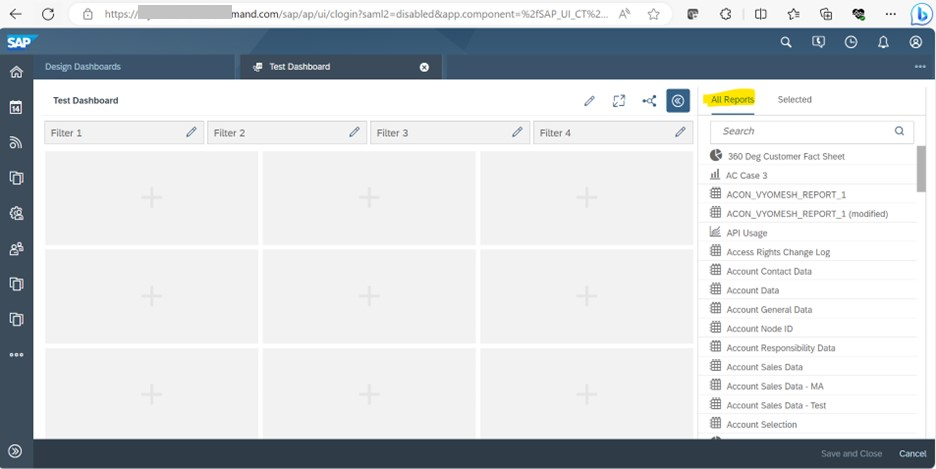
Step4: All the available report views will be displayed on the Right-hand side. Drag and drop the report that you want to use for your dashboard.
Step5: After dropping the report, choose from the available selections and click on “OK”.
It will now be displayed as shown below.
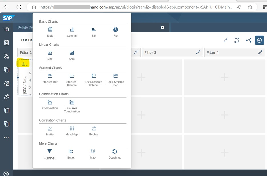
You can change the display type for the dashboard by clicking on the icon at top left (Options will be displayed on click of the icon) as shown below.
Step 6: Then, click on “save and close” button at the Right bottom. (Here, I have selected display type as table as it also shows values)
Now you can see your dashboard created under Design Dashboards view.
We can further edit our Dashboard to add multiple reports and to drill down.
1. To add more reports, select your dashboard and click on “Edit” option.
Drag and drop the report that you want to add to the dashboard, choose selection and click “OK”.
Again, we can change the view of the second report added in the dashboard by following the same steps as mentioned above.
Here, we have changed the second report display type also as Table Type.
Again, click on “Save and Close”.
Using Drill down option, we can add attributes and required fields that we want to show in the dashboard.
Step1: Open the dashboard by clicking on hyperlink.
Step 2: Click on Arrow Icon for drill down.
Under characteristics, we can select the field based on which we want to display the data.
Using Key figures, we can decide what all data we want to show in our dashboard.
Limitations that were observed in Design Dashboards:
1. You can select only 9 report views for a dashboard.
2. In SAP, when multiple business roles are selected for a user, the dashboard will display reports that are assigned to all of those selected roles. This means that only reports common to all selected roles will be shown in the dashboard. If there are no reports that are assigned to all selected business roles, the dashboard will appear empty.
Conclusion: Thus, Design Dashboards in SAP C4C are a convenient way to see and understand information in one place. They help users make better decisions based on visualized data. With easy-to-use interfaces and immediate access to important insights, these dashboards enable users to optimize their workflows and improve their overall performance. Ultimately, they enhance the efficiency and effectiveness of customer-focused processes in SAP C4C.
Thanks for Reading! Hope you found this blog helpful to understand the concept and creation of Design Dashboards better.
Regards,
Swapna Kushana
Let us consider a scenario, where you want to monitor your system performance for every couple of hours with respect to average response time, average network time and average server time and you don’t want to navigate to multiple reports to do that. You want to have a place where you can display all the reports in a single place with a single click.
This can be achieved with the help of Design Dashboards functionality where it gives a single consolidated view of all the required reports.
Let’s now dive into the realm of Design Dashboards as we navigate through this blog.
Design Dashboards serve as a visual interface that consolidate and display important information in a clear and concise manner which helps for quick data analysis, monitoring key metrics and making informed decisions.
Here are some of the Key features of Design Dashboards -
- Design Dashboards provide a comprehensive view of data on a single screen.
- They allow for easy comparison and display changes in data with precise figures.
- Access to design dashboards can be controlled through authorization settings.
- Connections can be created between reports within the dashboard for interactive filtering.
- Layouts, color schemes, and styles can be customized.
- Users can interact with dashboards by filtering data, drilling down into details, and highlighting specific points.
- Design dashboards can connect to multiple data sources, databases, and APIs.
- Data can be exported, and reports can be generated for further analysis.
As we are now aware of Design Dashboards and its functionality, let us see how to create a design dashboard in SAP C4C system.
Note: Make sure before you start with the design dashboard that- you have done below activity in the system, otherwise you will get an error when you try to open the work center for design dashboards.
Step1: Go to “Business Configuration” work center and “Implementation projects” view.

Step2: Click on “Open Activity List” at top Right.

Step3: Search for analytics and open “Administrator Analytics-settings” by clicking on the hyperlink.

Step4: Make sure that You have marked “Switch to Fiori Designer” as “Yes”.

Now, Let’s see the steps to create a dashboard.
Step 1: Go to “Business Analytics” work Centre and the “Design Dashboards” View.

Step 2: Click on “New” button at top right on the screen.

Step3: Enter the name for the Dashboard that you want to create.

Step4: All the available report views will be displayed on the Right-hand side. Drag and drop the report that you want to use for your dashboard.
Step5: After dropping the report, choose from the available selections and click on “OK”.

It will now be displayed as shown below.

You can change the display type for the dashboard by clicking on the icon at top left (Options will be displayed on click of the icon) as shown below.
Step 6: Then, click on “save and close” button at the Right bottom. (Here, I have selected display type as table as it also shows values)
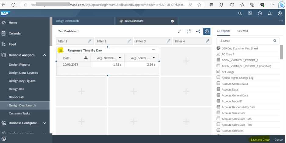
Now you can see your dashboard created under Design Dashboards view.

We can further edit our Dashboard to add multiple reports and to drill down.
1. To add more reports, select your dashboard and click on “Edit” option.

Drag and drop the report that you want to add to the dashboard, choose selection and click “OK”.

Again, we can change the view of the second report added in the dashboard by following the same steps as mentioned above.

Here, we have changed the second report display type also as Table Type.
Again, click on “Save and Close”.

Using Drill down option, we can add attributes and required fields that we want to show in the dashboard.
Step1: Open the dashboard by clicking on hyperlink.

Step 2: Click on Arrow Icon for drill down.

Under characteristics, we can select the field based on which we want to display the data.

Using Key figures, we can decide what all data we want to show in our dashboard.

Limitations that were observed in Design Dashboards:
1. You can select only 9 report views for a dashboard.
2. In SAP, when multiple business roles are selected for a user, the dashboard will display reports that are assigned to all of those selected roles. This means that only reports common to all selected roles will be shown in the dashboard. If there are no reports that are assigned to all selected business roles, the dashboard will appear empty.
Conclusion: Thus, Design Dashboards in SAP C4C are a convenient way to see and understand information in one place. They help users make better decisions based on visualized data. With easy-to-use interfaces and immediate access to important insights, these dashboards enable users to optimize their workflows and improve their overall performance. Ultimately, they enhance the efficiency and effectiveness of customer-focused processes in SAP C4C.
Thanks for Reading! Hope you found this blog helpful to understand the concept and creation of Design Dashboards better.
Regards,
Swapna Kushana
- SAP Managed Tags:
- SAP Service Cloud,
- C4C Analytics,
- C4C Service
You must be a registered user to add a comment. If you've already registered, sign in. Otherwise, register and sign in.
Labels in this area
-
ABAP
1 -
API Rules
1 -
c4c
1 -
CAP development
2 -
clean-core
2 -
CRM
1 -
Custom Key Metrics
1 -
Customer Data
1 -
Determination
1 -
Determinations
1 -
Introduction
1 -
KYMA
1 -
Kyma Functions
1 -
open SAP
1 -
RAP development
1 -
Sales and Service Cloud Version 2
1 -
Sales Cloud
1 -
Sales Cloud v2
1 -
SAP
1 -
SAP Community
1 -
SAP CPQ
1 -
SAP CRM Web UI
1 -
SAP Customer Data Cloud
1 -
SAP Customer Experience
1 -
SAP CX
2 -
SAP CX Cloud
1 -
SAP CX extensions
2 -
SAP Integration Suite
1 -
SAP Sales Cloud v1
2 -
SAP Sales Cloud v2
2 -
SAP Service Cloud
2 -
SAP Service Cloud v2
2 -
SAP Service Cloud Version 2
1 -
SAP Utilities
1 -
Service and Social ticket configuration
1 -
Service Cloud v2
1 -
side-by-side extensions
2 -
Ticket configuration in SAP C4C
1 -
Validation
1 -
Validations
1
Related Content
- Expert Live Session on SAP Sales Cloud Version 2 - June 10-12th 2024 in CRM and CX Blogs by SAP
- Don't miss the SAP Sales Cloud V2 Live session on June 10th '24 in CRM and CX Blogs by SAP
- Support Case vs Service Request – What's the difference? in CRM and CX Blogs by SAP
- SAP Commerce Cloud Q1 ‘24 Release Highlights in CRM and CX Blogs by SAP
- SAP Customer Checkout 2.0 Feature Pack 19 (Released on 26-MARCH-2024) in CRM and CX Blogs by SAP