- SAP Community
- Products and Technology
- Technology
- Technology Q&A
- Design Studio - Plot Time Measure On Y-Axis With L...
- Subscribe to RSS Feed
- Mark Question as New
- Mark Question as Read
- Bookmark
- Subscribe
- Printer Friendly Page
- Report Inappropriate Content
Design Studio - Plot Time Measure On Y-Axis With Line Chart
- Subscribe to RSS Feed
- Mark Question as New
- Mark Question as Read
- Bookmark
- Subscribe
- Printer Friendly Page
- Report Inappropriate Content
on 06-09-2017 8:12 PM
Hello Experts,
What I’m attempting to do is create a line chart that maps the time of day a particular batch job starts across a given date range. So the X-Axis is date, the Y-Axis is time (the data source has a 24 hour time format, but AM/PM would be fine too). I am loading a data source from a BEx query that provides the desired data. The name and date are attributes that function as expected. The time key figure (measure) however, loads as expected to the data source, it is displayed as expected in the crosstabs, but it will not plot on a chart. We are running Design Studio Release 1.6. Please advise if there is a way to get the time measure to plot as I am looking for it on this requirement as well as several others for our organization.
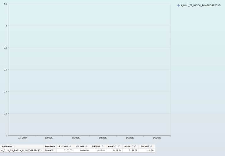
In the below screenshot you can see the default info chart (line chart) that Design Studio creates when loaded with the data source containing a Time key figure as the measure. You can see that by default it charts the date correctly along the X-Axis, but then puts decimals between 0 and 1.2 on the Y-Axis. My expectation would be the Y-Axis should contain a measure of time. Below the chart is a crosstab from the same data source as the chart so that you can see the data points that should be plotted. Notice NOTHING is plotted on the chart.
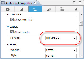
In the next screenshots you can see that I changed the format of the Y-Axis to force it into a time format to match the time format in the data source. It did format the Y-Axis as a 24 hour clock, but still nothing is plotted.

Below is a screenshot of the initial view of the data source. I have filtered the number of ‘job names’ and the date range just for the sake of a smaller dataset to present for example.

Finally, here’s an example of what I would expect the chart to look like. Or something similar to this (done in excel).

- SAP Managed Tags:
- SAP BusinessObjects Design Studio
Accepted Solutions (0)
Answers (1)
Answers (1)
- Mark as New
- Bookmark
- Subscribe
- Subscribe to RSS Feed
- Report Inappropriate Content
Hi Ian,
Thank you for taking the time to document the issue.
Only thing I could find is this thread https://answers.sap.com/questions/89325/how-to-display-seconds-in-timestamp-format-hhmmss.html where the conclusion was that Design Studio doesn't like the measure as a format. Web Intelligence seems OK with it (according to the thread) so perhaps that is an option?
You must be a registered user to add a comment. If you've already registered, sign in. Otherwise, register and sign in.
- Mark as New
- Bookmark
- Subscribe
- Subscribe to RSS Feed
- Report Inappropriate Content
Hi Tammy,
Thanks for the quick reply! In this particular case, the interactive dashboard capabilities from design studio are what we were looking for. So WebI probably won't do it. We may have to compromise though if Design Studio can't do it!
I opened a ticket with SAP support. So I'll update this thread if they come back with a way to achieve the desired results within Design Studio.
Thanks again,
Ian
- Mark as New
- Bookmark
- Subscribe
- Subscribe to RSS Feed
- Report Inappropriate Content
- Mark as New
- Bookmark
- Subscribe
- Subscribe to RSS Feed
- Report Inappropriate Content
SAP OSS responded with a particularly cryptic statement about changing my data model before citing the issue was consulting. And then they went on to recommend trying a bubble chart. Which is not applicable at all, which diminishes my confidence in their response a little bit as well...
See below. I'm not really sure what they mean by changing the data model. Any ideas?
Hello Ian,
My name is Gustavo Gabriel Gerhardt and I am
taking over this incident.
As I have analysed your data modelling, I
believe that by changing your data model, you will be able to achieve what you
want, however, I am not able to help you doing so since this is considered
consulting service and we are not allowed to provide that in Product Support
level.
Also, maybe a Bubble Chart will help you in this
task.
In case you want to hire consulting services
from SAP, please let me know and I will send you the contact details.
- Mark as New
- Bookmark
- Subscribe
- Subscribe to RSS Feed
- Report Inappropriate Content
Hi Ian,
By changing the data model, they are probably referring to how your time key figure has been defined in BW, as shown below, with regard to the Type/Data Type settings in particular:

Can you check how it has been configured in your system and we can then determine next steps based on that? Perhaps you could post a screenshot to confirm? At this stage my suspicion is that your data modelling is probably correct and that the problem is really a bug with the way the chart handles Time key figures but let us see.
Regards,
Mustafa.
- Mark as New
- Bookmark
- Subscribe
- Subscribe to RSS Feed
- Report Inappropriate Content

- Mark as New
- Bookmark
- Subscribe
- Subscribe to RSS Feed
- Report Inappropriate Content
Hi Ian,
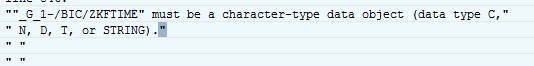
I think this has definitely shed some light on the issue. You will notice that the description of the TIMS Data Type indicates that the key figure value is "stored as char(6)". The chart will be expecting a measure to provide numeric values. I think it's likely that since the underlying key figure has been defined with a character data type, the chart cannot interpret it numerically and therefore treats the value as zero or null, hence the result you are experiencing.
I would definitely recommend that you change the data type of your Time key figure to DEC for testing purposes. Now, since your InfoCube already has data, I'm not sure if in this case you can simply change the data type on-the-fly. You might have to delete the data to make the change and reload, or you might have to create a new Time dimension with the DEC data type. You can try changing the data type directly first to see if you receive any warning messages.
If changing the data type to DEC still doesn't yield the desired result from the chart, I think you'll then have a good case to go back to SAP Support to suggest the issue is in fact a bug.
Let me know how you go.
Regards,
Mustafa.
- Mark as New
- Bookmark
- Subscribe
- Subscribe to RSS Feed
- Report Inappropriate Content
Mustafa,
Thank you!! This is still in our dev environment, and we created this key figure on the fly for the purposes of testing this very thing. So it shouldn't be a problem to reload the info cube. I'll give it a shot and update this thread with the results.
I really appreciate the continued community support!
Sincerely,
Ian
- Mark as New
- Bookmark
- Subscribe
- Subscribe to RSS Feed
- Report Inappropriate Content
- Mark as New
- Bookmark
- Subscribe
- Subscribe to RSS Feed
- Report Inappropriate Content
Hi Mustafa,
My apologies for the delayed response. I had some vacation time and then some other work priorities so this one got put on the back burner for a few days.
We did try to change the time key figure like you had suggested. However when we change it to type DEC, we get the below short dump every time we try to load data...
Also in the meantime, SAP did provide a more helpful update on my OSS ticket (pasted below). Based on that, it seems your speculation about the values needing to be numeric was right on point. We will work on finding a good way to convert the time format and give it another shot.
Hi Ian,
After many tests, I have found the solution for your case.
We know that the VALUE AXIS is numeric, right? Changing the format of the number shown there will change only the visual aspect of the number, but the number remains in the backgroung. When you put time data there, the application does not know how to adjust it into the screen, since chart background still numeric and is receiving a timestamp to be shown. Chart consider it as incompatible data.
Here is how we make it accept your data:
In the Chart VALUE AXIS, the number 1 represents 24 hours, 0 represents 0 hours. You should convert your HH:MM:SS from your query to a number, as below:
0 = 00:00:00
0.33333 = 08:00:00
0.5 = 12:00:00
1 = 00:00:00 (a complete day cycle)
How?
A day have 86400 seconds.
If you have a recorded time of 08:00:00, it will be 28800 seconds, right?
So, dividing 28800 by the total amount of seconds in a day will result in the number equivalent to the position.
28800 / 86400 = 0,3333333333333333
0,3333 will be understood as a position in the chart and the application will be able to handle it properly(and you can keep using hh:mm:ss format in chart).
- Mark as New
- Bookmark
- Subscribe
- Subscribe to RSS Feed
- Report Inappropriate Content
Hi Ian,
Thanks for the update. Good to see SAP came back with a constructive suggestion. Out of curiosity, I tried the approach. Here are my findings:
1) Creating a key figure of Type Time with DEC did not allow me to set decimal places, so when the data was loaded, the values were rounded to zero. Instead, I created a key figure of type Number with Floating Point (FLTP) and maximum decimal places. The test InfoCube looks like this:

2) The data source based on the BEx Query looks like this:

3) And the resulting InfoChart in SAPUI5 M Mode looks like this:

For some reason I didn't get the option to set the value axis label format to the time format HH:MM:SS, as in your original screenshot. Let me know if you have better luck.
Regards,
Mustafa.
- Mark as New
- Bookmark
- Subscribe
- Subscribe to RSS Feed
- Report Inappropriate Content


- Mark as New
- Bookmark
- Subscribe
- Subscribe to RSS Feed
- Report Inappropriate Content
Mustafa,
You're awesome! Thank you for giving this so much thought.
I'm probably going to have to table this issue for a little while as it has become a little more of a time sink than I had hoped. And other priorities are calling! I will come back and update this thread whenever we have the time to give it a little more attention though.
Thanks again for all your help...
Sincerely,
Ian
- SAC Story : Recent n Dates calculation in Technology Q&A
- How to create LLM based Chatbot for SAP HANA Cloud using RAG Application in Technology Blogs by SAP
- What’s New in SAP Datasphere Version 2024.9 — Apr 23, 2024 in Technology Blogs by Members
- HDI Artifact Recovery Wizard in Technology Blogs by SAP
- Sapphire 2024 user experience and application development sessions in Technology Blogs by SAP
| User | Count |
|---|---|
| 75 | |
| 9 | |
| 8 | |
| 7 | |
| 7 | |
| 6 | |
| 6 | |
| 6 | |
| 5 | |
| 4 |
You must be a registered user to add a comment. If you've already registered, sign in. Otherwise, register and sign in.