
- SAP Community
- Products and Technology
- Technology
- Technology Blogs by SAP
- Designing with Code (Part 3) – SAP Web Components
Technology Blogs by SAP
Learn how to extend and personalize SAP applications. Follow the SAP technology blog for insights into SAP BTP, ABAP, SAP Analytics Cloud, SAP HANA, and more.
Turn on suggestions
Auto-suggest helps you quickly narrow down your search results by suggesting possible matches as you type.
Showing results for
 Kai_Richter
Employee
Options
- Subscribe to RSS Feed
- Mark as New
- Mark as Read
- Bookmark
- Subscribe
- Printer Friendly Page
- Report Inappropriate Content
11-13-2023
6:24 AM

Our daily work is busy and usually there is a long list of tasks lining up: there are designs to be completed, discussions to be held, and reviews to be conducted, and so on...
...there is no time to take a step back and think.
Even if we know that some tasks could be done more efficiently, we often stick to the existing patterns because we lack the time to explore something different.
In the first part of this article series, I described that my time as a fellow in one of our product areas gave me the possibility to take this step back and learn how to create prototypes using our major UI technologies. I used this new skill to complement and complete my design workflow, rather than to replace the design phase. In the second article, I described, how design tools like Figma can be used in a way that already prepares your designs for implementation by using component libraries, styles, and layouts.
In this article, I want to give you an easy start into the development of prototypes using SAP Web Components. Even if you have no idea of HTML, JavaScript, or CSS, this will help you understand how things belong together. If you have a basic understanding of web development, this might open you the path into your own prototypes by offering you a simple and portable setup.
All code examples, the full article text, and additional detailed explanations on how to set up the text editor and other topics can be found on the GitHub page for this series: Design with Code.
Web Components
Web components are UI elements that you can embed into regular HTML. With them you can extend the predefined set of UI elements (input, button, etc.) that HTML offers. By using web components, you don’t have to care about the internals of the components as they are hidden away from you. The web component, like any other HTML element, offers you a tag name and a set of properties to control its behavior and appearance.
Web components are restricted to the presentation and behavior of the user interface element and purposely don’t include methods to handle data or communicate with a server. This functionality is added manually via JavaScript or by wrapping web components for use in JavaScript frameworks like React, Angular, Vue or SAPUI5.
As web components are so targeted, they can be used to provide a consistent presentation layer for various implementation frameworks, i.e., build the component once and then use it in several technologies, which you can see in the following figure.
 Figure 1 – Web components are restricted to presentation and component behavior. To use it in an application, data and logic must be implemented using plain JavaScript or by wrapping the web component for use in one of the JavaScript frameworks like React, Angular, Vue or SAPUI5.
SAP offers a web component library with more than 60 components that implement SAP’s design language and that can be used to build applications following the SAP Fiori design system for business applications. This component library including code is publicly available and can be extended based on individual needs using the same infrastructure. Wrappers for React and Angular are also available.
For this first example, we will use a setup with the plain web components without any framework.
Simple Prototyping Setup
To set up your first prototyping environment, it is enough to create an empty folder on your hard drive. In this folder, create a file called index.html and open it in an editor.
To make your life easier, you should use a dedicated code editor like VSCode from Microsoft, but even notepad will do for the start.
You now need to create the basic elements of an HTML file and add a reference to the web components library.
<!DOCTYPE html>

<html>

 <head>

  <meta charset="UTF-8">

  <script type="module" src="https://sap.github.io/ui5-webcomponents/assets/js/ui5-webcomponents/bundle.esm.js"></script>

 </head>

 <body>

  <!-- Content goes here -->

 </body>

</html>
Listing 1 - The basic HTML page with a reference to the web components library.
In Listing 1 you can see the basic elements of an HTML page without any contents in the body yet. What is important here is that we include the web component library as a JavaScript module into our page. Now, the browser is aware of all web components published by SAP in this bundle on GitHub. This link always points to the latest stable version of the web components.
It is important to note that this approach is not recommended if you want to develop productive applications. This bundle contains a lot of resources that your application eventually will not need, and this will slow down the performance. For a proper development setup, you should follow the instructions provided in the documentation.
As we are not planning to release our prototype as a productive application, we are safe to use this bundle to benefit from the simple setup at the cost of performance.
Now you can add your first web component into the page. We will use the ui5-button as one of the simpler components.
...

<body>

 <ui5-button>My First Button</ui5-button>

</body>

...
Listing 2 - Adding a button web component to the page.
As a result, you should be able to see a button on an empty page if you open your
index.html in a browser.
Figure 2 - The empty page with a button.
You will see that this button already is interactive and will react on hover and click. But of course, nothing will happen outside of this component-internal behavior. As described above, web components don't contain any logic outside of the component behavior. This will have to be added by us later.
Another thing catches your eye right away: the button doesn't look as it should according to the latest designs using the Horizon theme. In fact, what we see here, is that it still uses the old Quartz theme, which is set as default by the web components.
This means we need to switch to the new horizon theme.
...


<head>

 <meta charset="UTF-8">

 <script type="module"

  src="https://sap.github.io/ui5-webcomponents/assets/js/ui5-webcomponents/bundle.esm.js"></script>

 <script data-ui5-config type="application/json">

  {

   "theme": "sap_horizon"

  }

 </script>

</head>


...
Listing 3 - Setting the theme as a configuration parameter in the HTML header.
Including this script into the header of the HTML document tells the web components library to load the Horizon theme instead of the default. This is a configuration that is applied to the entire application. You can also experiment by setting other valid themes like
sap_horizon_dark or sap_horizon_hcb. You will find a list of all themes as well as other configuration parameters in the documentation. If you reload your browser, the button should now show in the right design.
Figure 3 - The button with the Horizon theme.
You can find the source code for this example on GitHub in the design-with-code project.
We have now created a very simple setup that allows you to display web components in a plain HTML page. This is a good start, but we now need to see what is needed to create an application prototype.
Using Web Components
All available SAP web components can be found in the [official documentation](https://sap.github.io/ui5-webcomponents/). In the left navigation bar, all available components are listed. The tag name for the components is prefixed with ui5- as a namespace to avoid naming conflicts when components from different libraries are used (for example, to differentiate the ui5-button from the standard HTML button).
Properties
The appearance and the behavior of web components can be controlled by the properties they expose. You find the properties of each SAP Web Component in the documentation.
The documentation for the button for instance lists the design property, which allows the following values:
Default,Emphasized, Positive, Negative, Transparent, Attention. If the property is not actively set, Default will be applied automatically.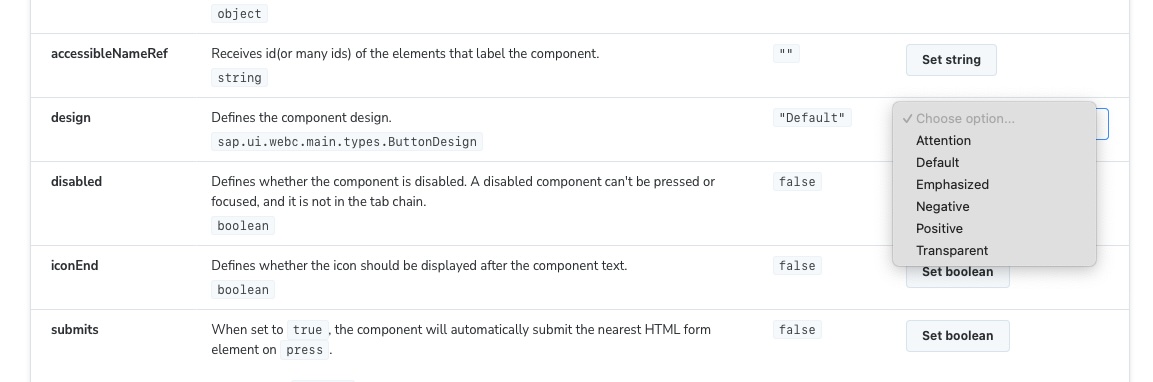
Figure 4 - Documentation of the design property with the available options, the default value and the possibility to set a value in the interactive example on top of the table.
The documentation of the web components is interactive, so that you can explore the properties right in the documentation which is great to understand the purpose if you are not certain.
It is important to note that the properties in the documentation are written in camel case (e.g.,
colorScheme), which is the convention in JavaScript. The same property is written with a hyphen in the HTML-tag (e.g., color-scheme), the camel case notation will not be recognized.Let's now try out how the different values of the button's design property work.
...


<body>

 <ui5-button>Default</ui5-button>

 <ui5-button design="Emphasized">Emphasized</ui5-button>

 <ui5-button design="Positive">Positive</ui5-button>

 <ui5-button design="Negative">Negative</ui5-button>

 <ui5-button design="Transparent">Transparent</ui5-button>

 <ui5-button design="Attention">Attention</ui5-button>

</body>


...
Listing 4 - Adding buttons with all different design options into the document's body.
This should now display the button in all different designs as shown in the next figure.
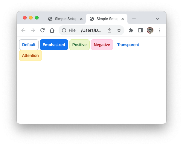
Figure 5 - The different button designs shown in the browser.
You can find the source code for this example in the GitHub project design-with-code.
Slots
Some web components allow other components to be placed inside of them by offering so-called slots. The available slots are listed in the documentation. Slots can also have names, which is important if a component offers multiple slots. One of the slots usually is the default slot, and any component placed inside without being assigned to a specific slot will be placed there.
The most basic slot is used for text. The ui5-button for instance takes its label as text inside of the start and end tag:
<ui5-button>Label</ui5-button>. This is equivalent to placing a text element in the default slot. This also means that you could also place more complex structures in this slot like the icon on top of the text shown in the figure below.
Figure 6 – Using the default slot of the button to create a button with more complex content.
You can find the source code for this example in the GitHub project design-with-code.
First Application Page
We will now add a page component to our HTML page. You will find the documentation of the page at the bottom of the navigation in the Fiori section, which contains more complex components that are more specific to the design system.
The source code for this example can be found on GitHub in the project design-with-code.
The example shows the final code and not each step in between, so that you can follow the examples here and then compare to the example on the repository.
...

<body style="height: 100%; margin: 0;">

 <ui5-page style="height:100%" background-design="Solid">

  <ui5-bar slot="header" design="Header">

   <ui5-title slot="startContent" level="H4">My App</ui5-title>

  </ui5-bar>

  <ui5-label>Default Content</ui5-label>

  <ui5-bar slot="footer" design="Footer">

   <ui5-button slot="endContent" design="Emphasized">OK</ui5-button>

   <ui5-button slot="endContent" design="Transparent">Cancel</ui5-button>

  </ui5-bar>

 </ui5-page>

</body>

...
Listing 5 - Adding a page with a header and footer bar.
In the listing above we made the following changes:
- We added the ui5-page component and set the background to solid.
- We want the page to use 100% of the available screen height. To achieve this, we need to set the
heightof thebodyand of theui5-pageto 100% using the CSSstyleattribute. If you don't set the body height, the page will appear empty, because the page will assume a height of 0. If this isn't sufficient, you can try to set the height of thehtmlelement to 100% in addition. - Setting the
marginto 0 will remove the white border that appears in some browsers. - The
ui5-pagehas three slots. As you see in the example, elements are assigned to slot using the slot attribute:
header- here we place a ui5-bar with a ui5-title element as application title. The bar also has slots, and we use the startContent slot to make the title appear on the left.default- this will hold the contents of the app. We just place a label as a placeholder for now.footer- here we place another ui5-bar and move two of our buttons into the endContent slot. The other buttons can be removed again. Following our standards, we use the emphasized button as primary action and the transparent button as the negative path action.
The result should now look like the figure below with a title bar, a footer bar with two buttons and a label in the content area. Layout and style are handled by the component for you.
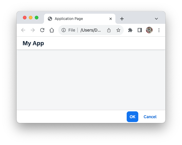
Figure 7 - The application with the page component, a title, and a footer.
Layout
While the page takes care of the overall page structure, you will have to take care of the layout yourself in order to define the page contents. At this point, you will need to make yourself familiar with some basic layout mechanisms in CSS. In this example, we will use the CSS flex box, which is a very powerful and flexible mechanism that also corresponds closely with the auto layout in Figma as discussed in the second article of this series (Designing with Code (Part 2) – Crossing the Bridge).
We want to create a simple form in our application. As there is no form component, we will make use of the flex box to lay out the form fields.
...


<ui5-panel class="margin-top" header-text="Address" fixed>

 <div class="form">

  <div class="form-element">

   <ui5-label show-colon>Name</ui5-label>

   <div class="text">John Doe</div>

  </div>

  <div class="form-element">

   <ui5-label show-colon>Street</ui5-label>

   <div class="text">Main Street 1</div>

  </div>

  <div class="form-element">

   <ui5-label show-colon>City</ui5-label>

   <div class="text">Big City</div>

  </div>

  <div class="form-element">

   <ui5-label show-colon>ZIP Code</ui5-label>

   <div class="text">12345</div>

  </div>

 </div>

</ui5-panel>

...
Listing 6 - A panel with a form inside, created out of div elements.
We replaced the label in the content area with a panel that contains a form. As there is no form component, we constructed the form from div elements. The class attributes refer to style definitions that were placed in a style element in the header of the page. We are going to discuss them later.
- The
ui5-panelis used as container for the form. It comes with a header text, and we can disable the collapse feature that is by default enabled by setting the flagfixed, which is equivalent to sayingfixed=true. - Inside of the panel we create the structure of the form using
divelements. Adivis like a frame in Figma and can be used as a container to structure and lay out elements.
- The outmost
divserves as a form container to hold the form elements. We will use the flex layout to arrange the form elements underneath each other. - Inside the form, we have several
divas form elements that hold a combination of label and field. They will be arranged vertically using a flex box. - Inside the form element container, we place a
ui5-labelwhere the colon is shown, and anotherdivdisplaying the text content. As there is no text component available in the web components library, we need to use our own text class apply the proper styles to format the text. In the listing below you can see the CSS classes that we use in order to create the right layout. The measures are taken from the specification of the form. We are also referencing CSS variables that are provided by the library using thevar()reference. The components in the library are also styled using these variables that come from the theme definition. It is highly recommended to use theme variables instead of fix values to ensure the styles are always compatible when switching themes. We will discuss this more in detail in a later article. For now, it is enough for you to know thatvar(--sapFontFamily)refers to the font family defined by the theme.
- The outmost
<head>

...


 <style>

  .margin-top{

   margin-top: 1rem;

  }


  .form{

   display:flex;

   flex-direction: column;

   gap: 1rem;

  }


  .form-element{

   display:flex;

   flex-direction: column;

   gap: 0.25rem;

  }


  .text{

   font-family: var(--sapFontFamily);

   font-size: var(--sapFontSize);

   color: var(--sapTextColor);

  }


</style>


</head>

...
Listing 7 - Styles defined for the layout of the form and for the formatting of the text element.
We placed the style definition in a style tag in the header element of the page to be able to reuse classes and to keep the code readable. If you are not familiar with CSS stylesheets, the
. in front of the names indicates that this is a class name..margin-topdefines a margin on top of the panel to separate the panel from the page title bar..formdefines the form layout as flex box with a vertical arrangement. Between the elements contained in the form layout there is a gap of 1 rem (=16px)..form-elementdefines the vertical layout of a label / value pair with a distance between the two of 0.25 rem (=4px)..textdefines the format of the text that displays the value in the form element. There is no text component in the library, so the styles must be applied manually, otherwise the text would be displayed in the browser's default font. As mentioned above, we use the reference to the theme variables to obtain the styles directly from the currently selected theme.
The result should now look like the following figure.

Figure 8 - The application with panel and form as described by the listings above.
If you are struggling with the layout using div elements and flex layouts, I want to quickly show you how this resembles the auto layout feature in Figma:

Figure 9 - Auto layout of the form frame in Figma; in the design view and in the code view.
Above you see the same form layout created with frames and auto layout in Figma. On the top right, you see the auto layout settings in the design perspective and below you see the CSS styles that are generated in the code view. These are the exact same CSS properties that we have defined above (the align-items and align-self property that are generated are redundant as they describe the default behavior). Figma frames are equivalent to div elements, and the auto layout behaves like the flex layout in CSS.
Summary and Outlook
In this article you have learned to create your own simple prototype using SAP Web Components.
As you have seen, setting up such a prototype can be as easy as creating a single HTML page.
A lot of what we have done was just putting together existing components and setting their properties. With that you can already explore and combine existing components, and by adding some basic layout and styling you can take it even a step further.
To create more complex interactive prototypes, you will need to learn how to work with events and how to connect the components to a data model using JavaScript. We will look into these topics in the next article of this series.
Remember, you find all code examples in this series as well as the full text and additional information on the GitHub page for this series: Design with Code.
- SAP Managed Tags:
- SAP Fiori,
- User Interface
Labels:
4 Comments
You must be a registered user to add a comment. If you've already registered, sign in. Otherwise, register and sign in.
Labels in this area
-
ABAP CDS Views - CDC (Change Data Capture)
2 -
AI
1 -
Analyze Workload Data
1 -
BTP
1 -
Business and IT Integration
2 -
Business application stu
1 -
Business Technology Platform
1 -
Business Trends
1,658 -
Business Trends
93 -
CAP
1 -
cf
1 -
Cloud Foundry
1 -
Confluent
1 -
Customer COE Basics and Fundamentals
1 -
Customer COE Latest and Greatest
3 -
Customer Data Browser app
1 -
Data Analysis Tool
1 -
data migration
1 -
data transfer
1 -
Datasphere
2 -
Event Information
1,400 -
Event Information
67 -
Expert
1 -
Expert Insights
177 -
Expert Insights
301 -
General
1 -
Google cloud
1 -
Google Next'24
1 -
GraphQL
1 -
Kafka
1 -
Life at SAP
780 -
Life at SAP
13 -
Migrate your Data App
1 -
MTA
1 -
Network Performance Analysis
1 -
NodeJS
1 -
PDF
1 -
POC
1 -
Product Updates
4,577 -
Product Updates
346 -
Replication Flow
1 -
REST API
1 -
RisewithSAP
1 -
SAP BTP
1 -
SAP BTP Cloud Foundry
1 -
SAP Cloud ALM
1 -
SAP Cloud Application Programming Model
1 -
SAP Datasphere
2 -
SAP S4HANA Cloud
1 -
SAP S4HANA Migration Cockpit
1 -
Technology Updates
6,873 -
Technology Updates
430 -
Workload Fluctuations
1
Related Content
- SAP Fiori for SAP S/4HANA - Empowering Your Homepage: Enabling My Home for SAP S/4HANA 2023 FPS01 in Technology Blogs by SAP
- Extend Your Crystal Reports Solutions in the DHTML Viewer With a Free Function Library in Technology Blogs by Members
- Consuming SAP with SAP Build Apps - Mobile Apps for iOS and Android in Technology Blogs by SAP
- SAP Application User provision based on Application Role via Entra ID in Technology Q&A
- Behind the compatibility - What are the compatibility means between GRC and the plugins in Technology Blogs by SAP
Top kudoed authors
| User | Count |
|---|---|
| 27 | |
| 18 | |
| 15 | |
| 13 | |
| 11 | |
| 9 | |
| 8 | |
| 8 | |
| 8 | |
| 7 |