Hello!
A couple of customers have been asking me how to add a target line in their charts during the last weeks. And the answer is: we do not provide a standard target lines in any kind of chart. However, there is a trick (or maybe… a workaround :D) that might help you to achieve your business needs. And that is why I am here, to help you to achieve your business needs!
Also, I would like to kindly ask you to vote on
this idea in SAP Customer Influences, as this blog post has been raised from its creator. ? Your vote can help all of us to achieve a higher level of customer satisfaction and a nicer interaction in our community!
First of all, I need to say that you will use two available tools, and they are:
- A new key figure
- Dual-Axis Combination chart type (only available in Responsive User Interface – Fiori)
So, let’s start it? ?
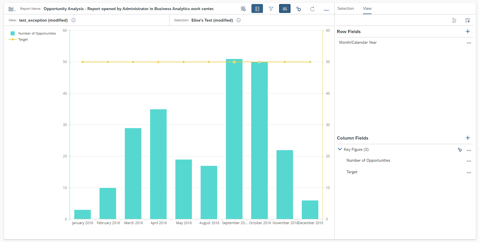
We have this fictional scenario:
- My customer has to show to his management team how many opportunities they had per month in 2016
- Also, they are supposed to achieve at least 50 opportunities in a monthly basis, and that is why they are in need of a target line, so it will be easier and friendly for them to understand where they are!
Steps to create your new key figure
1. Define the needed data source and the value for your target line (here I am going to use
Opportunity Header and Item as data source and 50 as value for the target line);
2. Go to
Design Key Figures work center and click on
New button;
3. Insert a name, select a data source and choose
Calculated as
Type;
4. Click on
Next button;
5. In the formula label, type the desired value;

6. Finish it! As you did not apply any formula/function, your key figure will always show the same value, which is perfect for having a fixed target line, right? ?
Now that you have created your target key figure, let’s create your Dual-Axis Combination chart type!
Steps to create your Dual-Axis Combination chart with a Target Line
1. In
Fiori, go to
Business Analytics work center and
Design Reports view;
2. Search All and Find your report (I am using
Opportunity Analysis);
3. Move to the rows visualization all the required fields;
4. Go to
Change Chart (table icon) and select
Dual-Axis Combination chart type.
I hope you all are able to achieve your business needs, and if you need any further assistance, I will be more than happy on helping you through the comments on this blog post.
See you soon, hopefully!
🙂
Sincerely,
Elise.
