- SAP Community
- Products and Technology
- Technology
- Technology Q&A
- Is it possible to highlight a dimensional value in...
- Subscribe to RSS Feed
- Mark Question as New
- Mark Question as Read
- Bookmark
- Subscribe
- Printer Friendly Page
- Report Inappropriate Content
Is it possible to highlight a dimensional value in a chart based on a filter selection?
- Subscribe to RSS Feed
- Mark Question as New
- Mark Question as Read
- Bookmark
- Subscribe
- Printer Friendly Page
- Report Inappropriate Content
on 11-23-2016 4:07 PM
Hi,
In many other Tools it is possible to highlight a selected value in a simple chart to emphazise the selected filter value in relation to the rest.
For example. A user selects her store in a drop down filter. In the chart that store is highlighted (in this case in Another color) to show the sales numbers she has in relation to all of the other stores in the area. How can this be done in Design Studio? I tried to attach an example Picture of the proposed chart, but wasn't able to upload it... Hoping for better ansering rate then to my last posting where none answered 😞
Regards,
Sofie H
- SAP Managed Tags:
- SAP BusinessObjects Design Studio
Accepted Solutions (0)
Answers (6)
Answers (6)
- Mark as New
- Bookmark
- Subscribe
- Subscribe to RSS Feed
- Report Inappropriate Content
Hi Sofie Havgård,
Can you explain more like do you want to highlight the store based on selection on chart or do you want to highlight the member in chart based on selection in a dropdown or list box?
If you want to highlight based on chart selection, you can achieve it in css using below class,
g .v-datapoint.v-morphable-datapoint.v-datapoint-hover.v-datapoint-selected rect
{ fill: #119911; }
g .v-datapoint.v-morphable-datapoint.v-datapoint-default
{
fill-opacity: 1;
}
Thanks,
Poovarasan
You must be a registered user to add a comment. If you've already registered, sign in. Otherwise, register and sign in.
- Mark as New
- Bookmark
- Subscribe
- Subscribe to RSS Feed
- Report Inappropriate Content
Hi Sofie Havgård,
Is your data source is from BW(a bex query)?
If it is, then there is a work around for it.
You can create an exception with variable as input to highlight value having same value.
Then you can use getdata("Measure","Selected_value"); in design studio to pass value for variable in exception.
Then enable conditional formatting in your chart the selected item will be high lighted.
If there is a conflict as two or more dimensions having same values then you can create a formula with distinct values and use it in exception.
Thanks,
Poovarasan
You must be a registered user to add a comment. If you've already registered, sign in. Otherwise, register and sign in.
- Mark as New
- Bookmark
- Subscribe
- Subscribe to RSS Feed
- Report Inappropriate Content
- Mark as New
- Bookmark
- Subscribe
- Subscribe to RSS Feed
- Report Inappropriate Content
Thanks Mustafa,
The values in the drop daown is not static but will change over time. The stores changes and since the number of stores could be a list of 30 to 40 none-numeric names (unfortunately we do not have our BO connected to SAP and BeX, which is my home arena. All our BO solutions are built on Universes) the css example you provided might not be the best?
Maybe it would be possible to save the selected value in a global variable and use that global value to highlight the chart bar that is selected in the drop down? Any suggestions?
/Sofie H
You must be a registered user to add a comment. If you've already registered, sign in. Otherwise, register and sign in.
- Mark as New
- Bookmark
- Subscribe
- Subscribe to RSS Feed
- Report Inappropriate Content
- Mark as New
- Bookmark
- Subscribe
- Subscribe to RSS Feed
- Report Inappropriate Content
Hi,
The sort order in the drop down must be alphabetical and the sort order in the chart would preferably be from "highest sales to lowest sales", but if not possible the client might settle for an alphabetical sorting...
It is really important for my client that the selected value from the drop down is NOT filtered out in the bar chart, but only highlighted or in other way visually stands out. The below link touches my dilemma... Close but no cigar...
https://archive.sap.com/discussions/thread/3783246
Sofie
- Mark as New
- Bookmark
- Subscribe
- Subscribe to RSS Feed
- Report Inappropriate Content
- Mark as New
- Bookmark
- Subscribe
- Subscribe to RSS Feed
- Report Inappropriate Content
Hi Sofie,
The only possibility I see of making this work with standard functionality is to apply the CSS approach I have described above. In this case, the sort order of the dropdown items and the chart category axis must both be alphabetical to ensure correct matching with the dropdown selection.
Let me know if you have further questions.
Mustafa.
- Mark as New
- Bookmark
- Subscribe
- Subscribe to RSS Feed
- Report Inappropriate Content
Thank you!
the css approach you suggested is probably the only solution Design Studio provides at this point, but my scripting skills are not that advanced 🙂 I found a third party add-on to Design Studio that probably is helpful for this exact issue... we'll see if that is the way forward for my client in this matter...
//Sofie
- Mark as New
- Bookmark
- Subscribe
- Subscribe to RSS Feed
- Report Inappropriate Content
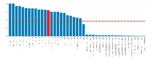
Hi Sofie,
The following example based on a column chart with months illustrates how to achieve the desired result. The same principle can be applied to your scenario:
1. Populate the Dropdown with the index values of the chart columns, as shown below:

If you prefer you can populate the values with the internal key of your chart category axis dimension members (Store key in your case).
2. Include the following CSS in your applications's custom CSS file:
/* Override chart column fill colour based on dynamic selection */

/* Column 1 */
.chartCol1 g.v-m-main g.v-m-plot g.v-plot-main g.v-datapoint-group .v-datapoint:nth-child(2) rect
{
   fill: red;
}

/* Column 2 */
.chartCol2 g.v-m-main g.v-m-plot g.v-plot-main g.v-datapoint-group .v-datapoint:nth-child(3) rect
{
   fill: red;
}

/* Column 3 */
.chartCol3 g.v-m-main g.v-m-plot g.v-plot-main g.v-datapoint-group .v-datapoint:nth-child(4) rect
{
   fill: red;
}

/* Column 4 */
.chartCol4 g.v-m-main g.v-m-plot g.v-plot-main g.v-datapoint-group .v-datapoint:nth-child(5) rect
{
   fill: red;
}

/* Column 5 */
.chartCol5 g.v-m-main g.v-m-plot g.v-plot-main g.v-datapoint-group .v-datapoint:nth-child(6) rect
{
   fill: red;
}

/* Column 6 */
.chartCol6 g.v-m-main g.v-m-plot g.v-plot-main g.v-datapoint-group .v-datapoint:nth-child(7) rect
{
   fill: red;
}

/* Column 7 */
.chartCol7 g.v-m-main g.v-m-plot g.v-plot-main g.v-datapoint-group .v-datapoint:nth-child(8) rect
{
   fill: red;
}


/* Column 8 */
.chartCol8 g.v-m-main g.v-m-plot g.v-plot-main g.v-datapoint-group .v-datapoint:nth-child(9) rect
{
   fill: red;
}


/* Column 9 */
.chartCol9 g.v-m-main g.v-m-plot g.v-plot-main g.v-datapoint-group .v-datapoint:nth-child(10) rect
{
   fill: red;
}


/* Column 10 */
.chartCol10 g.v-m-main g.v-m-plot g.v-plot-main g.v-datapoint-group .v-datapoint:nth-child(11) rect
{
   fill: red;
}

/* Column 11 */
.chartCol11 g.v-m-main g.v-m-plot g.v-plot-main g.v-datapoint-group .v-datapoint:nth-child(12) rect
{
   fill: red;
}

/* Column 12 */
.chartCol12 g.v-m-main g.v-m-plot g.v-plot-main g.v-datapoint-group .v-datapoint:nth-child(13) rect
{
   fill: red;
}
Alternatively you can replace the column index in the class names with the internal key of your Store dimension to correspond to the Dropdown as above.
3. Include the following code in the "On Select" event script of your drop down component:
var selectedColumn = me.getSelectedValue();     /* Key */
var columnClass = "chartCol" + selectedColumn; 	/* CSS Class for highlighting */

INFOCHART_1.setCSSClass(columnClass);		/* Highlight column */
The result is as shown below:

Hope that helps,
Mustafa.
You must be a registered user to add a comment. If you've already registered, sign in. Otherwise, register and sign in.
- Mark as New
- Bookmark
- Subscribe
- Subscribe to RSS Feed
- Report Inappropriate Content
Hi Sofie -
First I'm sorry if there were no replies on your previous question; everyone here volunteers their own time and tries to help
There are some ideas on these threads/replies:
You must be a registered user to add a comment. If you've already registered, sign in. Otherwise, register and sign in.
- Mark as New
- Bookmark
- Subscribe
- Subscribe to RSS Feed
- Report Inappropriate Content
Thank you! This is very helpful. I didn't find those when searching myself. All I found when googling was in the old scn and the links didn't work.
I understand that people are answering questions on a "free/available time" basis 🙂 But I must say that so far I find the answering frequency and search possibilities much better in the old SCN than in this new format.
Could you please have a look at my other Design Studio question too, regarding opening a new Design Studio document in a new launchpad tab, instead of in a new browser tab.
Thank you so much Tammy!
//Sofie H
- Mark as New
- Bookmark
- Subscribe
- Subscribe to RSS Feed
- Report Inappropriate Content
Hi,
The store selection is done in a drop down at the top of the page.
The selection would not only "highlight" the chosen store in that chart, but also be used as filter in other tables and charts at that specific page. Thank you!
Sofie
You must be a registered user to add a comment. If you've already registered, sign in. Otherwise, register and sign in.
- SAP BTP SDK for Android 24.4.0 is now available in Technology Blogs by SAP
- AI Foundation on SAP BTP: Q1 2024 Release Highlights in Technology Blogs by SAP
- Efficient Memory Storage and Data Loading of SAP HANA Column Tables in Technology Blogs by Members
- How to use Transaction BD87 to reprocess failed IDocs in Technology Blogs by Members
- Receive and present a clear picture of your process analysis to your business executives in Technology Blogs by SAP
| User | Count |
|---|---|
| 86 | |
| 10 | |
| 10 | |
| 9 | |
| 7 | |
| 7 | |
| 6 | |
| 5 | |
| 4 | |
| 4 |
You must be a registered user to add a comment. If you've already registered, sign in. Otherwise, register and sign in.