- SAP Community
- Products and Technology
- Technology
- Technology Q&A
- How can one format the tooltip of a text basic com...
- Subscribe to RSS Feed
- Mark Question as New
- Mark Question as Read
- Bookmark
- Subscribe
- Printer Friendly Page
- Report Inappropriate Content
How can one format the tooltip of a text basic component in SAP Design Studio through CSS?
- Subscribe to RSS Feed
- Mark Question as New
- Mark Question as Read
- Bookmark
- Subscribe
- Printer Friendly Page
- Report Inappropriate Content
on 01-10-2018 3:13 PM
Some elements like the text basic component, allow to fill a tooltip though the TEXT.setTooltip(tooltip) command, and which also defaults to the contents of the text component.
Example figure:

In our case (using SAP Design Studio version 16.4.1 with the Theme Mobile) the look of the default tooltip style clashes a bit with the flat look we are using for the remaining dashboard so I would like to change the format style for all the basic tooltips.
Normally this element would have a CSS class which could be overridden to change the background, border, text font and so on.
I tried to find though the SAP forums, but the only tooltip formatting questions were for charts. For example in https://archive.sap.com/discussions/thread/3720212 is described how to format the tooltip of a chart with the v-m-tooltip class, but text tooltips seems to be modified by a different class.
I tried to find which one, but since the element only appears when hovered I can't seem to grab it to inspect the element and figure which class it belongs with the F12 browser developer tools. I tried multiple ideas about grabbing focus but without success (for the chart tooltip I managed do it though).
I even tried to look at the com.sap.ip.bi.zen.rt.themelib.phx_16.4.1.201701050818.jar file to inspect the theme classes belonging to the theme, but couldn't find one specific for the tooltips.
One work around I found would be to use a " " (space) as the tooltip value so it wouldn't show and instead create a new custom popup tooltip with a custom css function like the one presented in https://archive.sap.com/discussions/thread/3621162 for setting a tooltip for the Icon component. But then I would have to do so for each and every other text element to keep things consistent which would be more kind quite an hassle.
Thanks in advance.
- SAP Managed Tags:
- SAP BusinessObjects Design Studio
Accepted Solutions (1)
Accepted Solutions (1)
- Mark as New
- Bookmark
- Subscribe
- Subscribe to RSS Feed
- Report Inappropriate Content
A basic text component uses title attribute to display tooltip which can't be styled using css. Although you can achieve some custom tooltip with the css trick mentioned here, this does not avoid the default tooltip. Hence, I would suggest you to try Formatted Text View component as I did below:
1. I used the script below in on startup event of the application to assign text and tooltip-text to the component :
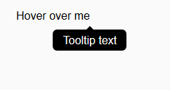
var _htmlText = '<div class="tooltip">Hover over me  <span class="tooltiptext">Tooltip text</span></div>';
FORMATTEDTEXTVIEW_1.setHtmlText(_htmlText);
2. Then I used following css to show custom formatted tooltip:
.tooltip {
    position: relative;
    display: inline-block;
}

.tooltip .tooltiptext {
    visibility: hidden;
   width:100%;
    background-color: black;
    color: #fff;
    text-align: center;
    border-radius: 6px;
    padding: 5px 0;
    position: absolute;
    z-index: 1;
    top: 150%;
    left: 50%;
    margin-left: 0px;
}

.tooltip .tooltiptext::after {
    content: "";
    position: absolute;
    bottom: 100%;
    left: 50%;
    margin-left: -5px;
    border-width: 5px;
    border-style: solid;
    border-color: transparent transparent black transparent;
}

.tooltip:hover .tooltiptext {
    visibility: visible;
}
3. There is no need to assign any css class to the Formatted Text View component.
4. The result:
You must be a registered user to add a comment. If you've already registered, sign in. Otherwise, register and sign in.
- Mark as New
- Bookmark
- Subscribe
- Subscribe to RSS Feed
- Report Inappropriate Content
Very well, since using new external components (SDK or partners) is out of scope for the moment, I tried the suggestion of Arijit by using the FormattedTextComponent.
First, I customized the CSS of the tooltip to remove the arrow and wrapping, and add the same style has the custom style for the charts tooltip.
.tooltip .tooltiptext {
    text-align: left;
    visibility: hidden;
    width:100%;
    background: #FFFFFF;
    border:1px solid;
    border-color:#666666;
    border-radius: 1px;
    top: 40px;
    color: #333333;
    left: 0%;
    padding: 2px 15px;
    position: absolute;
    white-space:nowrap;
    display: inline-block;
    box-shadow: 1px 1px 1px #888888;}<br>
Then I've created a function "foo" to generate the HTML for the approriate css style for the text and content.
var htmlOUT = '<div class="' + textCSS + '">' + text + '  <span class="' + tooltipCSS + '">' + tooltipText + '</span></div>';
return htmlOUT;
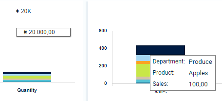
and then I just set the tooltip and text with this call in a script. This way I can later pass text formatted with formatting functions and populate it will values retriven from data sources. As an example:
FORMATTEDTEXTVIEW_1.setHtmlText(GLOBAL_SCRIPTS_1.foo("€ 20K", "€ 20.000,00", "tooltip", "tooltiptext"));And it works with a good effect when it renders. Neat!
Now the only problem is this:

Unlike a basic text component. In the editor view the FormattingTextComponent has a default style "blue" with some padding or alignment issues. It is more difficult to position it right. Even though it as a proprerty for CSS Class, it doesn't look like it does with the CSS of a component. Although if we run the application it will render fine with the style of the class given in the HTML.
Since it means changing all the text blocks instead of a "simple" call to change the style of all components, it will be out of scope for the current project. But I'll might consider this in the future, specially if I can tweak that intial view in editor mode to look like the final style of the text with the same positioning.
Thank you Arijit.
Answers (2)
Answers (2)
- Mark as New
- Bookmark
- Subscribe
- Subscribe to RSS Feed
- Report Inappropriate Content
Browsing again at the links provided by Arijit, namely the "how to achieve some custom tooltip with the css trick mentioned here" posted at Stack Overflow, there was an alternate solution posted there a few threads below by a ChrisF were a javascript code to change the title atribute since it seems it can't be done to affect all compoments through CSS.
Script shown at ChrisF's Stackoverflow solution:
// Use a closure to keep vars out of global scope
(function () {
    var ID = "tooltip", CLS_ON = "tooltip_ON", FOLLOW = true,
    DATA = "_tooltip", OFFSET_X = 20, OFFSET_Y = 10,
    showAt = function (e) {
        var ntop = e.pageY + OFFSET_Y, nleft = e.pageX + OFFSET_X;
        $("#" + ID).html($(e.target).data(DATA)).css({
            position: "absolute", top: ntop, left: nleft
        }).show();
    };
    $(document).on("mouseenter", "*[title]", function (e) {
        $(this).data(DATA, $(this).attr("title"));
        $(this).removeAttr("title").addClass(CLS_ON);
        $("<div id='" + ID + "' />").appendTo("body");
        showAt(e);
    });
    $(document).on("mouseleave", "." + CLS_ON, function (e) {
        $(this).attr("title", $(this).data(DATA)).removeClass(CLS_ON);
        $("#" + ID).remove();
    });
    if (FOLLOW) { $(document).on("mousemove", "." + CLS_ON, showAt); }
}());
I tried to load the script into a JS Injector Addon Component I one time used, changed the ID to "tooltipJS" and changed the style in the CSS through:
#tooltipJS {
    text-align: left;
    background: #FFFFFF;
    border:1px solid;
    border-color:#666666;
    border-radius: 1px;
    top: 40px;
    left: 0%;
    padding: 2px 15px;
    position: absolute;
    z-index: 20;
    white-space:nowrap;
    display: inline-block;
    box-shadow: 1px 1px 1px #888888;
    font-weight: normal;
    font-size:10pt;
    font-family: Roboto;
    text-decoration: none;
    color:#001C44;}
and got the intended result affecting all standard tooltips, now with the same style as the custom used on the chart tooltip.
There are a few more details in ChrisF's JS script as also a note that there is a but when the title is empty (work around discussed here) but it doesn't seem to happen in DS.
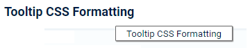
- Example 01 - Default basic text component which tooltip value is the same as the name of the component:
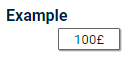
- Example 02 - After assigning a custom tooltip text with TEXT.setTooltip("100£");
A pity this solution requires the use of an additional component, as a solution with only standard components would be preferable. But at least the result look just as intended.
You must be a registered user to add a comment. If you've already registered, sign in. Otherwise, register and sign in.
- Mark as New
- Bookmark
- Subscribe
- Subscribe to RSS Feed
- Report Inappropriate Content
An "easy" answer is to look at extensions on the SAP App Center https://www.sapappcenter.com/productLines/11#!/list/page/1/search=tool%20tips - some are free, some offer free trials - I thought this partner had it when I last looked http://visualbi.com/sap-lumira-designer/vbx-extensions/
You must be a registered user to add a comment. If you've already registered, sign in. Otherwise, register and sign in.
- First steps to work with SAP Cloud ALM Deployment scenario for SAP ABAP systems (7.40 or higher) in Technology Blogs by SAP
- The Session Timer only appears after the first inactivity. in Technology Q&A
- Exploring ML Explainability in SAP HANA PAL – Classification and Regression in Technology Blogs by SAP
- Automated check for SAP HANA Cloud availability with SAP Automation Pilot in Technology Blogs by SAP
- Be a Cockroach: A Simple Guide to AI and SAP Full-Stack Development - Part I in Technology Blogs by Members
| User | Count |
|---|---|
| 75 | |
| 9 | |
| 8 | |
| 7 | |
| 7 | |
| 6 | |
| 6 | |
| 6 | |
| 5 | |
| 4 |
You must be a registered user to add a comment. If you've already registered, sign in. Otherwise, register and sign in.