

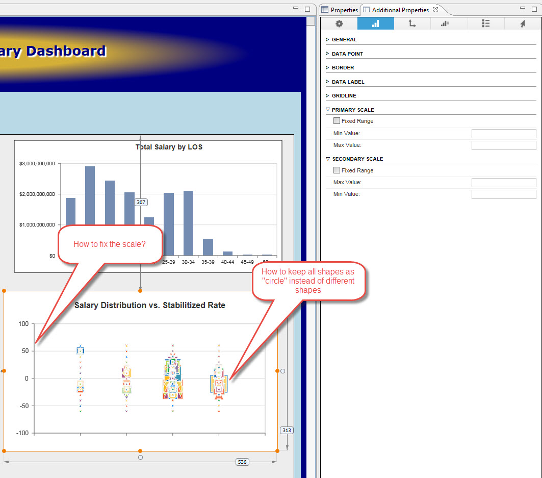
The first image is the bubble chart metric I created in Xcelsius. Since we're re-developing all of our dashboards in Lumira Designer, I am having a hard time trying to replicate what I did in Xcelsius for this particular metric.
The second photo is my attempt to replicate the first image. As you can see, it's a mess. I used an Infochart component and tried to go through each setting/property but I couldn't find a way to adjust the vertical (y) axis, and keep all the shapes of the bubble the same. Any guidance on how to do this would be greatly appreciated. I also attached a preview of my data set.
You must be a registered user to add a comment. If you've already registered, sign in. Otherwise, register and sign in.