- SAP Community
- Products and Technology
- Technology
- Technology Q&A
- Create a github-like heat map
- Subscribe to RSS Feed
- Mark Question as New
- Mark Question as Read
- Bookmark
- Subscribe
- Printer Friendly Page
- Report Inappropriate Content
Create a github-like heat map
- Subscribe to RSS Feed
- Mark Question as New
- Mark Question as Read
- Bookmark
- Subscribe
- Printer Friendly Page
- Report Inappropriate Content
on 08-15-2017 9:51 PM
I'm hoping to create a heat map that somewhat resembles Github's:

The challenges:
1. The size of the rectangles can vary widely:

vs

2. The number of weekdays and weeks also vary widely (see prior images).
3. The size of the font is dependent upon the number of records in the Secondary Category axis. If the number of records are large enough, the labels aren't displayed.

Desired:
1. the rectangle are formatted as squares w/ a given length and width
2. the report always shows 52 weeks, even if there isn't data to support it
3. the font size is constant; if necessary, the chart could grow to accommodate more 'rows'
Are any of these desired aspects possible?
- SAP Managed Tags:
- SAP BusinessObjects - Web Intelligence (WebI)
Accepted Solutions (0)
Answers (1)
Answers (1)
- Mark as New
- Bookmark
- Subscribe
- Subscribe to RSS Feed
- Report Inappropriate Content
You must be a registered user to add a comment. If you've already registered, sign in. Otherwise, register and sign in.
- Mark as New
- Bookmark
- Subscribe
- Subscribe to RSS Feed
- Report Inappropriate Content
I like it.
Questions:
* how did you get the spacing between the months headers?
* is there a way to base the color intervals on a % of total?
* if the crosstab was embedded in a section (perhaps region in your example) to have the color intervals be consistent across the sections, perhaps as a percentage of a grand total?
* is there a way to force the size of the rectangles?
* is there a way to display the count if you move the mouse over the rectangle?
- Mark as New
- Bookmark
- Subscribe
- Subscribe to RSS Feed
- Report Inappropriate Content
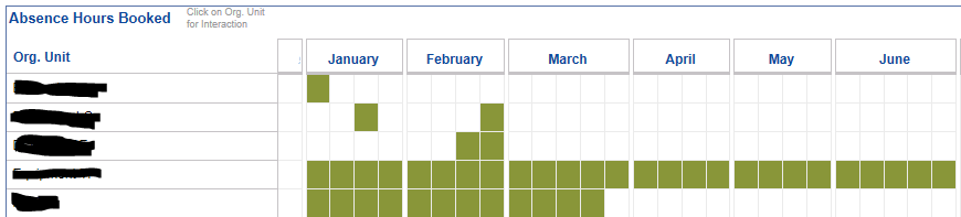
Q2. Yes, just define more ranges in the conditional formatting. The one I've used is a simple - is the cell contents > 0, if so then turn the background and text to be green
Q3. The colours would be consistent across sections, and could be applied as a % of a grand total.
Q4. The size of the rectangles is fixed by setting the Height and Width of the crosstab body cells
Q5. Not directly as a text pop-up, but you can use Element Linking and another table to display the count when a rectangle is clicked.
- SAP HANA Cloud Vector Engine: Quick FAQ Reference in Technology Blogs by SAP
- Activate API - Provider API to Create Freight Order for Subcontracting in Technology Q&A
- FB60 does not post. No error message is displayed. in Technology Q&A
- Convert GL Account Hierarchies from Fiori to Cost element Groups in SAP S4HANA in Technology Q&A
- sap.m Table image as barcode in Technology Q&A
| User | Count |
|---|---|
| 93 | |
| 11 | |
| 10 | |
| 9 | |
| 9 | |
| 7 | |
| 6 | |
| 5 | |
| 4 | |
| 4 |
You must be a registered user to add a comment. If you've already registered, sign in. Otherwise, register and sign in.