- SAP Community
- Questions about SAP Websites
- New top menu flashes a bit too much
- Subscribe to RSS Feed
- Mark Question as New
- Mark Question as Read
- Bookmark
- Subscribe
- Printer Friendly Page
- Report Inappropriate Content
New top menu flashes a bit too much
- Subscribe to RSS Feed
- Mark Question as New
- Mark Question as Read
- Bookmark
- Subscribe
- Printer Friendly Page
- Report Inappropriate Content
on 05-15-2017 4:35 PM
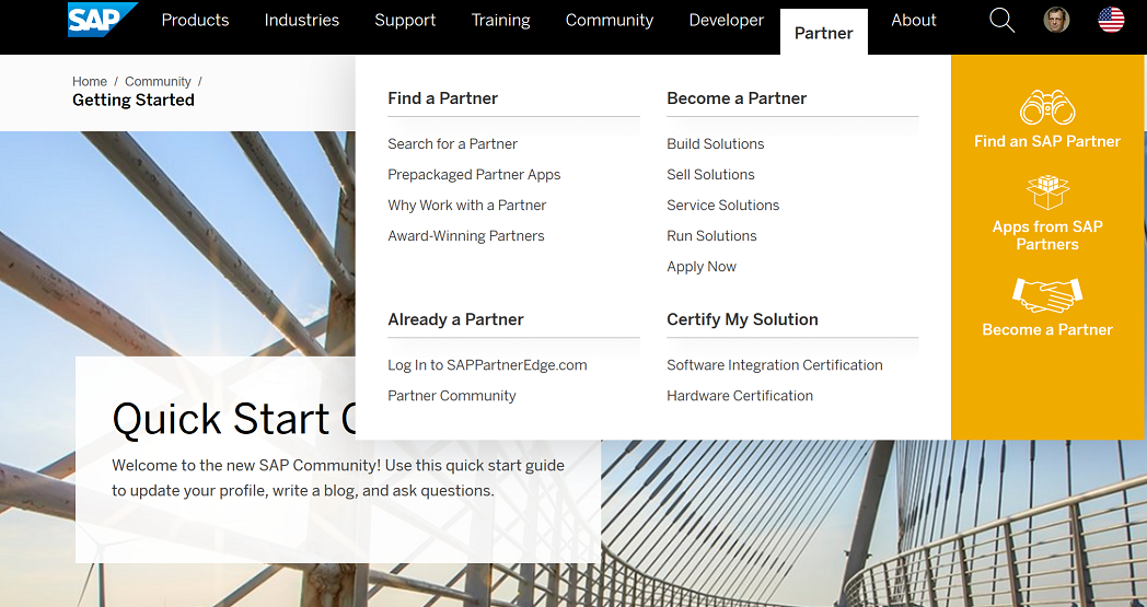
Looks like a new top menu got implemented recently with the expanded options and some odd yellow "side bar". While I appreciate the effort, is there any way not to flash it every time the mouse cursor simply happens to be dragged across the menu area? Maybe it's just me but it feels like it's going to give me a seizure. Every time I move the mouse in the menu vicinity (for example, to use the bookmark toolbar in the browser), the full screen white-yellow-black flashes of the drop-down menus appear and it's rather unpleasant visual stimuli.
Isn't there a way to add a short delay to make sure the menu appears when it's rather consciously navigated to vs. just passing by the respective screen area?
- SAP Managed Tags:
- SAP Community
Accepted Solutions (0)
Answers (7)
Answers (7)
- Mark as New
- Bookmark
- Subscribe
- Subscribe to RSS Feed
- Report Inappropriate Content
I agree. Didn't realise (when I tweeted about this very subject yesterday) that there was already something here. I've incremented the "me too!" counter above. Thanks.
You must be a registered user to add a comment. If you've already registered, sign in. Otherwise, register and sign in.
- Mark as New
- Bookmark
- Subscribe
- Subscribe to RSS Feed
- Report Inappropriate Content
I disabled the menu drop-down via CSS on most pages. Now I use bookmarks and if I really need some links from the menu - I navigate to pages where I have not disabled this drop-down.
Probably the same can be done via uBlock or similar.
Not a perfect solution, I know, but I lost hope. 🙂
- Mark as New
- Bookmark
- Subscribe
- Subscribe to RSS Feed
- Report Inappropriate Content
This effect used to annoy me a little before. It is worse now. Click on the "community" tab in my browser, move the mouse down to click on some content, and a huge (uuuge) menu pops up. If the content you are after is in the top half the page it is suddenly hidden and you have to move the mouse way out of the way to get rid of the menu. Even if not, the pop-up is seriously distracting.
It reminds me a little of the "this report contains flashing images" disclaimer on TV news reports these days.
No offence meant to anyone involved, but who tested this and thought it was a good idea?
A short delay would make an enormous difference.
You must be a registered user to add a comment. If you've already registered, sign in. Otherwise, register and sign in.
- Mark as New
- Bookmark
- Subscribe
- Subscribe to RSS Feed
- Report Inappropriate Content
- Mark as New
- Bookmark
- Subscribe
- Subscribe to RSS Feed
- Report Inappropriate Content
My standard Community browsing behavior:
I have constantly opened 7 tabs related to SAP in FireFox browser:
1. Notifications
2. Q&A: SAP BusinessObjects Planning and Consolidation, version for SAP NetWeaver
3. Q&A: EPM Add-In for Excel
4. Q&A: Using SAP.com
5. Coffee Corner
6. BPC help
7. EPM help
I am switching between the mentioned tabs and the menu is very annoying.
You must be a registered user to add a comment. If you've already registered, sign in. Otherwise, register and sign in.
- Mark as New
- Bookmark
- Subscribe
- Subscribe to RSS Feed
- Report Inappropriate Content
Same here. I always have multiple tabs going on. There is no other navigation anyway. I can see a question list for a specific tag and from there I can only open the questions one by one. Naturally, I do right-click -> new tab. And that's exactly where the menu gets in the way a lot.
Not really objecting to the menu's content (that's the whole other story) but the way it unrolls unnecessarily, combined with its size, makes using SCN less enjoyable.
- Mark as New
- Bookmark
- Subscribe
- Subscribe to RSS Feed
- Report Inappropriate Content
- Mark as New
- Bookmark
- Subscribe
- Subscribe to RSS Feed
- Report Inappropriate Content
- Mark as New
- Bookmark
- Subscribe
- Subscribe to RSS Feed
- Report Inappropriate Content
Today I noticed, that in my not officially supported (here) browser in the pages with a country selector I need to click on the menu to display it.
If only I could get the same behavior for all other pages....
*** I am not requesting this to be 'fixed' ***
You must be a registered user to add a comment. If you've already registered, sign in. Otherwise, register and sign in.
- Mark as New
- Bookmark
- Subscribe
- Subscribe to RSS Feed
- Report Inappropriate Content
- Mark as New
- Bookmark
- Subscribe
- Subscribe to RSS Feed
- Report Inappropriate Content
- Mark as New
- Bookmark
- Subscribe
- Subscribe to RSS Feed
- Report Inappropriate Content

You must be a registered user to add a comment. If you've already registered, sign in. Otherwise, register and sign in.
- Mark as New
- Bookmark
- Subscribe
- Subscribe to RSS Feed
- Report Inappropriate Content
I'm somewhat surprised, Jelena - how come you previously blamed the greyness of the page contents and don't love the new flashy design?
----
Volker Ducking and Running
You must be a registered user to add a comment. If you've already registered, sign in. Otherwise, register and sign in.
- Mark as New
- Bookmark
- Subscribe
- Subscribe to RSS Feed
- Report Inappropriate Content
Haha. 🙂 I guess yellow band livens up the "top menu of death" slightly but now it just sucks in a different way.
- Mark as New
- Bookmark
- Subscribe
- Subscribe to RSS Feed
- Report Inappropriate Content
May be not delay but mouse click?
You must be a registered user to add a comment. If you've already registered, sign in. Otherwise, register and sign in.
- Mark as New
- Bookmark
- Subscribe
- Subscribe to RSS Feed
- Report Inappropriate Content
- Mark as New
- Bookmark
- Subscribe
- Subscribe to RSS Feed
- Report Inappropriate Content
Just noticed that https://support.sap.com/ seems to work that way.
It's strange that it's not consistent through all the new sap.com sites 😞
- Mark as New
- Bookmark
- Subscribe
- Subscribe to RSS Feed
- Report Inappropriate Content
Well, the design of the menu is different, too. So... 2DX?
- weird formatting when opening profile in Questions about SAP Websites
- How can I easily switch between P and S user accounts with Universal ID? in Questions about SAP Websites
- Increasing the maximum number of favourites to Favourites Menu in Questions about SAP Websites
- [BUG] Inbox link opens dashboard at first click in Questions about SAP Websites
- Please Don't Require Me to Click on a Menu to See Whether I Have Inbox Items in Questions about SAP Websites
| User | Count |
|---|---|
| 1 | |
| 1 | |
| 1 | |
| 1 | |
| 1 |
You must be a registered user to add a comment. If you've already registered, sign in. Otherwise, register and sign in.