- SAP Community
- Products and Technology
- Technology
- Technology Q&A
- SAC line charts
- Subscribe to RSS Feed
- Mark Question as New
- Mark Question as Read
- Bookmark
- Subscribe
- Printer Friendly Page
- Report Inappropriate Content
SAC line charts
- Subscribe to RSS Feed
- Mark Question as New
- Mark Question as Read
- Bookmark
- Subscribe
- Printer Friendly Page
- Report Inappropriate Content
on 03-24-2023 5:19 PM
Hi SAP community
I am trying to create a chart in SAC that shows the headcount trend for 2023 Actuals, 2023 Budget, and 2022 Actuals.
I have tried different solutions but it appears I cant get it right.
I have created three calculated measures, one for each trend. My dimension is Date. However, I am not able to get the 2022 data in there.
I also tried to add cross calculations to the chart but still not able go get all trend lines in ne chart.
Please let me know if anyone has a suggestion on how to do this.
Thanks
- SAP Managed Tags:
- SAP Analytics Cloud
Accepted Solutions (0)
Answers (2)
Answers (2)
- Mark as New
- Bookmark
- Subscribe
- Subscribe to RSS Feed
- Report Inappropriate Content


You must be a registered user to add a comment. If you've already registered, sign in. Otherwise, register and sign in.
- Mark as New
- Bookmark
- Subscribe
- Subscribe to RSS Feed
- Report Inappropriate Content
- Mark as New
- Bookmark
- Subscribe
- Subscribe to RSS Feed
- Report Inappropriate Content

- Mark as New
- Bookmark
- Subscribe
- Subscribe to RSS Feed
- Report Inappropriate Content


- Mark as New
- Bookmark
- Subscribe
- Subscribe to RSS Feed
- Report Inappropriate Content

- Mark as New
- Bookmark
- Subscribe
- Subscribe to RSS Feed
- Report Inappropriate Content
kocomandi
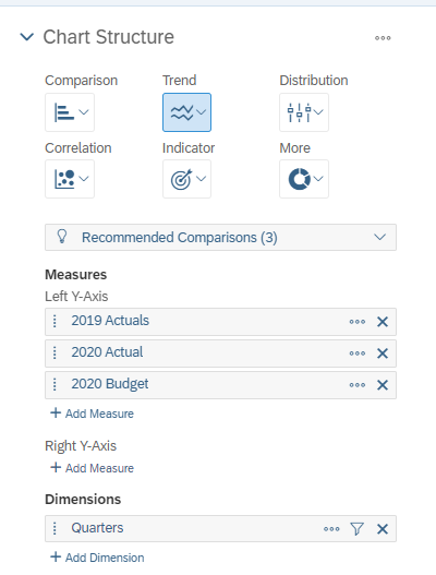
Ok you did not show a sample of the chart but I am assuming you want to visualize these 3 measures over date dimension in a line chart. Now I am assuming you can only visualize these measure over a common date parameter like Quarters or months because if you do it over years than 2019 Actuals is something which is in 2019 and cannot be available in 2020. 2020 Actual and Budget makes sense as they both are in same year. Something like below.

If the above is what you want, First create a calculated dimension with below formula. Change the name of date dimension as per your model.
IF(RIGHT([d/"SAP_CEP_SALES_PLANNING":CALMONTH].[p/CALQUARTER],
        1)="1",
        'Q1',
        IF(RIGHT([d/"SAP_CEP_SALES_PLANNING":CALMONTH].[p/CALQUARTER],
                1)="2",
                'Q2',
                IF(RIGHT([d/"SAP_CEP_SALES_PLANNING":CALMONTH].[p/CALQUARTER],
                        1)="3",
                        'Q3',
                        'Q4')))<br>
Then create 3 restricted measures one for 2019 Actuals, 2020 Actuals and 2020 Budget (replace years 2023)

Chart configuration:
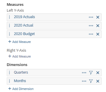
If you want to analyze over months, then create another calculated dimension called Months with below formula.
[d/"SAP_CEP_SALES_PLANNING":CALMONTH].[p/MONTHDESC]Output:

Hope this helps !!
Please accept and upvote if this helps you.
Nikhil
You must be a registered user to add a comment. If you've already registered, sign in. Otherwise, register and sign in.
- Mark as New
- Bookmark
- Subscribe
- Subscribe to RSS Feed
- Report Inappropriate Content
- Mark as New
- Bookmark
- Subscribe
- Subscribe to RSS Feed
- Report Inappropriate Content

- Mark as New
- Bookmark
- Subscribe
- Subscribe to RSS Feed
- Report Inappropriate Content
- Top Picks: Innovations Highlights from SAP Business Technology Platform (Q1/2024) in Technology Blogs by SAP
- BTP Apps, F4 Help and Personal Value Lists in Technology Q&A
- Strategic Workforce Planning in SAC in Technology Q&A
- What’s New in SAP Datasphere Version 2024.8 — Apr 11, 2024 in Technology Blogs by Members
- Consuming SAP with SAP Build Apps - Connectivity options for low-code development - part 2 in Technology Blogs by SAP
| User | Count |
|---|---|
| 101 | |
| 13 | |
| 13 | |
| 11 | |
| 11 | |
| 7 | |
| 6 | |
| 5 | |
| 4 | |
| 4 |
You must be a registered user to add a comment. If you've already registered, sign in. Otherwise, register and sign in.