- SAP Community
- Products and Technology
- Technology
- Technology Q&A
- InfoChart - unable to use column & line combinatio...
- Subscribe to RSS Feed
- Mark Question as New
- Mark Question as Read
- Bookmark
- Subscribe
- Printer Friendly Page
- Report Inappropriate Content
InfoChart - unable to use column & line combination
- Subscribe to RSS Feed
- Mark Question as New
- Mark Question as Read
- Bookmark
- Subscribe
- Printer Friendly Page
- Report Inappropriate Content
on 02-15-2017 2:11 PM
Please, can anyone help me create a simple InfoChart which displays one series of data as columns and another series as a line? My data source looks like this (v. simplified):

I want to show John Doe's data as columns, and Paris data as a line. This is what I get in Excel in under 5 seconds:

But I am not able to do the same in DS. Here's what I get when I try (again DS treats years as series and I am unable to swap axis):


And that doesn't seem to change things at all, I still get the same InfoChart.
Please, can anyone advise how I need to structure my data source so that I get the InfoChart I want (like the one in Excel)? I have seen people doing it, and for some reason I simply can't.
Thanks,
Agata
- SAP Managed Tags:
- SAP BusinessObjects Design Studio
Accepted Solutions (1)
Accepted Solutions (1)
- Mark as New
- Bookmark
- Subscribe
- Subscribe to RSS Feed
- Report Inappropriate Content
Solution to this problem is described in the following threads:
https://answers.sap.com/questions/155419/waterfall-charts-in-design-studio-16.html
You must be a registered user to add a comment. If you've already registered, sign in. Otherwise, register and sign in.
Answers (1)
Answers (1)
- Mark as New
- Bookmark
- Subscribe
- Subscribe to RSS Feed
- Report Inappropriate Content
I think I found a solution for this. I have managed to get this view at last:
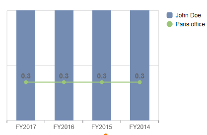
As it seems Design Studio always treats your key figures (measures) as your series. In my data source the key figures where sitting in FY2017, FY2016 etc. that's why DS wouldn't put them on the x-axis. Now I have moved my key figures to John Doe and Paris office and now DS treats them as series. Plain stupid. So disconnected from how BW queries are built and forces you to structure your data sources the way DS likes them, not how you like them...
You must be a registered user to add a comment. If you've already registered, sign in. Otherwise, register and sign in.
- Consolidation Extension for SAP Analytics Cloud – Automated Eliminations and Adjustments (part 1) in Technology Blogs by Members
- ML- Linear Regression definition , implementation scenarios in HANA in Technology Blogs by Members
- Filter on multiple criteria in Technology Q&A
- AI Foundation on SAP BTP: Q1 2024 Release Highlights in Technology Blogs by SAP
- Workload Analysis for HANA Platform Series - 2. Analyze the CPU, Threads and Numa Utilizations in Technology Blogs by SAP
| User | Count |
|---|---|
| 88 | |
| 10 | |
| 10 | |
| 9 | |
| 7 | |
| 7 | |
| 6 | |
| 5 | |
| 4 | |
| 4 |
You must be a registered user to add a comment. If you've already registered, sign in. Otherwise, register and sign in.